 Redakcja Choose TV
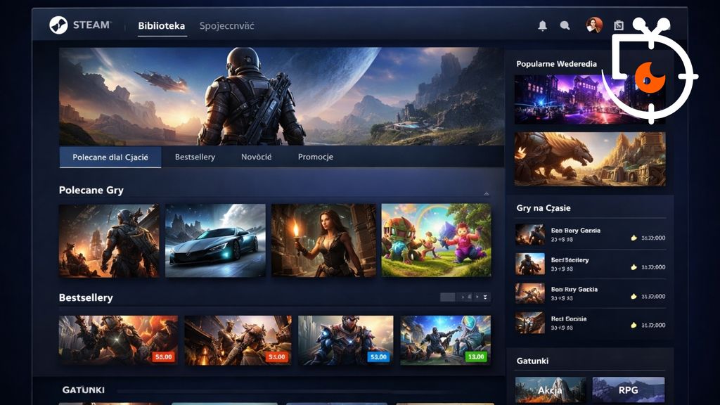
Valve is refreshing the appearance of Steam once again, and this time the changes are more noticeable than before. The platform, which has been around for years, is getting a new store layout with an emphasis on readability and better game discovery. The new design is already rolling out in beta, and the initial reactions are quite positive. The changes don’t turn everything upside down, but they improve what has been most bothersome. This is another step in modernising one of the most important platforms for PC gamers.
Clearer store and more information
Valve has revamped the Steam homepage to be more transparent and information-rich. More details now appear under each title, and the recommended games section now shows short video clips and reasons for recommendations. Additionally, there are larger graphics and better visual quality, making the whole thing look more modern and less chaotic.
New sections and more convenient browsing
New features have also been introduced, such as a Wishlist directly on the homepage and a DLC section tailored to your owned games. The Discovery Queue operates faster and doesn't require navigating between pages, while scrolling has been improved to better fit the rest of the interface. Importantly, some changes – like animations or micro-trailers – can be turned off, giving users greater control over how the store looks.
Valve isn't revolutionising things, but they're steadily improving Steam, and this time the effect is really noticeable. The new look makes browsing games quicker and more enjoyable, which can be a significant change for many users.
source: gamesradar.com