The Philips PML 9009 is the brand's flagship LCD television with Mini LED backlighting. It boasts impressive build quality, a stylish remote, and Philips' unique multicoloured Ambilight feature. In terms of picture quality, black levels and contrast could be improved—they don’t quite match the depth and vibrancy offered by similarly priced competitors. However, thanks to effective image algorithms, tonal quality remains satisfying. The screen’s relatively low brightness is well managed, and the inclusion of Dolby Vision provides a gateway to HDR content. The TV’s smooth colour transitions are noteworthy, surpassing some higher-end models. The PML 9009 truly excels in gaming performance, offering an experience that will please any gamer. Its motion-smoothing system also deserves praise, with two adjustable sliders allowing users to select their preferred smoothing level, making it a solid choice for sports viewing. Although the TitanOS operating system is still evolving and lacks a wide range of apps, the manufacturer is expected to address this over time.
- Matching (Score)
- Our verdict
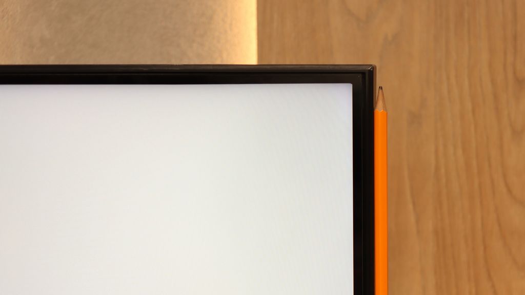
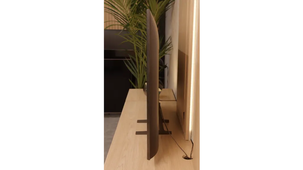
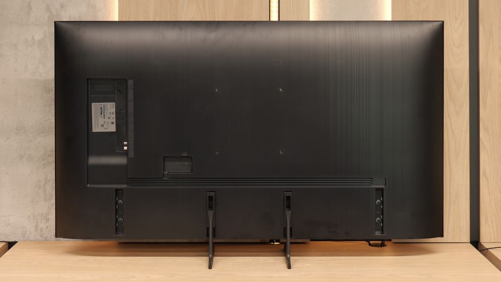
- TV appearance
- Where to buy
- Contrast and black detail
- HDR effect quality
- Factory color reproduction
- Color reproduction after calibration
- Smoothness of tonal transitions
- Image scaling and smoothness of tonal transitions
- Blur and motion smoothness
- Console compatibility and gaming features
- Input lag
- Compatibility with PC
- Viewing angles
- TV efficiency during daytime
- Details about the matrix
- TV features
- Apps
- Playing files from USB
- Sound
Philips PML9009 / 9019 / 9059 vs Samsung Q7F
![]() Direct compare
Direct compare
Check the best price offer:
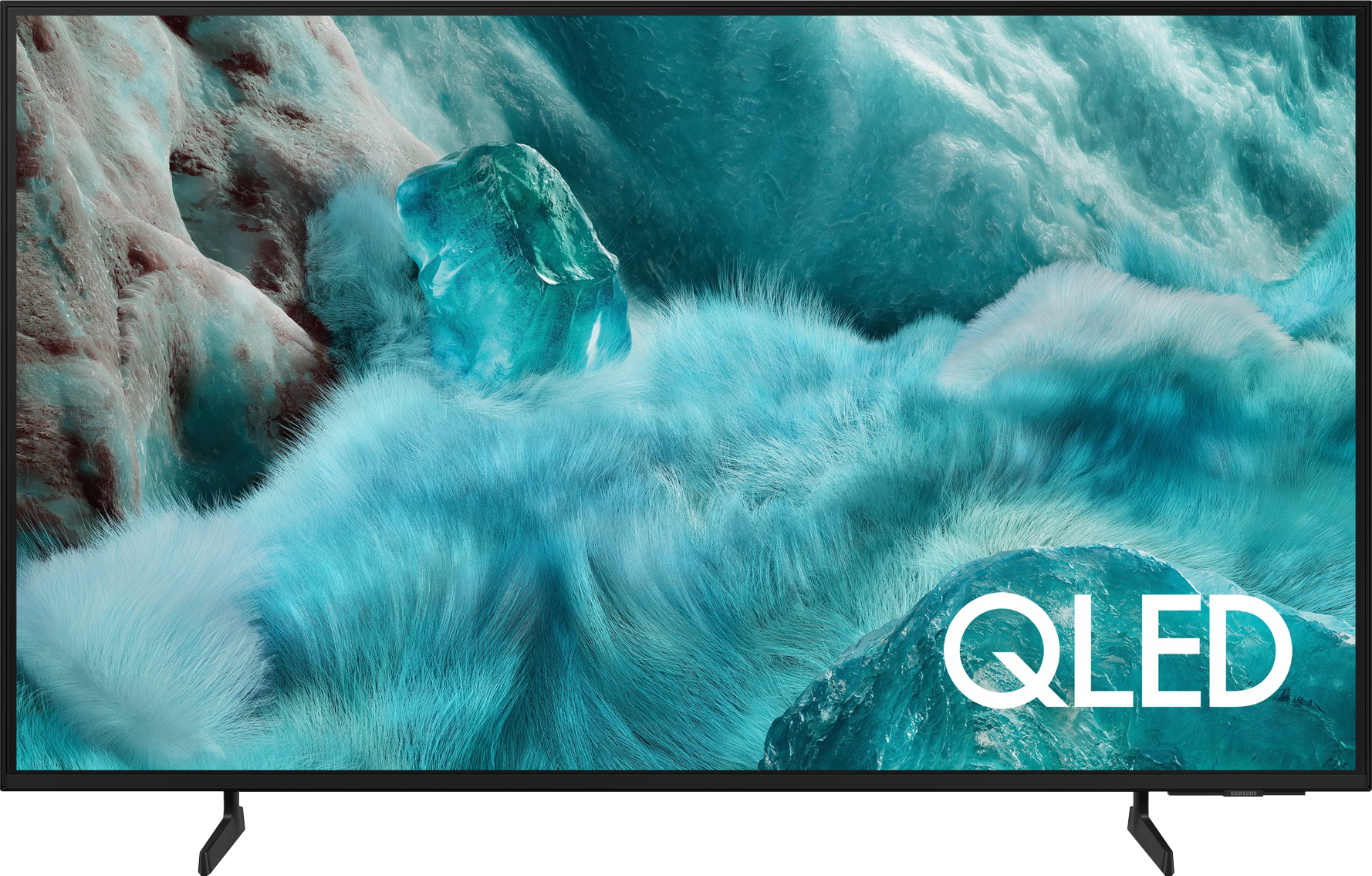
Samsung Q7FThe Xtra / PML9019 / PML9059 / PML9009 / PML9049 / AMBILIGHT TV

Panel type: LCD VA
Resolution: 3840x2160
System: Titan OS
Model year: 2024
Complete the survey to find out the result
Panel type: LCD VA
Resolution: 3840x2160
System: Tizen
Model year: 2025
Complete the survey to find out the result
Overall rating
6.8
5.7
 Movies and series in UHD quality
 6.5
5.7
 Classic TV, YouTube
 6.3
5.6
 Sports broadcasts (TV and apps)
 6.6
5.3
 Gaming on console
 8.5
6.3
 TV as a computer monitor
 8.6
6.0
 Watching in bright light
 6.1
3.9
 Utility functions
 6.1
6.6
 Apps
Apps 6.2
8.7
 Sound quality
 6.7
5.8
Complete the survey to find out what fits your preferences
Advantages
Superb tonal quality of scenes exceeding the capabilities of the television
Well-functioning dynamic tone mapping feature
Colour reproduction after calibration
Performance when connected to a console/PC
Solid native contrast (VA Panel)
Vivid colors thanks to the QLED filter
Low input lag (around 10MS)
Advanced and smooth Tizen operating system
Small sleek pilot with Type-C charging
Disadvantages
Significant halo/bloom effect
Poor viewing angles
TitanOs system is not as advanced as the competition
Average contrast and black levels
Very low brightness (only 250 nits in HDR)
Lack of many features for gamers, including VRR and HGiG – the manufacturer promised something, but ultimately these features are simply not there
Lack of many classic "TV" features, e.g., USB recording or PIP
No Dolby Vision
Average quality of digital image processing
Our verdict
Samsung Q7F is the cheapest model from the manufacturer in the QLED line, and it must be admitted that several advantages can easily be pointed out. After calibration, the colors look really good, and the additional QLED filter makes the hues more saturated than in typical budget LCD TVs. In addition, there is a VA panel that offers quite decent native contrast. It is certainly not at the level of top constructions, but it does fine for everyday viewing. The biggest plus, however, is the Tizen system, which is Samsung's flagship card. It runs smoothly, is well-developed, provides access to a plethora of applications and add-ons, and at the same time allows you to easily connect the TV to the SmartThings ecosystem and control other devices in the home. And this is basically where the list of pros ends, because the longer you use the Q7F, the more it becomes clear that it is a heavily unfinished product. It is not just about the panel itself with its low brightness and mediocre picture quality in HDR films, but also about the lack of features that usually worked flawlessly in Samsung TVs. The manufacturer claims the presence of VRR and HGiG, but in practice, they are of no use, which makes it difficult to recommend the TV even to casual gamers. It also doesn't perform very well for regular television, as the digital image processing is at best average, and the tonal transition improvement feature, which usually performed excellently in Samsung TVs, here practically does not work. The Q7F is a product that can only be recommended to those looking for a TV with two phrases on the box: “QLED” and “good Smart TV”. The rest receive a rather bland product that lacks a lot to compete even with other more budget-friendly offerings. It is a shame because usually the word "QLED" in Samsung meant something more than just an ordinary TV.
TV appearance


Contrast and black detail
6.6/10
4.7/10
Local dimming function: Yes, number of zones: 75 (15 x 5)
Local dimming function: No
Contrast:
Result
132,000:1
Result
16,550:1
Result
14,450:1
Result
7,850:1
Result
6,650:1
Result
2,850:1
Result
2,750:1
Result
3,300:1
Result
3,050:1
Result
2,750:1
Halo effect and black detail visibility:

The Philips PML9009 features a high-contrast VA panel. While it doesn’t produce the same depth and dimensionality as OLED displays, it remains a solid choice for home cinema, outperforming IPS/ADS panels in this regard. The measured static contrast ratio, at 6000:1 without local dimming, is commendable and showcases the Mini LED backlighting capabilities of this model. Though the contrast and black level measurements aren’t among the highest, the television performed well in certain scenes, such as Oblivion, where it effectively separated light – an achievement not always seen in much pricier units. Testing was conducted at medium power dimming; the lowest dimming level didn’t achieve satisfactory black levels, while the highest setting led to detail loss. Unfortunately, our test with The Revenant highlighted some issues. While background details were clear, the dimming zones disrupted the overall tonal balance, resulting in a noticeable halo effect around the subtitles.
The Samsung Q7F in the tested size of 55 inches has a VA panel, which immediately translates to decent native contrast. Values around 3000:1 may not be record-breaking, as we know that VA panels are currently being produced with more than double the contrast, but it still performs much better than IPS or ADS panels, where blacks quickly fade into shades of gray or navy blue. Unfortunately, we won't find typical local dimming zones here, but the manufacturer has added something resembling global dimming – meaning the whole screen darkens in relation to the content. The effect? In most scenes, blacks look quite solid, although during night screenings, we can still see that they resemble dark navy blue or gray rather than true pitch black. Overall, it's okay, but without fireworks – it's not spectacular, but it's also not a disaster.
HDR effect quality
6.1/10
3.7/10
Luminance measurements in HDR:

Result
548 nit

Result
550 nit
Result
824 nit

Result
491 nit

Result
582 nit
Result
215 nit
Result
225 nit
Result
267 nit
Result
113 nit
Result
250 nit
Scene from the movie “Pan” (about 2800 nits)


Scene from the movie “Billy Lynn” (about 1100 nits)


Static HDR10


Dynamic: Dolby Vision
Dynamic: HDR10+


HDR luminance chart:
Samsung Q7F
HDR luminance
Philips PML9009 / 9019 / 9059
HDR luminance
The Philips PML9009 struggles to deliver the highest HDR performance. Scenes with effects around 550 nits don’t provide particularly impressive lighting, though the effects remain stable, an improvement over SDR materials. A notable exception is in Gemini Man, where a flashlight as the sole light source stands out. This is likely due to the absence of large dark areas and the relatively small size of the light source compared to scenes with larger, brighter elements like the sun. While the brightness results in HDR content aren’t quite strong enough to recommend this TV for productions utilising a wide colour gamut, it’s worth mentioning that the model does achieve decent coverage, reaching 93% of the DCI-P3 spectrum.
Unfortunately, the Samsung Q7F is not one of the bright televisions, and this directly affects the quality of HDR movies. The peak brightness of the panel is only about 250 nits, which is definitely too low to speak of true cinematic experiences. In practice, the image in HDR content does not differ significantly from classic SDR, making it hard to talk about any "wow effect" that usually accompanies us while watching such films. During testing movie scenes, the image simply looked dim, and brightness almost invariably hovered around the mentioned 250 nits. The worst performance was observed in shots with small, intensely glowing elements – the applied global dimming technique reacted very aggressively, dimming the entire screen to maintain the black effect. On the plus side, it is worth noting the presence of a QLED coating that expands the color palette. As a budget QLED model, the Q7F performs quite decently here: its DCI-P3 color coverage is about 93%, and BT.2020 reaches 70%. This means that colors, despite the low brightness, can look quite vivid and attractive.
Factory color reproduction
5.3/10
5/10


Factory Mode
After calibration


Factory Mode
After calibration
During testing, the Philips PML9009 performed best in the factory "Filmmaker" mode, which we evaluated across both SDR and HDR content. A key characteristic observed in this mode is the EOTF curve’s behaviour in HDR content and gamma settings in SDR, designed to enhance image accuracy. However, the PML9009 presented noticeable issues, particularly with white balance, as a pronounced red dominance created a yellow tint across the entire image. This affected skin tones and white areas, with faces and whites appearing unnaturally warm. The colour shift was confirmed through the "ColourChecker" palette, where colours leaned towards warmer shades.
In the gamma analysis, responsible for image contrast, we noticed considerable inaccuracies early on. Our measured values spiked above the reference, causing dark scenes to lose detail and merge visually up to about 10% screen brightness. Following this, the values dropped below the target line, further degrading contrast—an area already challenging for this model.
In HDR content, the white balance remained similarly flawed, and the EOTF curve also restricted brightness levels, resulting in a dim, muted image. Colour inaccuracies were even more pronounced here, with lower luminance levels causing large deviations from accurate colours, which were clearly visible on the error graph, often exceeding acceptable limits. While aiming for cinematic quality, this mode ultimately fell short in delivering balanced colour and contrast fidelity.
The factory color reproduction in the Samsung Q7F definitely isn't one of its strong points. In Filmmaker mode, which theoretically should be closest to neutral, the white balance issue is immediately noticeable. There's too much red on the screen, while blue is noticeably lacking. The effects of this are very easy to see – white, instead of being neutral, takes on warm, almost slightly orange tones. Over time, this makes the entire image look somewhat unnatural, and bright areas of the scene can seem unrealistic. The problems become even more apparent in HDR content. The graphs show that the TV has significant errors in the Color Checker palette, which translates to visible inaccuracies in the real image. In practice, this means that colors are not presented as they should be. The Q7F also heavily manipulates brightness; darker elements are overly boosted, causing them to lose their cinematic feel, while bright parts can appear dimmed. As a result, the image seems flattened, and instead of helping to bring out details, contrast only highlights its own limitations. This is particularly frustrating in HDR materials, as every detail matters there. In scenes where a subtle play of light and shadow should be felt, the Q7F either overdoes the brightening or, conversely, suppresses elements that were meant to draw the eye. This causes the image to lose its depth, and instead of cinematic realism, we get more of a simplification effect.
Color reproduction after calibration
7.5/10
7.6/10


Philips has long provided sophisticated calibration tools, including 2-point and 20-point grayscale adjustments as well as an advanced CMS (Colour Management System). These allow users to make significant improvements, and even those less attentive to image quality will likely notice a positive difference post-calibration. Both SDR and HDR content benefit from this process, notably eliminating the prominent yellow tint caused by an overemphasis on red in the white balance.
For SDR content, although gamma adjustments don’t entirely resolve the loss of detail in dark areas, the overall improvements bring most content to an impressive standard, with minimal, hardly perceptible errors. Colour accuracy is notably enhanced, achieving nearly reference quality with low deltaE errors.
HDR content, however, remains somewhat limited due to the display’s lower brightness capability. While the white balance has largely been corrected, a slight blue tint can occasionally appear. The EOTF curve aligns very well, providing accurate geometry, though colour errors persist due to the limited luminance. This calibration offers a substantial improvement but may still fall short for viewers who expect high brightness levels in HDR.
After professional calibration, we managed to bring the Q7F in order – at least in terms of SDR content. The picture in this mode looks really good: the white balance has been set correctly, the colors appear natural, and errors in the color palette have dropped to values that are practically invisible to the eye. The gamma behaves excellently, and the only minor drawback is a slight brightening of smaller elements, which results from the lack of local dimming. For everyday TV watching or standard quality films, the Q7F performs surprisingly well.
It was much more difficult to tame HDR content. Despite adjusting the white balance, the television continues to manipulate brightness significantly, causing scenes to sometimes look unnatural – what was meant to be subtly darker can end up being overly brightened, and bright parts of the image sometimes appear dull. The final effect is better than in the factory settings, but it is evident that the design limitations of the Q7F do not allow for fully utilizing the potential of HDR materials.
Smoothness of tonal transitions
7/10
9/10


In many films or series, you may have noticed instances where colour bands appear in areas that should exhibit smooth transitions. This is why we evaluate tonal transitions as part of our testing. The Philips PML9009 performed admirably in this area across all test scenes. While a few elements could benefit from finer processing, the overall result was impressive. Notably, it handled the challenging scene from The Green Knight exceptionally well, with no significant stuttering or unwanted artefacts visible, proving the TV’s capability to maintain smooth gradients even in demanding scenes.
The fluidity of tonal transitions in the Q7F is really impressive. The gradients are smooth, without strong steps or artificial divisions that can be quite noticeable in cheaper televisions. Even in more challenging scenes, like the one from The Revenant or the red shot of the actor flowing in water, the image held its level and simply looked good. If someone examines it very closely, they might notice slight imperfections in extremely demanding moments, but they are subtle enough that most people won't even notice them. For this price range, the Q7F handles gradation surprisingly well, and it's hard to find anything serious to criticize.
Image scaling and smoothness of tonal transitions
7.2/10
4.5/10
Smooth transition function

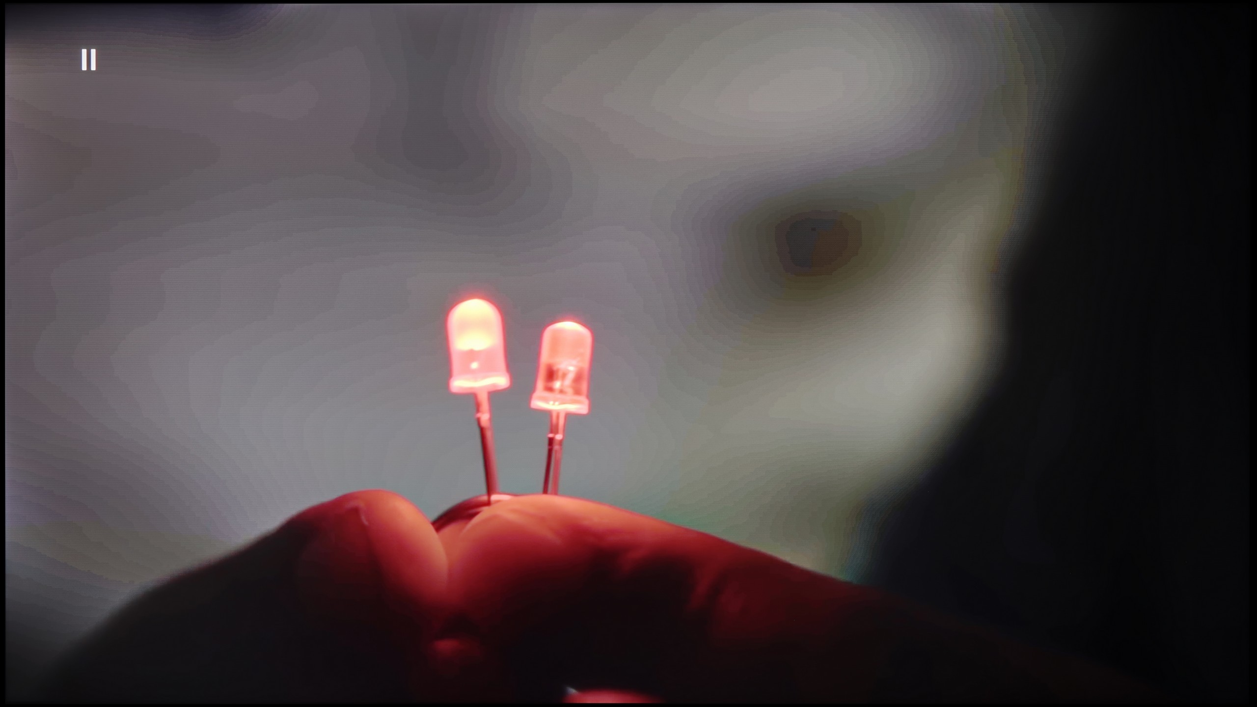
Image without overscan on the SD signal


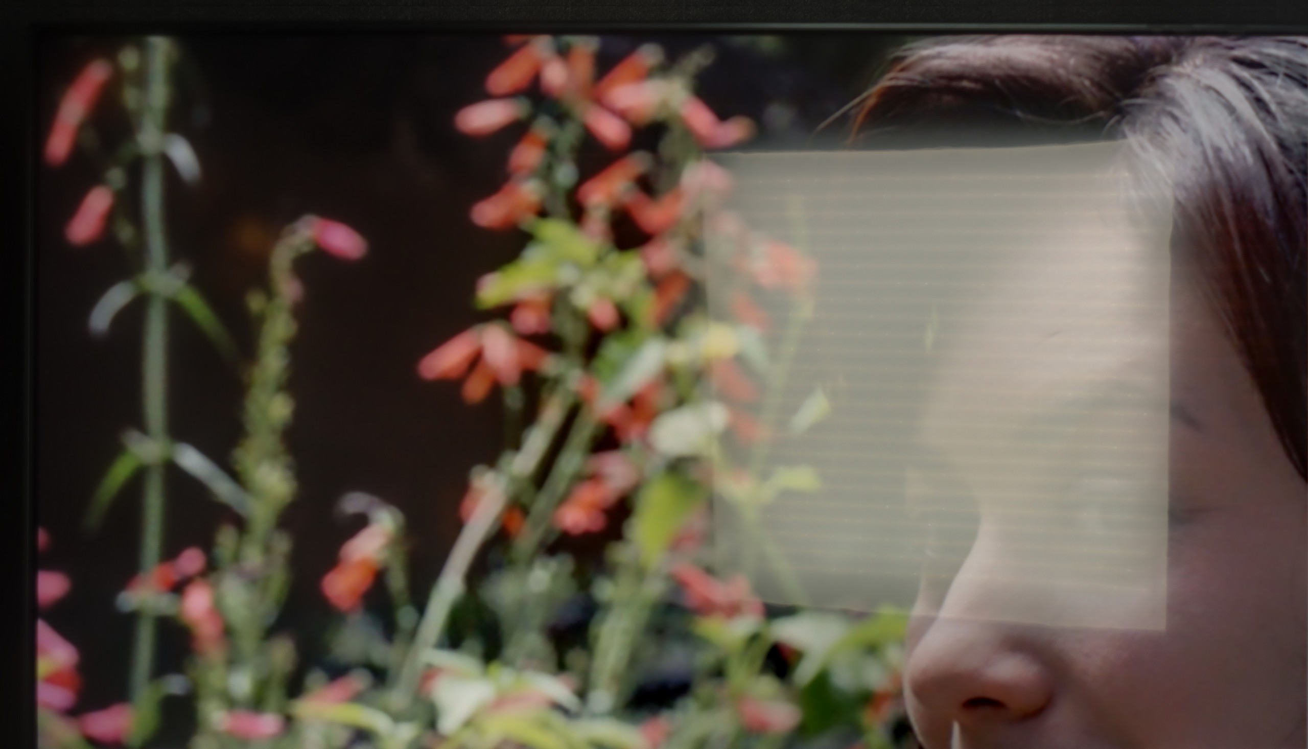
Given the impressive handling of tonal transitions by the Philips PML9009, one might expect similar success in the image scaling test. However, the results were less than stellar. When upscaling lower-quality images, like those from certain TV programmes or older films, the Philips algorithm tended to blur fine details noticeably, especially in intricate elements like fine branches or a model's hair.
On the other hand, the tonal transition performance remains noteworthy, with the TV offering several levels of smoothing. Even at the lowest setting, it effectively addresses non-smooth transitions in most materials, and crucially, it preserves the film grain effect, maintaining fidelity to the director's vision. However, it’s worth noting that some fine details may still appear slightly softened.
Upscaling and digital image processing in the Q7F is a bit of a sine wave. On one hand, we have really nice upscaling – weaker sources look better than one might expect. The image becomes clearer, sharper, and even older movies or terrestrial TV hold up well. Samsung has been strong in this area for years, and the Q7F confirms that. On the other hand… things start to get tricky. The TV has a problem with overscan – part of the image is simply cut off, and it looks rather unrefined. Additionally, we were let down by a feature called "noise reduction," which should improve the smoothness of tonal transitions in weaker materials. In other Samsungs, it works relatively well, but here it practically makes no difference – the banding in gradients remains. It's a bit disappointing because we could have expected more from a model that is aimed at users looking for a display for SDR content.
Blur and motion smoothness
7.7/10
5.5/10

Blur (native resolution, maximum refresh rate):


Blur (BFI function enabled):
Image flickers in this mode


The Philips PML9009 has a 120 Hz native refresh rate, a baseline standard for watching sports and an ideal setting for gaming on consoles or PCs. Philips includes an effective motion-enhancement system for users who want to reduce the stutter of 24 fps content or need fluid motion for fast-paced scenes, like in football matches. The dedicated "Smoothness" slider effectively mitigates stuttering, while "Motion Blur Reduction" enhances the sharpness of dynamic content. Each setting produces a noticeable difference, so users can tailor the motion effects to their preferences. Our recommended setup achieves a moderate smoothing effect, avoiding the exaggerated “soap opera” appearance.
Regarding pixel response time, VA panels like this generally fall short compared to OLED or even IPS panels, which can lead to a slight "black halo" trailing behind fast-moving objects. Although not a frequent issue with this TV, the effect can be seen in certain scenes.
Motion blur and motion fluidity in the Q7F is probably the most budget-conscious element of this TV. The 60 Hz panel is noticeable, with blur being quite evident, especially in dynamic scenes, and it's rather difficult to consider this model as equipment designed for watching sports or playing fast-paced games. In tests with the little green man, there was a long tail, and the ball in a football match would leave trails behind it.
On the plus side, the presence of motion smoothing is commendable. It really makes a difference in movies - especially since most materials are recorded at 24 frames. Here we can decide for ourselves whether we prefer a more "cinematic" image, with the slight jerkiness characteristic of cinema, or a smoother, more "television-like" one. This actually works quite well and helps improve the viewing comfort for series or movies.
Console compatibility and gaming features
9.8/10
3.3/10
- ALLM

- VRR

- VRR range48 - 144Hz
- Dolby Vision Game Mode
- Correct implementation of HGIG
- 1080p@120Hz
- 1440p@120Hz
- 4K@120Hz
- Game bar

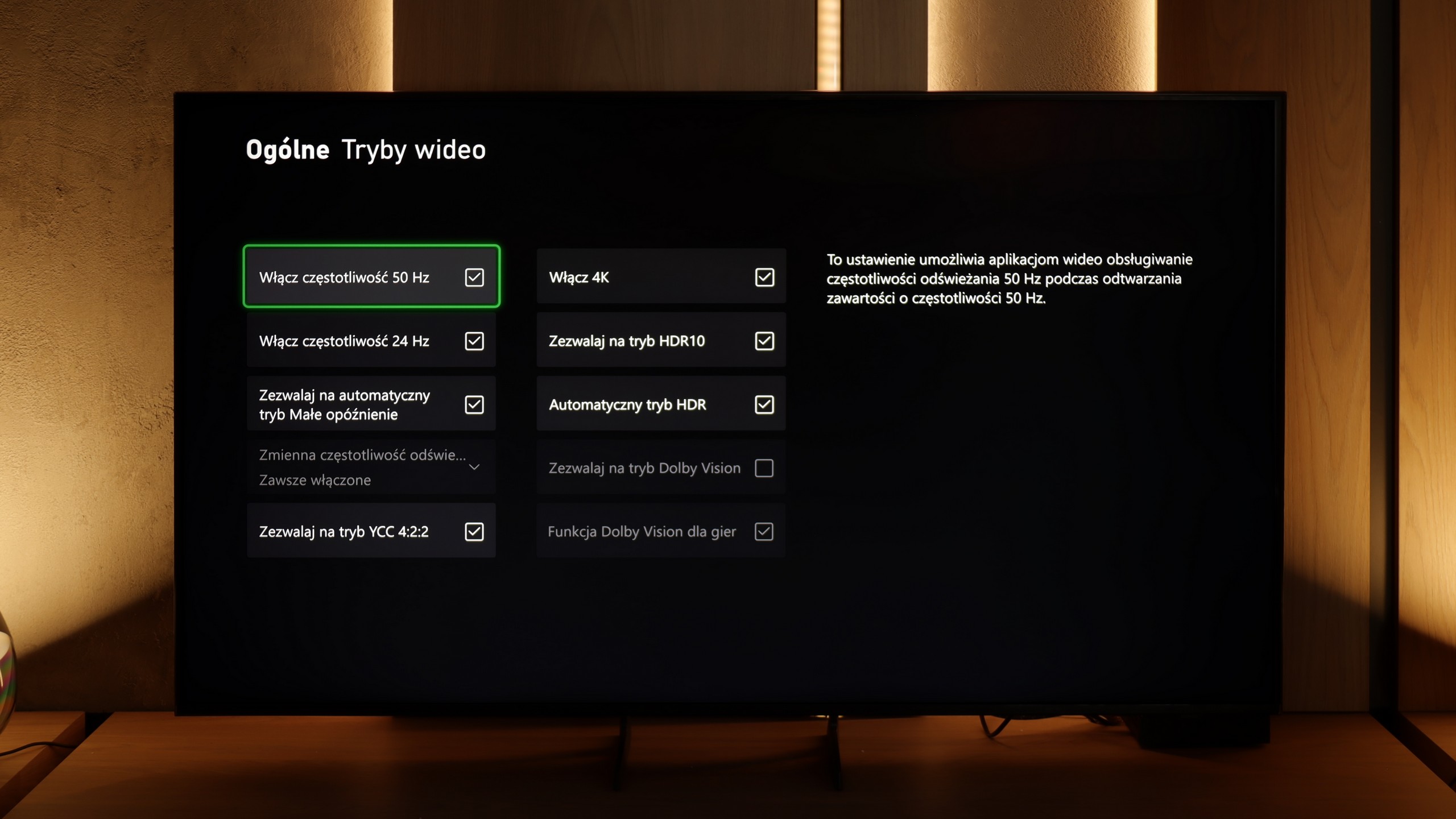


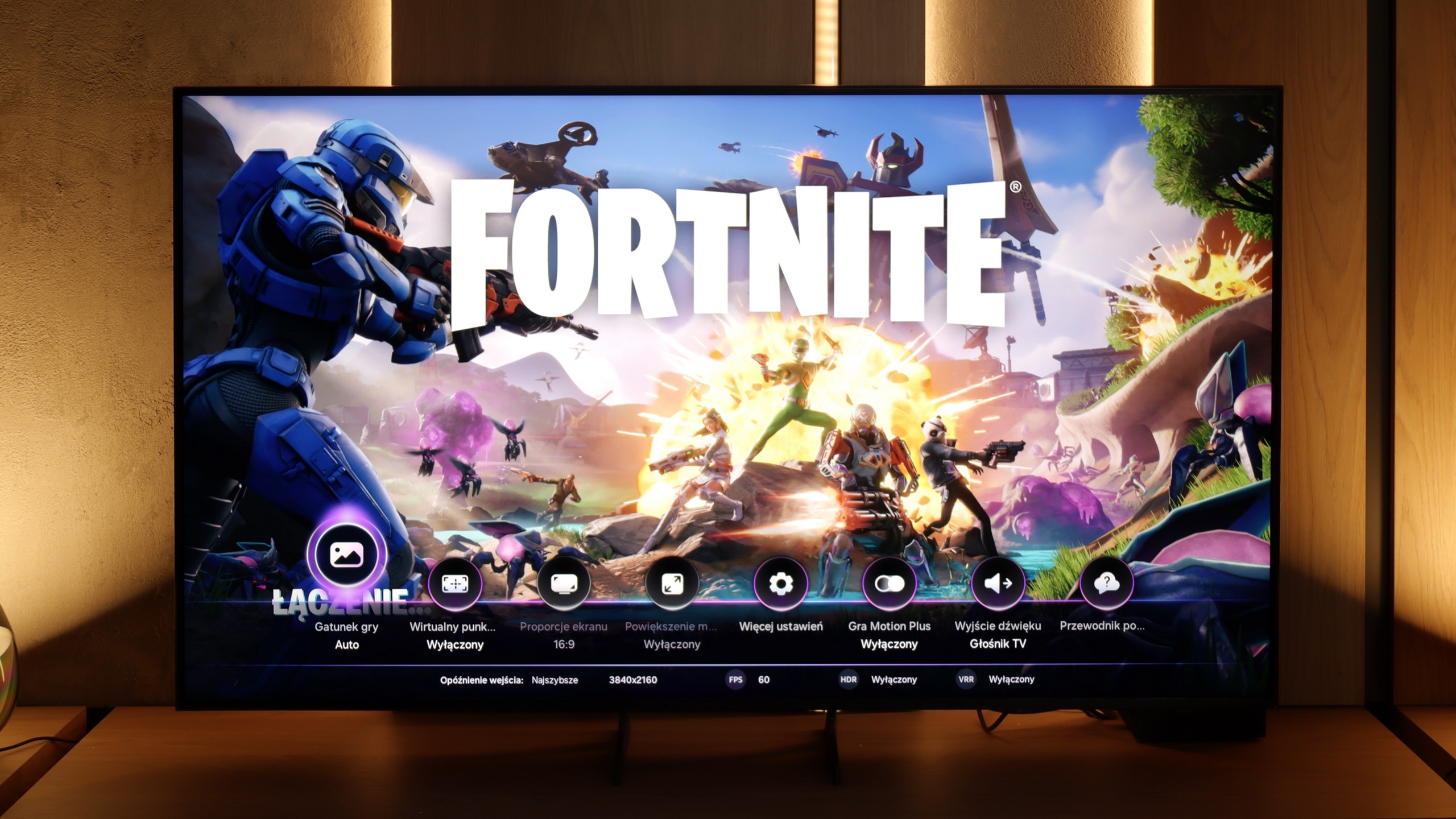

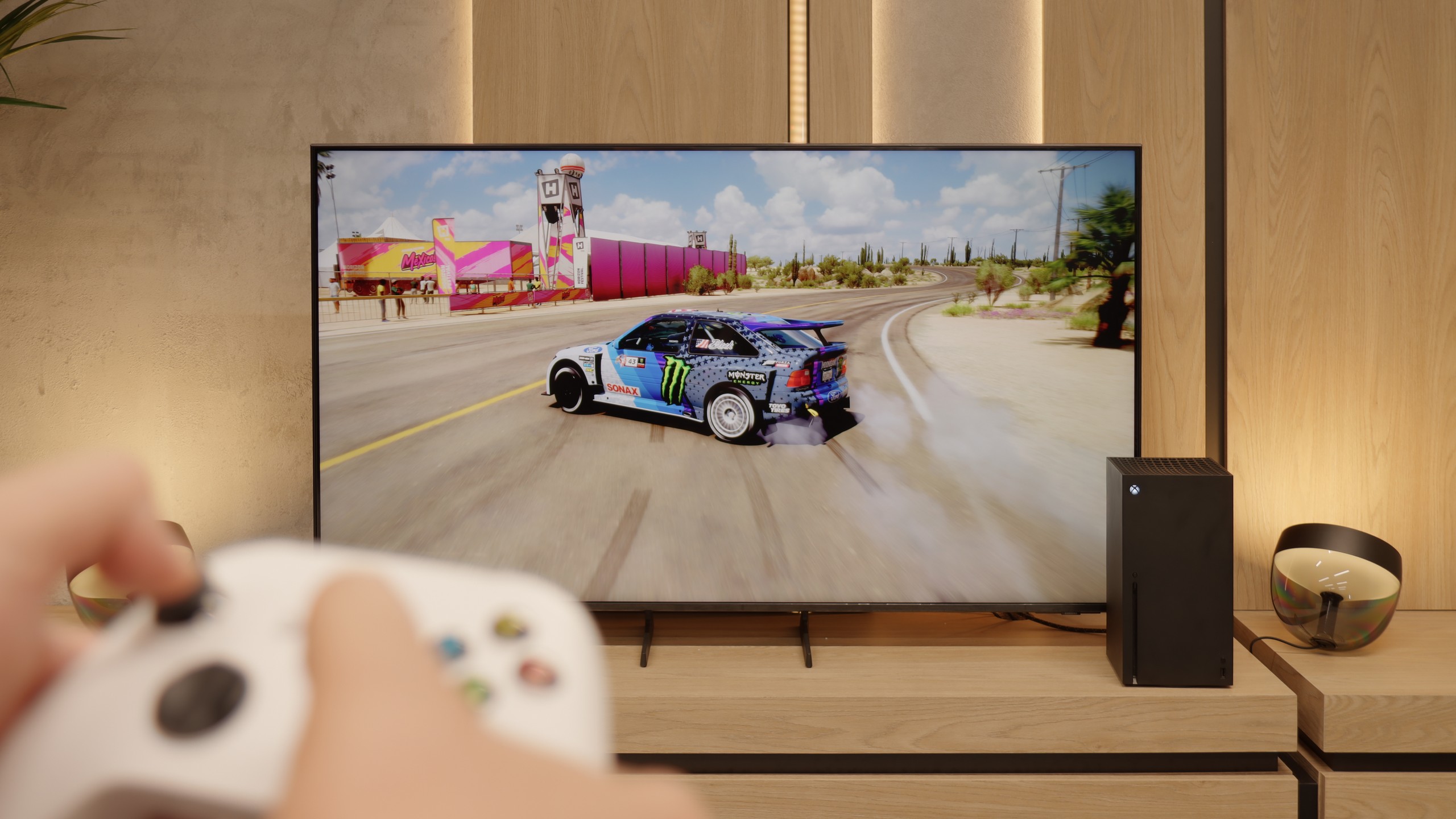
The Philips PML9009, with HDMI 2.1 ports supporting full bandwidth, is thoroughly equipped with gamer-focused features. Core functions like Variable Refresh Rate (VRR) and Auto Low Latency Mode (ALLM) are included, as well as the additional perks of G-Sync and FreeSync compatibility and low-lag HDR Dolby Vision support. All these gaming features activate seamlessly, proving this model’s suitability for gaming. The TV’s HGIG mode, particularly beneficial for gaming, adjusts HDR effects to the television’s capabilities to avoid image dimming and blooming, an advantage given the still limited number of games supporting Dolby Vision.
For added convenience, the PML9009 has a GameBar menu, allowing in-game setting adjustments without needing to exit. This menu includes features like a crosshair option and black level correction, which can enhance the visibility of shadowed areas—ideal for competitive play.
Overall, the Philips PML9009 offers a comprehensive setup for gamers, supporting VRR, ALLM, G-Sync, FreeSync, and HDR Dolby Vision to deliver immersive, high-quality gaming experiences across a wide range of titles.
Features for gamers in the Samsung Q7F is a topic that evokes quite a bit of mixed emotions. On one hand – no sensible person expected miracles here, after all, it's a 60 Hz television, and it was clear from the beginning that it wouldn't be a device to extract the maximum from a console or PC. On the other hand, since the manufacturer promised specific solutions in promotional materials, it's natural that we wanted to see them in practice. At the start, it's quite decent. The automatic game mode (ALLM) works, so there's no need to manually fiddle with the settings; the console switches the TV to low latency mode by itself. Additionally, we have the Game Bar, which looks impressive and allows you to check a few basic parameters without leaving the game. And this is where the good news ends.
The biggest problem with the Q7F is VRR, or rather its absence. Indeed, a relevant icon appears in the menu, and you can even see it in the Game Bar, but throughout the entire test, the function remained dead and could not be activated in any way. The issue with HGiG is even more painful; this option was actually available at the beginning, but after a software update, it disappeared completely, which is simply unprofessional. Therefore, the Q7F is only suitable for absolute basics. Sure, you can turn on the console, play more mellow titles, and enjoy low input lag, but if someone is counting on more advanced features that the manufacturer promised, they will be disappointed. This is not a television intended for gaming, and it's better to be aware of this before purchasing.
Input lag
9.6/10
10/10
SDR
HDR
Dolby Vision
The Philips PML9009 excels in input lag measurements, showcasing impressive performance across various signals and resolutions. Gamers will appreciate the manufacturer’s optimisation, with an exceptionally low input lag of 8 ms when playing at 4K120Hz with HDR—virtually imperceptible even in fast-paced online games. Furthermore, the game mode with Dolby Vision also maintains a commendable response time of 16 ms, ensuring that players experience minimal delay during gameplay. This combination of low input lag and effective game mode implementation solidifies the PML9009 as an excellent choice for competitive gamers seeking a responsive, immersive experience.
The input lag on the Samsung Q7F is really good for a 60 Hz display. Measurements showed values below 12 ms, which means that for regular gaming on a console, this model is more than sufficient. Of course, it doesn’t match the top-level 120 Hz screens that can go below 6–7 ms, but in everyday use, it's hard to talk about noticeable delay. In this regard, the Q7F does not lag behind the competition in its segment and can easily be considered a safe choice for casual or sports gaming. At least in this respect.
Compatibility with PC
8.6/10
6/10

The Philips PML9009 also excels in everyday tasks, with measured delays of just 8 ms providing nearly instantaneous reactions in the mouse-screen-eye connection. Its proper implementation of chroma 4:4:4 ensures crisp, sharp fonts, making it ideal for text work. While the subpixel layout of the matrix is BGR, this doesn't create any issues when using the Windows operating system. However, users on other systems may encounter challenges with text rendering, as those platforms may struggle to convert text accurately. Overall, the PML9009 is a versatile display suitable for gaming and daily productivity tasks.
Cooperation with a PC on the Q7F is decent, although it's not a TV that will satisfy the most demanding users. The fonts are displayed clearly and sharply, so you can comfortably work on it – especially for everyday office tasks or browsing the internet. With thin letters, you can notice slight shading, but it's not something that interferes with normal use. In a smaller size, the Q7F can actually work as a computer screen, although you have to keep its limitations in mind. The lack of variable refresh rate means that we won't benefit from G-Sync or FreeSync, and 60 Hz effectively closes the door to more demanding PC gaming. For work and light use, it will be okay, but for serious gaming, it's definitely better to look for something higher up in Samsung's offering.
Viewing angles
2.6/10
3.5/10
A commonly known drawback of VA panels that do not have an angle coating is their poor viewing angles. This is no different this time. Even after a slight shift off-axis, the image becomes washed out, and the colours undergo significant degradation.
The viewing angles on the Q7F are simply poor – typical for VA panels. Just sitting slightly to the side and it's immediately clear that the picture loses quality. Colors fade, contrast significantly drops, and blacks begin to resemble more of a gray than anything deep. This is a television that is definitely best viewed straight on, and any larger viewing angle comes with compromises.
TV efficiency during daytime
6.1/10
3.9/10


Matrix brightness
Average luminance SDR
Samsung Q7F: 237 cd/m2
Philips PML9009 / 9019 / 9059: 564 cd/m2
While the Philips PML9009 offers good brightness levels for SDR materials—making it suitable for evening or dark-room viewing—the reflection suppression is only average. This can be attributed to the satin finish of the panel, which is prone to reflections from various light sources, as it neither absorbs nor diffuses them effectively. However, the relatively high brightness in SDR mode enables the television to perform adequately in brighter rooms, often outperforming many OLED models in this regard. This makes it a viable option for users who might watch content in well-lit environments.
The performance of the Q7F during the day unfortunately does not impress. Due to low brightness, the screen quickly succumbs in very sunlit rooms. Therefore, it is difficult to recommend it to those who plan to watch television in a bright living room with large windows. In moderately lit rooms, it still manages, but in bright light, the picture loses clarity. Additionally, the fact that the panel does not always effectively handle reflections means that during the day, glare can be problematic. This is more of a screen for evening viewing than for daily sessions in full sunlight.
Details about the matrix
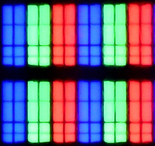
Subpixel Structure:

Panel uniformity and thermal imaging:


Philips PML9009 / 9019 / 9059
Samsung Q7F
TV features
6.1/10
6.6/10
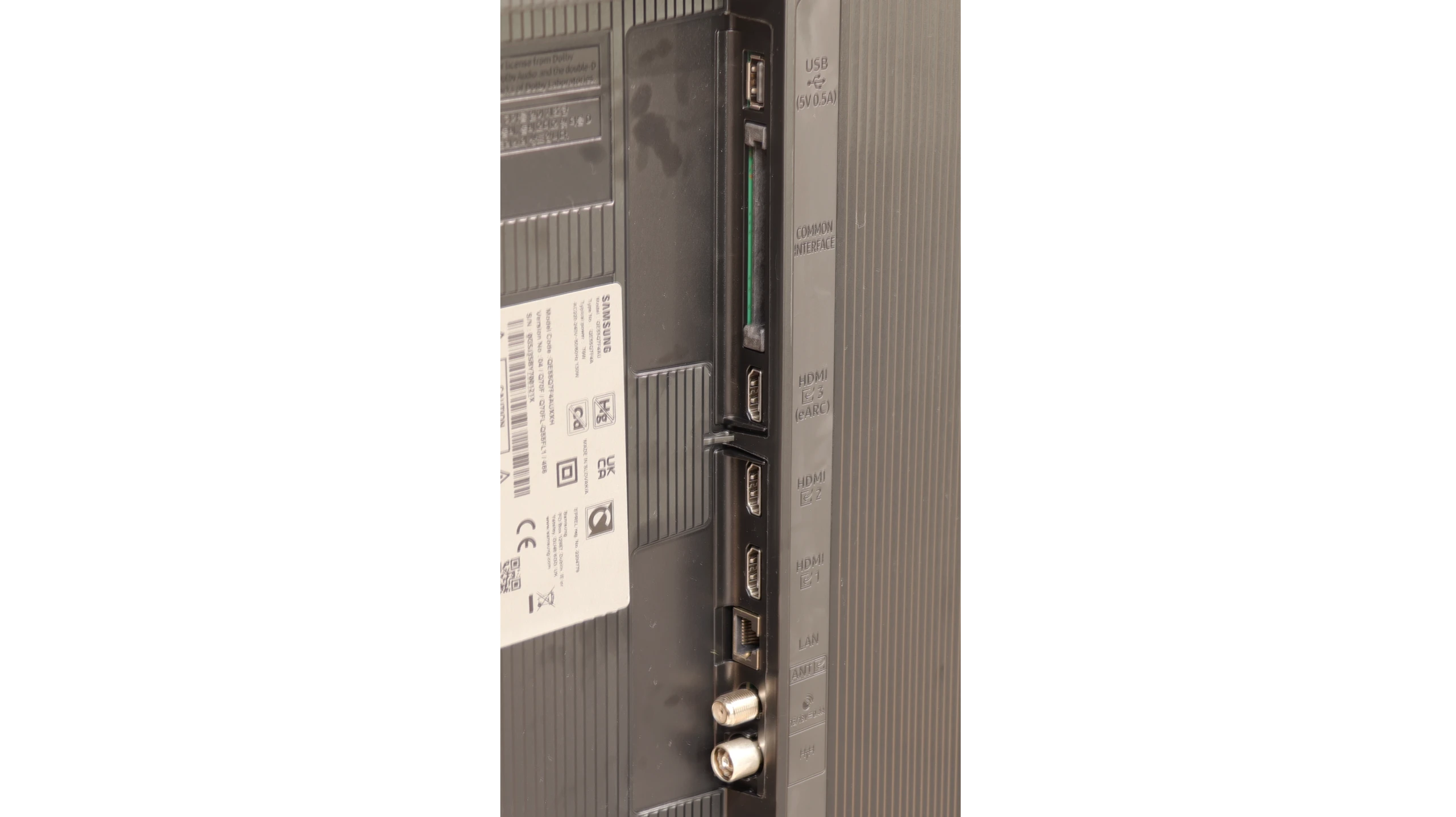
- HDMI inputs0 x HDMI 2.0, 4 x HDMI 2.1 48Gbps3 x HDMI 2.0, 0 x HDMI 2.1
- OutputsToslink (Optical audio), eARC (HDMI), ARC (HDMI), Mini-Jack (Headphones)Toslink (Optical audio), eARC (HDMI), ARC (HDMI)
- Network InterfacesWi-Fi 2.4GHz, Wi-Fi 5GHz, Ethernet (LAN) 100MbpsWi-Fi 2.4GHz, Wi-Fi 5GHz, Ethernet (LAN) 100Mbps
- TV receptionDVB-T, DVB-T2, DVB-S, DVB-S2, DVB-CDVB-T, DVB-T2, DVB-S, DVB-S2, DVB-C
Classic features:
- Recording to USB (terrestrial TV)
- Recording programming
- Picture in Picture (PiP)
- RF remote control (no need to aim at the screen)
- Backlit remote control
- Teletext
- Audio only mode
- Bluetooth headphones support
- Simultaneous Bluetooth headphones & TV audio
Smart features:
- AirPlay
- Screen mirroring (Windows Miracast)
- Voice search
- Voice search in native language
- Ability to connect a keyboard and mouse


Before delving into the software that powers the Philips PML9009, it’s essential to highlight one of the standout features of the manufacturer’s TVs: the multicoloured Ambilight backlighting. This unique feature enhances the viewing experience by projecting colours from the back of the TV that correspond to the on-screen action, creating a more immersive atmosphere.
The operating system used in the PML9009 is Philips' proprietary TitanOs. While it offers some benefits, it is notably more closed and limited when compared to other models that use the Google TV system. One significant drawback is the absence of essential applications such as Apple TV, MAX, Canal+, and Player. Additionally, TitanOs restricts users from performing basic tasks like scheduling recordings or recording to USB. Apple device users may also be disappointed by the lack of AirPlay functionality, which allows for easy screen sharing.
On a positive note, the TV supports connecting a keyboard and mouse, which can simplify navigation through the menu. However, it's worth noting that while the remote pairs via Bluetooth for voice selection in English, all other functions rely on infrared (IR) connectivity.
In summary, TitanOs has its limitations, especially for users who frequently utilize a variety of streaming platforms. It seems better suited for those who primarily engage with a few key services—what one might refer to as the "holy trinity" of streaming: Netflix, YouTube, and CDA.
Smart TV – Tizen system
Here Q7F shows its strongest side. Samsung has been developing the Tizen system for years, and it is evident that we are dealing with a mature, refined platform. Everything works smoothly, the menu does not lag even when switching between heavier applications, and installing additional programs from the library is quick and hassle-free. Additionally, there is full support for AirPlay, integration with voice assistants, as well as a wide range of add-ons – from collaboration with devices in the SmartThings ecosystem to the ability to control Philips Hue smart lighting or other smart gadgets. Samsung strongly focuses on advanced network features, and it shows – in terms of Smart TV, Q7F has absolutely nothing to be ashamed of, and on the contrary, it can put more expensive competitor models to shame.
Classic Features
On the side of classic "TV" solutions, it is clear that the manufacturer has put everything on the smart card. We will not find USB recording or PiP mode here, features that used to be standard. It is evident that Q7F is primarily intended to be a media center, not a device for users accustomed to more traditional solutions. Fortunately, there are several practical additions – we have Bluetooth for pairing headphones or speakers and the option to change the font size in the menu, which will be appreciated by users with weaker eyesight.
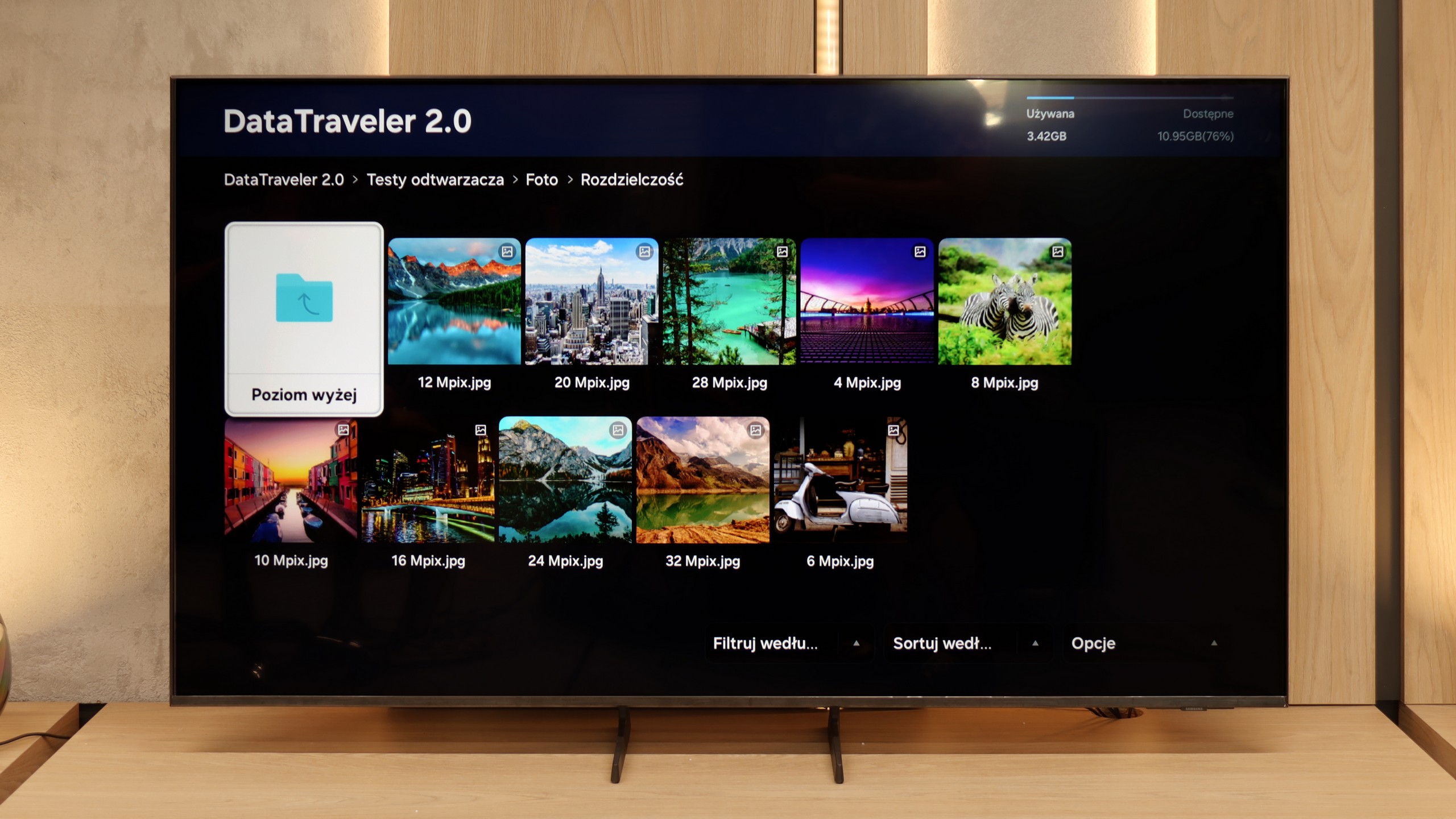
Playing files from USB
8.2/10
9/10
Supported photo formats:
Maximum photo resolution:

The default media player integrated into the Philips PML9009 provides a fairly comprehensive set of features but does have certain limitations. It supports nearly all common video formats except for the relatively rare .asf format. However, users may encounter issues due to the absence of the H.265 HEVC codec for high-bitrate content and a lack of support for .sub subtitle files, which are popular among many users.
With photo playback, the media player performs adequately, though it does not support some widely used resolutions and formats, such as HEIC, commonly found on Apple devices. The player excels in audio playback and leaves little room for criticism.
Unfortunately, the system's limitations prevent users from extending the player’s functionalities, meaning users are confined to the capabilities the manufacturer has included. This can be a drawback for those who rely on specific formats or additional features not provided by the built-in player.
In the Q7F, we have a built-in file player, and as is usually the case with Samsung TVs, it works quite well – most popular movies or music play without any fuss. For basic use, it’s sufficient, and there’s usually no need to reach for external solutions like connecting a laptop. It’s worse if someone wants to upload photos – it can stumble here, especially with Apple’s HEIC or PNG, which are visible in the player menu but don’t necessarily want to work.
Apps
6.2/10
8.7/10
Sound
6.7/10
5.8/10
- Maximum volume-80dB
- Dolby Digital Plus 7.1
- Dolby True HD 7.1
- Dolby Atmos in Dolby Digital Plus (JOC)
- Dolby Atmos in Dolby True HD
- DTS:X in DTS-HD MA
- DTS-HD Master Audio
At the outset, it is worth noting that sound quality is a subjective matter. The built-in audio system in the Philips PML9009 is characterised by clear high tones, but the bass is quite flat and significantly worse than in competing models in the same price range.
The Samsung Q7F comes with a 20 W speaker system and… well, there’s no point in sugarcoating it; it’s not really impressive. The TV itself sounds quite decent, meaning we can clearly hear series, news, or daily programs, and the dialogues are not lost, but there is a lot lacking in depth and sound space. There is practically no bass; something thuds, but it resembles more of a knock on a box than true low tones. Music sounds flat, and movies also don't make any significant impression – we won’t feel like we're in a cinema. It’s a sound in the category of “acceptable,” just enough to have something built-in, but if someone is counting on stronger experiences, they will sooner or later reach for a soundbar anyway. And to be honest – even the simplest model will make a significant difference here, and Samsung has quite a few of those in their offering.
Acoustic Measurements
No acoustic data
80dBC (Max)
75dBC