The Philips PML 9009 is the brand's flagship LCD television with Mini LED backlighting. It boasts impressive build quality, a stylish remote, and Philips' unique multicoloured Ambilight feature. In terms of picture quality, black levels and contrast could be improved—they don’t quite match the depth and vibrancy offered by similarly priced competitors. However, thanks to effective image algorithms, tonal quality remains satisfying. The screen’s relatively low brightness is well managed, and the inclusion of Dolby Vision provides a gateway to HDR content. The TV’s smooth colour transitions are noteworthy, surpassing some higher-end models. The PML 9009 truly excels in gaming performance, offering an experience that will please any gamer. Its motion-smoothing system also deserves praise, with two adjustable sliders allowing users to select their preferred smoothing level, making it a solid choice for sports viewing. Although the TitanOS operating system is still evolving and lacks a wide range of apps, the manufacturer is expected to address this over time.
- Matching (Score) |
- Our verdict |
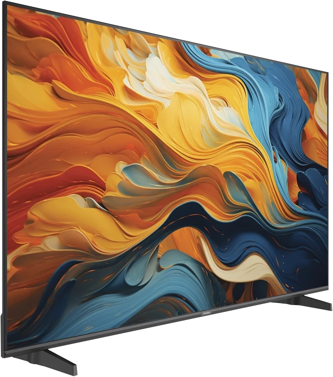
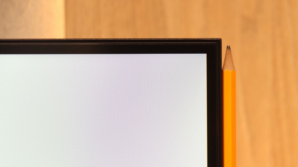
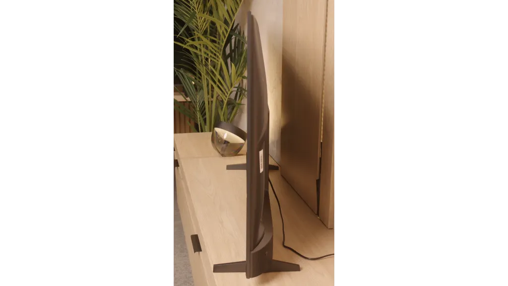
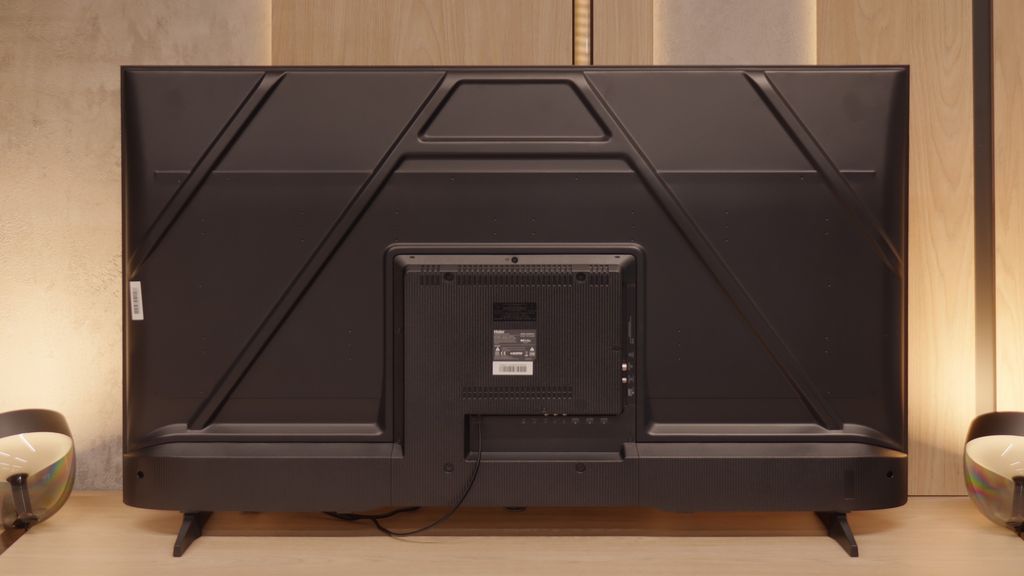
- TV appearance |
- Where to buy |
- Contrast and black detail |
- HDR effect quality |
- Factory color reproduction |
- Color reproduction after calibration |
- Smoothness of tonal transitions |
- Image scaling and smoothness of tonal transitions |
- Blur and motion smoothness |
- Console compatibility and gaming features |
- Input lag |
- Compatibility with PC |
- Viewing angles |
- Daytime performance |
- Panel details |
- TV features |
- Apps |
- Playing files from USB |
- Sound
Philips PML9009 / 9019 / 9059 vs Haier K85F
![]() Direct comparison
Direct comparison
The Xtra / PML9019 / PML9059 / PML9009 / PML9049 / AMBILIGHT TV
K85F / K85FUX

Panel type: LCD VA
Resolution: 3840x2160
System: Titan OS
Model year: 2024
Complete the survey to find out the result
Panel type: LCD VA
Resolution: 3840x2160
System: Google TV
Model year: 2025
Complete the survey to find out the result
Overall rating
6.8
5.4
 Movies and series in UHD quality
 6.5
5.2
 Classic TV, YouTube
 6.3
5.2
 Sports broadcasts (TV and apps)
 6.6
4.6
 Gaming on console
 8.5
6.4
 TV as a computer monitor
 8.6
6.0
 Watching in bright light
 6.1
4.1
 Utility functions
 6.1
5.5
 Apps
Apps 6.7
9.6
 Sound quality
 6.7
4.8
Complete the survey to find out what fits your preferences
Advantages
Superb tonal quality of scenes exceeding the capabilities of the television
Well-functioning dynamic tone mapping feature
Colour reproduction after calibration
Performance when connected to a console/PC
Low input lag, great for gaming
Surprisingly good file player via USB
High contrast and decent blacks (VA panel)
Good text readability in PC monitor mode
Presence of gaming features: ALLM and VRR
Access to many applications thanks to GoogleTV
Disadvantages
Significant halo/bloom effect
Poor viewing angles
TitanOs system is not as advanced as the competition
Average contrast and black levels
Catastrophic picture quality in HDR mode
Poor quality of workmanship and fit of materials
Slow, glitchy, and poorly translated Google TV system
Very poor sound quality from built-in speakers
Problematic remote (and no batteries included)
Poor viewing angles
Low brightness and weak anti-reflective coating
Low color gamut coverage
Our verdict
The debut of the Haier brand in the European TV market with the K85F model gives the impression of being rushed, and after thorough testing, it feels almost unfinished. Analyzing this product, we come to a fundamental conclusion: its biggest problem is not the quality of the panel used. Given its price segment, this is simply average, with the typical advantages of VA technology in the form of high contrast and equally typical disadvantages such as poor viewing angles. What actually disqualifies this model as a home entertainment center is the glaring lack of engineering and, above all, software refinement. The list of shortcomings is long and starts from the first contact with the device. Careless assembly, which could have been avoided at the quality control stage, a poorly optimized and poorly translated Google TV system, and annoying issues with such basic functions as pairing the remote—these all contribute to the picture of a product that seems to have been released to market without due diligence. The catastrophic picture quality in HDR mode, resulting not only from low brightness but also from a complete lack of intelligent adaptation to the signal, only adds to this disappointing image. However, it turns out that this model has its second, surprising face. It is enough to look at it not through the prism of a home TV, but rather as a large and cheap display for special tasks. Then its shortcomings take a backseat, and unexpected advantages come to the forefront: an exceptionally well-functioning media player with USB, outstanding font readability from a PC, and access to a huge database of applications. In such a role—as a screen in a conference room, hotel lobby, or simple advertising player—the Haier K85F performs surprisingly well. For the typical user seeking a reliable and simply well-functioning TV for the living room in 2025, however, the Haier K85F is a proposition that is extremely difficult to recommend with a clear conscience. It is a product full of contradictions that fails in its primary function intended by the manufacturer on too many fronts.
TV appearance


Contrast and black detail
6.6/10
5.6/10
Local dimming function: Yes, number of zones: 75 (15 x 5)
Local dimming function: No
Contrast:
Result
132,000:1
Result
16,550:1
Result
14,450:1

Result
7,850:1
Result
6,650:1
Result
3,550:1
Result
5,200:1
Result
5,350:1
Result
5,400:1
Result
3,500:1
Halo effect and black detail visibility:

Check the visibility of bright lights on a dark background. Mini-LEDs often struggle with this. The photo does not compare black levels – that’s what the video below is for.
The video accurately shows differences in contrast and black levels between TVs, as well as potential issues: halo around bright objects or Mini-LED zone operation visible as brightness jumps.
The Philips PML9009 features a high-contrast VA panel. While it doesn’t produce the same depth and dimensionality as OLED displays, it remains a solid choice for home cinema, outperforming IPS/ADS panels in this regard. The measured static contrast ratio, at 6000:1 without local dimming, is commendable and showcases the Mini LED backlighting capabilities of this model. Though the contrast and black level measurements aren’t among the highest, the television performed well in certain scenes, such as Oblivion, where it effectively separated light – an achievement not always seen in much pricier units. Testing was conducted at medium power dimming; the lowest dimming level didn’t achieve satisfactory black levels, while the highest setting led to detail loss. Unfortunately, our test with The Revenant highlighted some issues. While background details were clear, the dimming zones disrupted the overall tonal balance, resulting in a noticeable halo effect around the subtitles.
Well, let's get to the meat of the matter, which is how the Haier K85F handles black levels and contrast. The key information is that the television uses a VA panel, which is crucial for picture quality in dark scenes. Thanks to this, the contrast is really solid – our measurements showed values around 5000:1, which is much better than those of popular IPS panels.
However, it's important to remember that we are talking about budget equipment. So, we should not expect any advanced technologies, such as local dimming. The backlighting works across the entire screen at all times. How did it look during viewing? We took the movie “Oblivion” with its cosmic landscapes for a test, and we also checked classic black bars in other productions. The effect was quite decent. The blacks had a good depth, but they weren't perfectly inky – a slight, bluish glow could be seen, revealing that the backlighting of the panel was still active.
HDR effect quality
6.1/10
3.4/10
Luminance measurements in HDR:

Result
548 nit

Result
550 nit
Result
824 nit

Result
491 nit

Result
582 nit
Result
217 nit
Result
212 nit
Result
278 nit
Result
250 nit
Result
273 nit
Scene from the movie “Pan” (about 2800 nits)


Scene from the movie “Billy Lynn” (about 1100 nits)


The photos show two HDR10 movies. 'Pan' is one of the brightest productions ever made, while 'Billy Lynn' (soldier) has brightness typical of streaming (Netflix, Prime, HBO MAX). Notice the intensity of effects and detail in whites.
Static HDR10


The photos present the visibility of white details in various HDR formats. They do not show brightness differences between TVs (these can be compared in the previous gallery).
HDR luminance chart:
Haier K85F
Philips PML9009 / 9019 / 9059
The Philips PML9009 struggles to deliver the highest HDR performance. Scenes with effects around 550 nits don’t provide particularly impressive lighting, though the effects remain stable, an improvement over SDR materials. A notable exception is in Gemini Man, where a flashlight as the sole light source stands out. This is likely due to the absence of large dark areas and the relatively small size of the light source compared to scenes with larger, brighter elements like the sun. While the brightness results in HDR content aren’t quite strong enough to recommend this TV for productions utilising a wide colour gamut, it’s worth mentioning that the model does achieve decent coverage, reaching 93% of the DCI-P3 spectrum.
Now let's move on to one of the hottest topics in the world of televisions, which is the quality of HDR effect. In the case of the Haier K85F model, we must unfortunately make it clear: if you are looking for equipment to watch content in a wide dynamic range, you should steer clear of this model. The main issue is its very low peak brightness, which during our tests barely reached 250 nits. To give you a better idea of what this means – such a value is okay for watching standard SDR materials, but it is absolutely insufficient to show any real benefits of HDR. The image simply lacks the "power" to generate bright, striking bursts. All our measurements and tests on specialist patterns only confirmed this. As if that weren't enough, the television also struggles with color reproduction. In this budget model, we won't find any technologies that expand the color palette, such as quantum dot layers (known in marketing as "QLED"). As a result, the coverage of the DCI-P3 color space, which is crucial for HDR materials, is only about 80%. In practice, this means that the image will not only be dark but also devoid of vibrant, saturated colors that the director wanted to show us.
Factory color reproduction
5.3/10
3.8/10


This gallery shows how colors change after professional TV calibration. If you notice the difference, we recommend ordering this service at SkalibrujTV.com.
Factory Mode
After calibration


This gallery shows how colors change after professional TV calibration. If you notice the difference, we recommend ordering this service at SkalibrujTV.com.
Factory Mode
After calibration
During testing, the Philips PML9009 performed best in the factory "Filmmaker" mode, which we evaluated across both SDR and HDR content. A key characteristic observed in this mode is the EOTF curve’s behaviour in HDR content and gamma settings in SDR, designed to enhance image accuracy. However, the PML9009 presented noticeable issues, particularly with white balance, as a pronounced red dominance created a yellow tint across the entire image. This affected skin tones and white areas, with faces and whites appearing unnaturally warm. The colour shift was confirmed through the "ColourChecker" palette, where colours leaned towards warmer shades.
In the gamma analysis, responsible for image contrast, we noticed considerable inaccuracies early on. Our measured values spiked above the reference, causing dark scenes to lose detail and merge visually up to about 10% screen brightness. Following this, the values dropped below the target line, further degrading contrast—an area already challenging for this model.
In HDR content, the white balance remained similarly flawed, and the EOTF curve also restricted brightness levels, resulting in a dim, muted image. Colour inaccuracies were even more pronounced here, with lower luminance levels causing large deviations from accurate colours, which were clearly visible on the error graph, often exceeding acceptable limits. While aiming for cinematic quality, this mode ultimately fell short in delivering balanced colour and contrast fidelity.
Well, how does the television perform with colors straight from the factory, without any intervention from our side? The Haier K85F offers a full range of picture modes, such as Dynamic or Eco, but for anyone who wants to watch movies according to the creators' intentions, only one really matters: Film mode. This is the mode we focused our tests on, and unfortunately, its name has little to do with reality. The picture in the factory settings is far from what we could call cinematic fidelity and requires many adjustments. Let's start with the white balance, which has a clear lack of red color. In practice, this means that the whole picture has a cool, bluish tint. The situation is even worse when it comes to brightness management, specifically gamma curves (for SDR) and EOTF (for HDR). Their graph resembles a real rollercoaster, which has a disastrous effect on the viewing experience. This results in unnatural dimming of SDR content, causing details in the shadows to get lost, and in the case of HDR – excessive brightness, which further exacerbates the issue of highlights. This combination, meaning too cool white combined with chaotic brightness and excessive blue color saturation, causes enormous errors in color reproduction. Our measurements on a specialized ColorChecker chart showed errors (Delta E) regularly reaching and exceeding values of 8-9. In simpler terms: errors above the threshold of 3 are easily noticeable to the naked eye, so such a result means that the colors on the screen are simply heavily distorted.
Color reproduction after calibration
7.5/10
6.2/10


The photos show how movies look on the TV. Pay attention to black detail visibility, colors, and shadow tint.


The photos show how movies look on the TV. Pay attention to black detail visibility, colors, and shadow tint.
Philips has long provided sophisticated calibration tools, including 2-point and 20-point grayscale adjustments as well as an advanced CMS (Colour Management System). These allow users to make significant improvements, and even those less attentive to image quality will likely notice a positive difference post-calibration. Both SDR and HDR content benefit from this process, notably eliminating the prominent yellow tint caused by an overemphasis on red in the white balance.
For SDR content, although gamma adjustments don’t entirely resolve the loss of detail in dark areas, the overall improvements bring most content to an impressive standard, with minimal, hardly perceptible errors. Colour accuracy is notably enhanced, achieving nearly reference quality with low deltaE errors.
HDR content, however, remains somewhat limited due to the display’s lower brightness capability. While the white balance has largely been corrected, a slight blue tint can occasionally appear. The EOTF curve aligns very well, providing accurate geometry, though colour errors persist due to the limited luminance. This calibration offers a substantial improvement but may still fall short for viewers who expect high brightness levels in HDR.
Well, is there anything we can do about this image? Can professional calibration save the situation? The answer is: both yes and no. It must be clearly stated that there are certain things we cannot overcome. The limitations of the construction itself, namely a poor panel and its narrow color coverage, mean that you can forget about achieving meaningful HDR – we won’t sugarcoat it for you. The biggest beneficiary of our adjustments is undoubtedly the SDR mode, and it is precisely for watching such content, after calibration, that this television begins to make sense. We managed to tame the white balance in our own way. Although the TV only offers basic 2-point adjustment (instead of precise 20-point), it’s not perfect, but we successfully eliminated that unpleasant, cold "chill" in the image. Above all, however, we recorded a significant improvement in brightness management. The gamma curve, which previously resembled a rollercoaster, looks like an almost perfectly straight line after calibration. This is a sign that the TV can finally display images without artificially dimming or brightening them. The conclusion is simple: even in the case of such a cheap television, professional adjustment of the settings can achieve a lot and draw out its maximum potential.
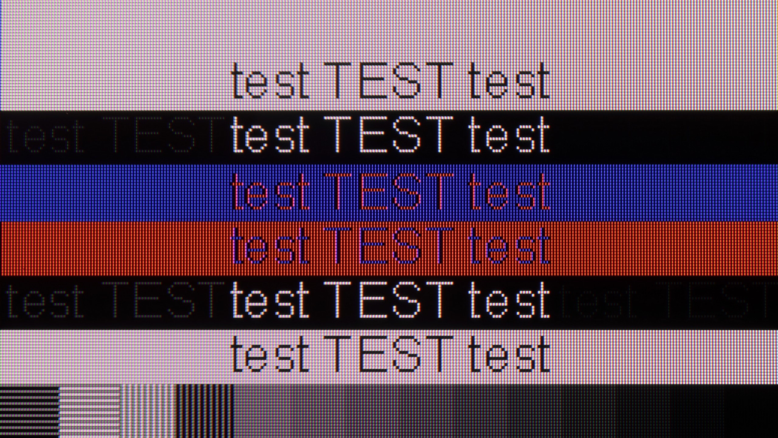
Smoothness of tonal transitions
7/10
7.6/10


These are selected scenes that show smooth tonal transitions from one color to another. If you see distinct banding, it’s the TV panel’s fault.

These are selected scenes that show smooth tonal transitions from one color to another. If you see distinct banding, it’s the TV panel’s fault.

These are selected scenes that show smooth tonal transitions from one color to another. If you see distinct banding, it’s the TV panel’s fault.

These are selected scenes that show smooth tonal transitions from one color to another. If you see distinct banding, it’s the TV panel’s fault.
In many films or series, you may have noticed instances where colour bands appear in areas that should exhibit smooth transitions. This is why we evaluate tonal transitions as part of our testing. The Philips PML9009 performed admirably in this area across all test scenes. While a few elements could benefit from finer processing, the overall result was impressive. Notably, it handled the challenging scene from The Green Knight exceptionally well, with no significant stuttering or unwanted artefacts visible, proving the TV’s capability to maintain smooth gradients even in demanding scenes.
It's time to address an issue that many may overlook, but to the trained (and not only) eye, it can be quite irritating. We're talking about the smoothness of tonal transitions, or how smoothly the screen displays transitions between very similar shades of one color – for example, on a clear blue sky. We must admit that in this category, the Haier K85F, considering its price, performs quite decently. In bright scenes, such as the aforementioned sky or expansive landscapes in the movie "The Martian," there are no harsh, contrasting bands visible. Indeed, if we look closely, we can spot minimal imperfections, but generally, the effect is more than satisfactory. However, the situation changes when darker scenes are on the screen, such as gloomy corridors in games or nighttime landscapes. Here, banding, or the posterization effect, becomes much more noticeable. Transitions in shadows and shades of gray are no longer as smooth and can irritate the more sensitive eye. This is not a level that would completely disqualify the television, but it is evident that this is an area where costs were cut.
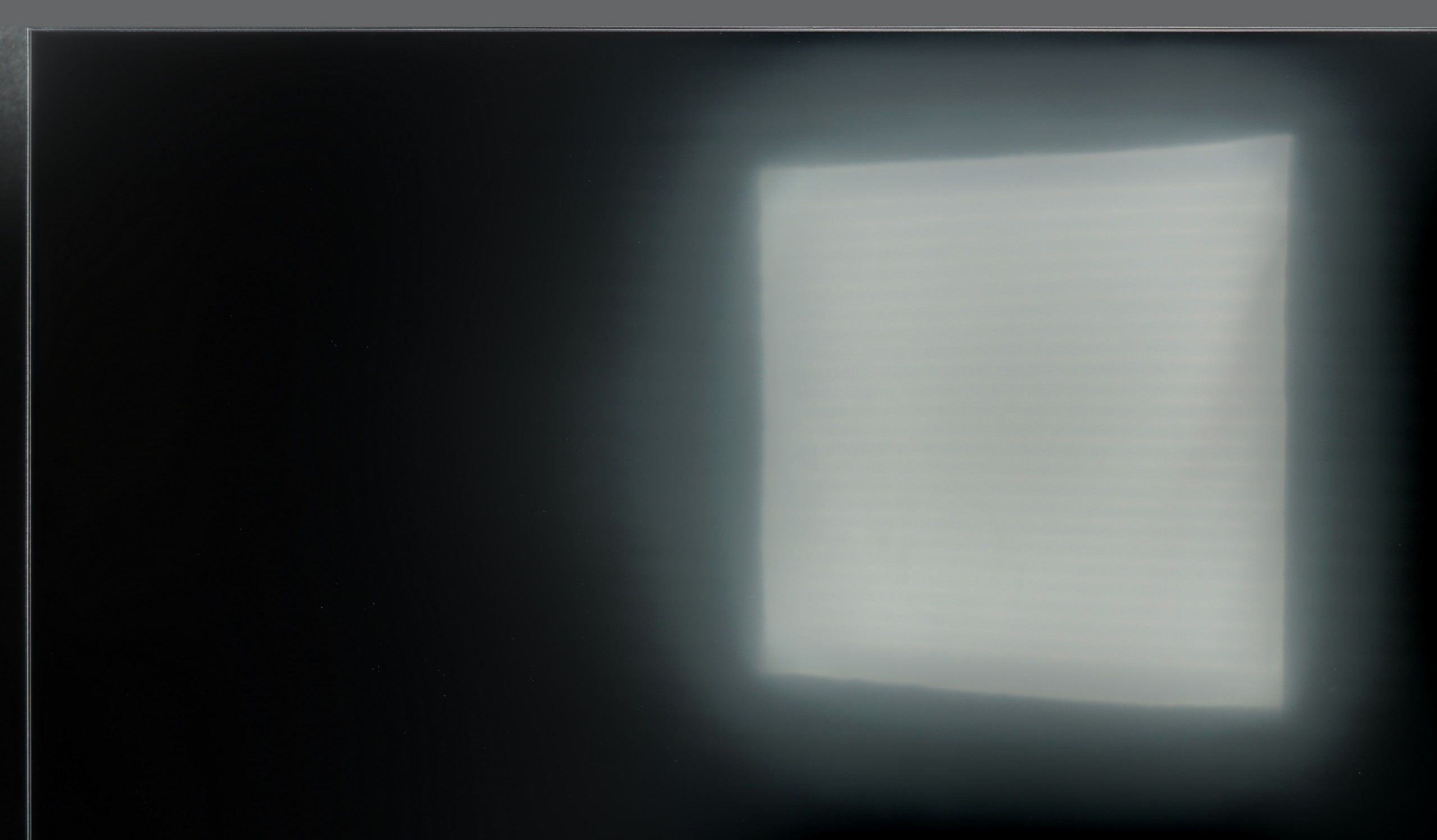
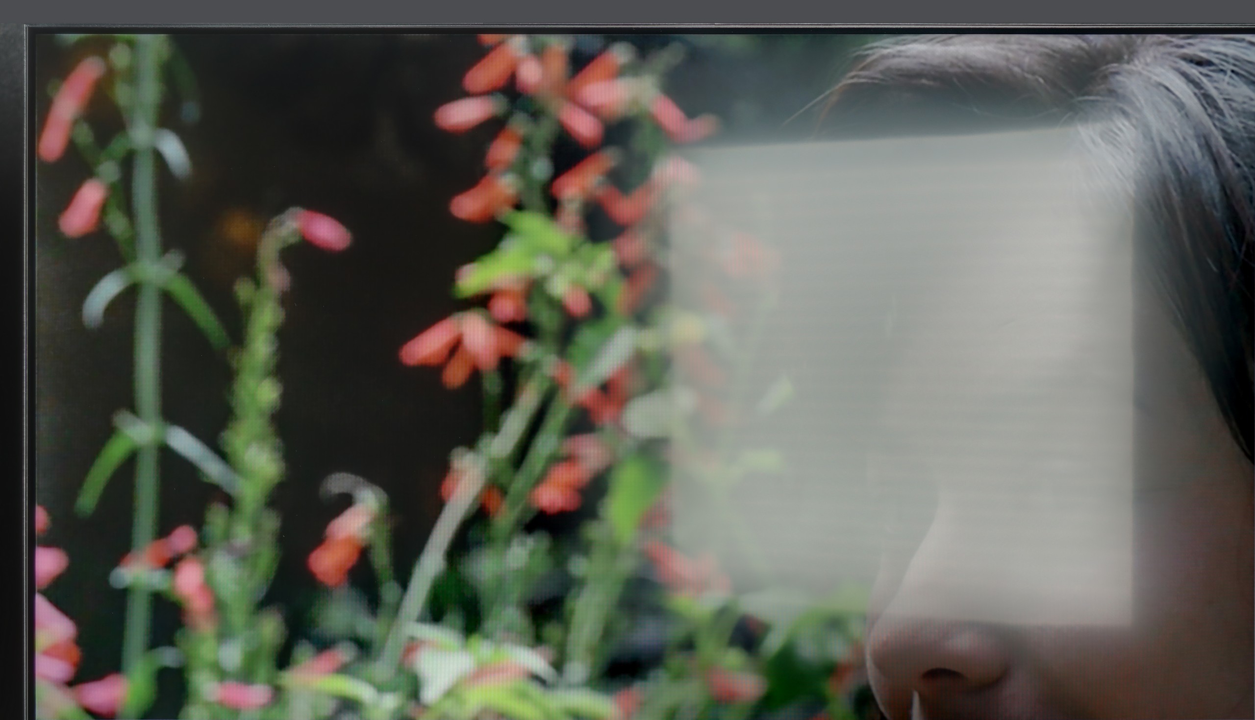
Image scaling and smoothness of tonal transitions
7.2/10
4/10
Smooth transition function


The match photo shows how the TV smooths weak tonal transitions in low-quality video.
Image scaling SD (576i)


The model photo shows how it handles upscaling of SD material.
Given the impressive handling of tonal transitions by the Philips PML9009, one might expect similar success in the image scaling test. However, the results were less than stellar. When upscaling lower-quality images, like those from certain TV programmes or older films, the Philips algorithm tended to blur fine details noticeably, especially in intricate elements like fine branches or a model's hair.
On the other hand, the tonal transition performance remains noteworthy, with the TV offering several levels of smoothing. Even at the lowest setting, it effectively addresses non-smooth transitions in most materials, and crucially, it preserves the film grain effect, maintaining fidelity to the director's vision. However, it’s worth noting that some fine details may still appear slightly softened.
Let's move on to digital processing and image scaling, that is, how the Haier K85F handles lower resolution signals, for example, from standard television. Right from the start, we encounter an extremely annoying and completely incomprehensible issue – the overscan feature is enabled by default. This means that the television artificially enlarges the image, cropping its edges, and this occurs on every source, even 1080p. To see the full frame, you have to dig into the screen settings every time and manually switch the format to "stretch to 16:9." It's a detail, but incredibly frustrating. The scaling of content to 4K resolution can be described in one word: acceptable. And that's basically it. The image processor does not strip the image of details, nor does it generate jagged edges or other artifacts. It simply does its job, without any fireworks. It's fine, but nothing more. The biggest and most noticeable shortcoming in the digital processing section is the absence of a banding smoothing function. This is an algorithm that could significantly reduce the annoying banding effect we mentioned earlier. Unfortunately, the manufacturer did not implement such a solution, condemning us to watch the imperfections of the panel and low-quality materials in all their glory.
Blur and motion smoothness
7.7/10
4.5/10

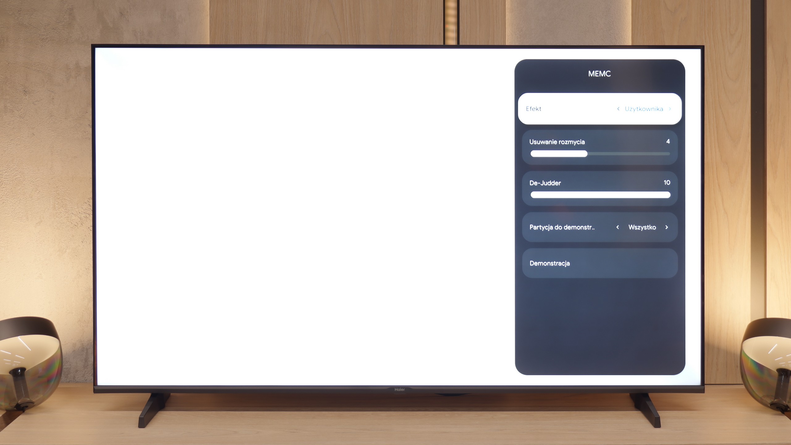
Blur (native resolution, maximum refresh rate):


The Philips PML9009 has a 120 Hz native refresh rate, a baseline standard for watching sports and an ideal setting for gaming on consoles or PCs. Philips includes an effective motion-enhancement system for users who want to reduce the stutter of 24 fps content or need fluid motion for fast-paced scenes, like in football matches. The dedicated "Smoothness" slider effectively mitigates stuttering, while "Motion Blur Reduction" enhances the sharpness of dynamic content. Each setting produces a noticeable difference, so users can tailor the motion effects to their preferences. Our recommended setup achieves a moderate smoothing effect, avoiding the exaggerated “soap opera” appearance.
Regarding pixel response time, VA panels like this generally fall short compared to OLED or even IPS panels, which can lead to a slight "black halo" trailing behind fast-moving objects. Although not a frequent issue with this TV, the effect can be seen in certain scenes.
The panel in the K85F model operates at a native refresh rate of 60 Hz, which already sets certain expectations for smoothness of the image right from the start. However, we must admit that we were very positively surprised when we found not one, but two separate sliders for motion control in the settings menu: one labeled "Blur Reduction" and the other "De-Judder." Such generosity in this price segment is an absolute rarity, as usually manufacturers offer at most one common option. Unfortunately, our enthusiasm quickly dwindled as fast as it appeared. It soon became clear why Haier was so "generous" – the slider responsible for blur reduction is simply a dummy. Moving it does not produce any visible effect on the screen; thus, only one of the two options actually works.
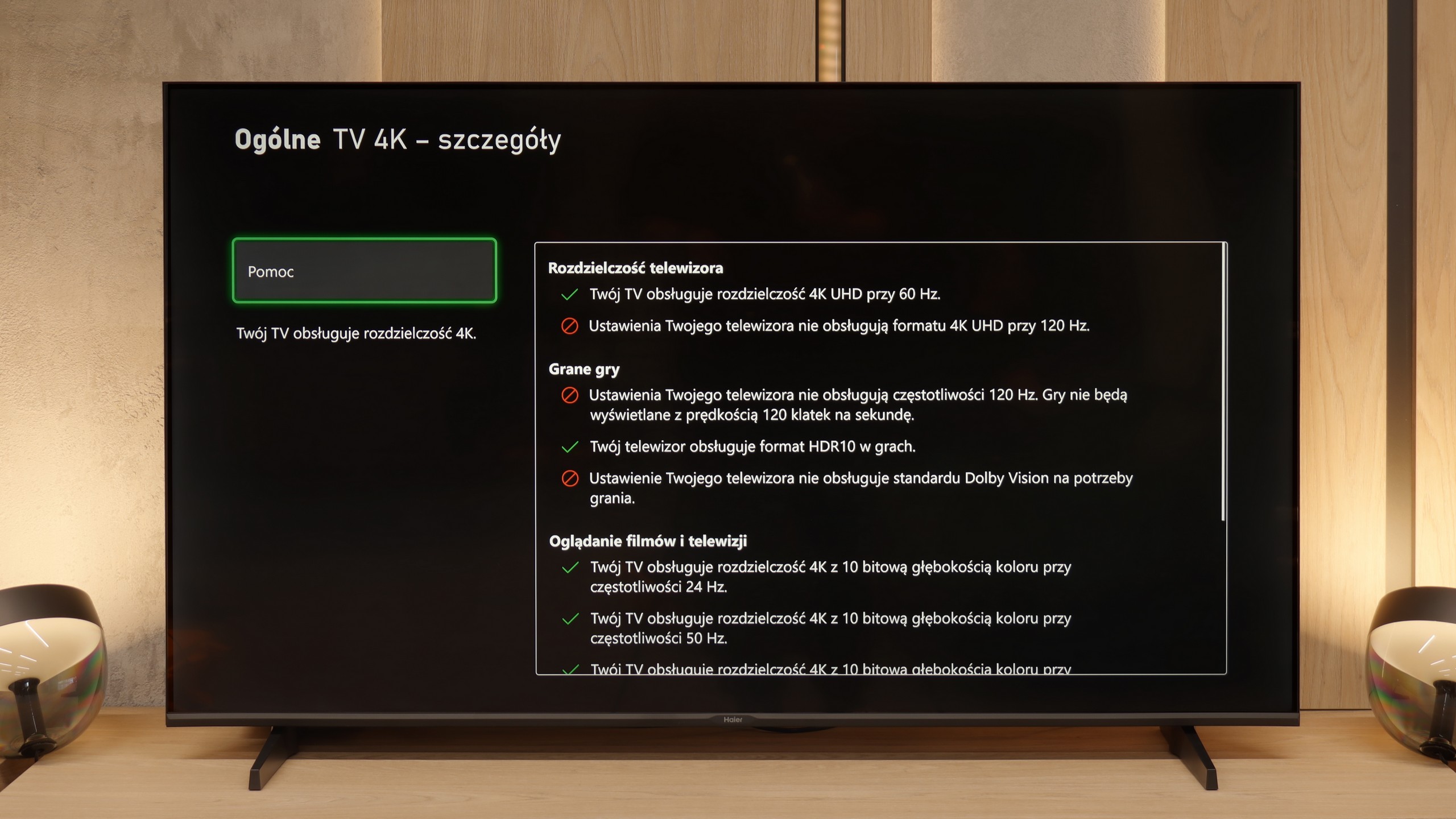
Console compatibility and gaming features
9.8/10
4/10
- ALLM

- VRR
- VRR range48 - 144Hz48 - 60Hz
- Dolby Vision Game Mode

- Correct implementation of HGIG
- 1080p@120Hz
- 1440p@120Hz
- 4K@120Hz
- Game bar

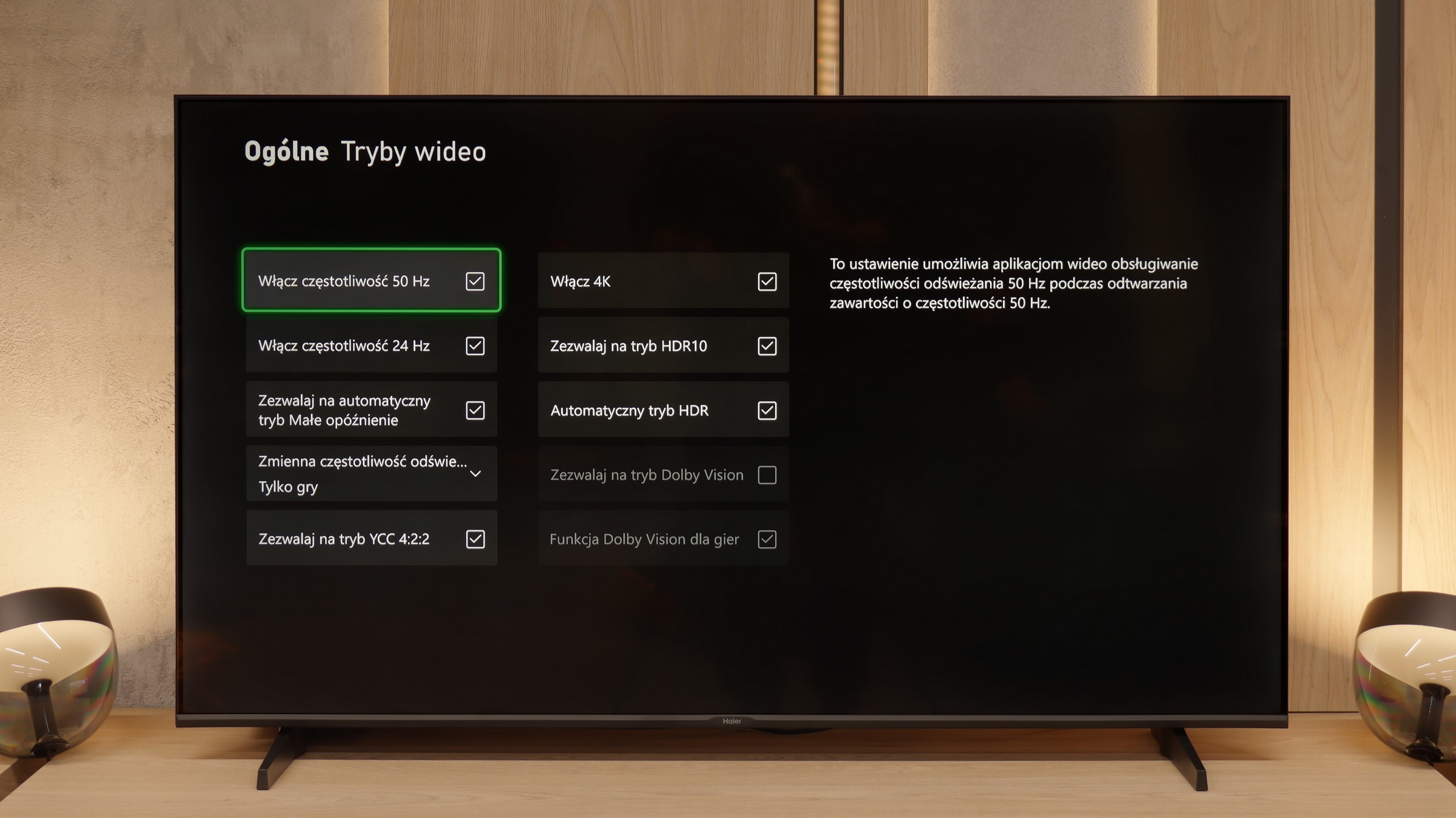


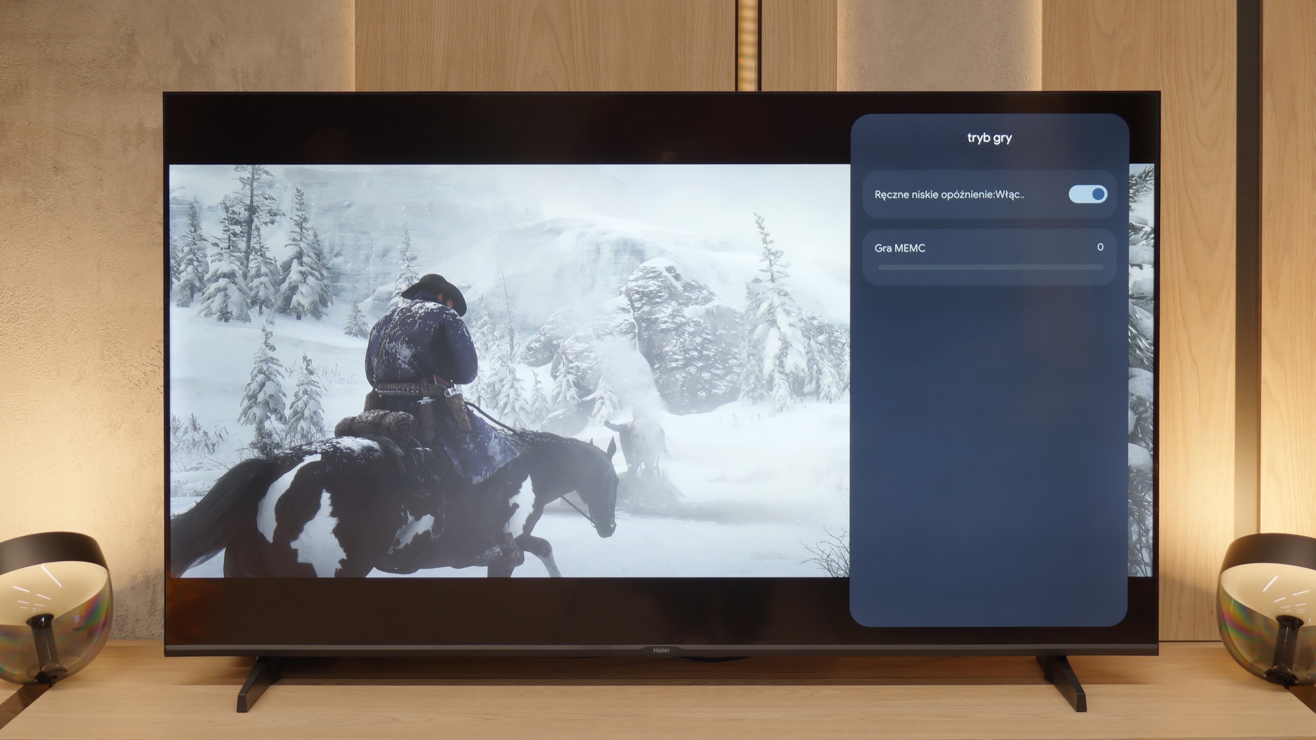

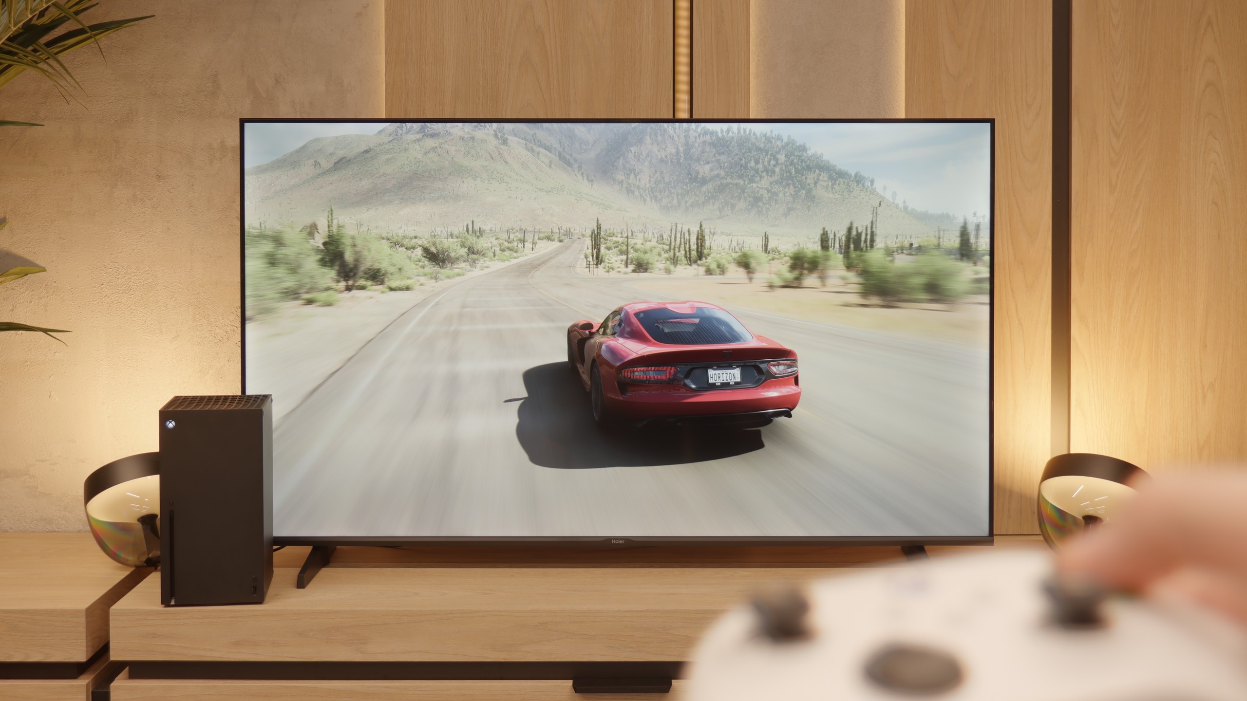
The Philips PML9009, with HDMI 2.1 ports supporting full bandwidth, is thoroughly equipped with gamer-focused features. Core functions like Variable Refresh Rate (VRR) and Auto Low Latency Mode (ALLM) are included, as well as the additional perks of G-Sync and FreeSync compatibility and low-lag HDR Dolby Vision support. All these gaming features activate seamlessly, proving this model’s suitability for gaming. The TV’s HGIG mode, particularly beneficial for gaming, adjusts HDR effects to the television’s capabilities to avoid image dimming and blooming, an advantage given the still limited number of games supporting Dolby Vision.
For added convenience, the PML9009 has a GameBar menu, allowing in-game setting adjustments without needing to exit. This menu includes features like a crosshair option and black level correction, which can enhance the visibility of shadowed areas—ideal for competitive play.
Overall, the Philips PML9009 offers a comprehensive setup for gamers, supporting VRR, ALLM, G-Sync, FreeSync, and HDR Dolby Vision to deliver immersive, high-quality gaming experiences across a wide range of titles.
Let's move on to the features for gamers, although we must point out right away that this is more of a proposal for "casual" players. The manufacturer boasts in the specifications about the presence of HDMI 2.1 ports, which looks impressive on paper, but in reality, it is largely a marketing gimmick. What good is a modern port when the heart of the television is a panel with a refresh rate of 60 Hz? It physically cannot display a signal at 120 frames per second, even at lower resolutions, which takes away HDMI 2.1's most important advantage. That's a shame. (That’s why we mark it as HDMI 2.0 ports in our tests). Another oddity is the television's response to attempts to calibrate HDR from the console. Changes in brightness settings cause very unnatural behavior of the image, which might suggest an incorrect implementation of the HGiG standard. To be honest, however, you shouldn't worry too much about this, because as we have mentioned multiple times, we simply do not recommend using any HDR content on this screen. However, to make it not so bitter, the Haier K85F also has two significant and unexpected advantages. The first is the presence of ALLM, or Auto Low Latency Mode, which switches the television to low latency mode as soon as it detects a connected console. The second, even bigger surprise is support for VRR, or Variable Refresh Rate. Although it works in a very modest range of 48-60 Hz, its very presence is commendable. Thanks to this, the image in games can stutter less, which truly improves the gaming experience.
Input lag
9.6/10
10/10
SDR
HDR
Dolby Vision
The Philips PML9009 excels in input lag measurements, showcasing impressive performance across various signals and resolutions. Gamers will appreciate the manufacturer’s optimisation, with an exceptionally low input lag of 8 ms when playing at 4K120Hz with HDR—virtually imperceptible even in fast-paced online games. Furthermore, the game mode with Dolby Vision also maintains a commendable response time of 16 ms, ensuring that players experience minimal delay during gameplay. This combination of low input lag and effective game mode implementation solidifies the PML9009 as an excellent choice for competitive gamers seeking a responsive, immersive experience.
However, we have to give credit to Haier – there is one parameter where this television absolutely shines and embarrasses many more expensive models. We are talking about input lag, or signal delay. Our measurements showed a remarkably low result of only 13 ms. This is a huge advantage that makes controlling games instantaneous and extremely responsive. In this regard, the K85F performs excellently.
Compatibility with PC
8.6/10
6/10

The photo shows the legibility of small fonts. Ideally, lines should be the same thickness on both light and dark text, with minimal pixel gaps.
The Philips PML9009 also excels in everyday tasks, with measured delays of just 8 ms providing nearly instantaneous reactions in the mouse-screen-eye connection. Its proper implementation of chroma 4:4:4 ensures crisp, sharp fonts, making it ideal for text work. While the subpixel layout of the matrix is BGR, this doesn't create any issues when using the Windows operating system. However, users on other systems may encounter challenges with text rendering, as those platforms may struggle to convert text accurately. Overall, the PML9009 is a versatile display suitable for gaming and daily productivity tasks.
And what if we try to use this Haier as a computer monitor? Here, what was a big surprise for us, the TV performs exceptionally well. For office work – it’s perfect. All thanks to the fact that it properly supports the so-called chroma sampling 4:4:4. To put it simply: every single letter on the screen is sharp, without annoying colored halos or blurriness. Sure, let’s be straightforward – this is not equipment for PC gamers. 60 Hz is too low for them. But if you just need a big screen for text work, browsing the internet, coding, or displaying presentations, then the K85F will perform excellently in this role. It’s one of its strongest and, to be honest, most unexpected applications.
Viewing angles
2.6/10
2.8/10
A commonly known drawback of VA panels that do not have an angle coating is their poor viewing angles. This is no different this time. Even after a slight shift off-axis, the image becomes washed out, and the colours undergo significant degradation.
At almost the very end of the evaluation of the panel itself, we left the viewing angles, which unfortunately are one of its biggest weaknesses. However, we must honestly admit that this is no surprise – it is simply a natural and widely known characteristic of VA-type panels. In the unit we tested, interestingly, the brightness of the image did not drop drastically when we moved away from the center of the screen. The real problem, however, is the colors, which instantly begin to fade. A slight change in position on the sofa is enough for the hues to lose their saturation and become washed out. In this regard, the Haier K85F presents a very average level, typical for this technology.
Daytime performance
6.1/10
4.1/10


Panel brightness
Haier K85F: 276 cd/m2
Philips PML9009 / 9019 / 9059: 564 cd/m2
While the Philips PML9009 offers good brightness levels for SDR materials—making it suitable for evening or dark-room viewing—the reflection suppression is only average. This can be attributed to the satin finish of the panel, which is prone to reflections from various light sources, as it neither absorbs nor diffuses them effectively. However, the relatively high brightness in SDR mode enables the television to perform adequately in brighter rooms, often outperforming many OLED models in this regard. This makes it a viable option for users who might watch content in well-lit environments.
And how does the television perform in confrontation with daylight, for example in a heavily sunlit living room? Unfortunately, we don't have good news here. As we've established, this is a television with relatively low brightness, which becomes a serious drawback in the face of sunlight. The situation is further worsened by the applied screen coating. Instead of effectively suppressing reflections, its satin structure tends to unfavorably scatter them. In practice, this means that the reflection of a window or lamp turns into a large, blurred, milky halo, which degrades contrast and effectively hinders viewing. The conclusion is therefore clear: if the television is to be placed in a bright room, the K85F model will not be a good choice.
Panel details
Subpixel Structure:

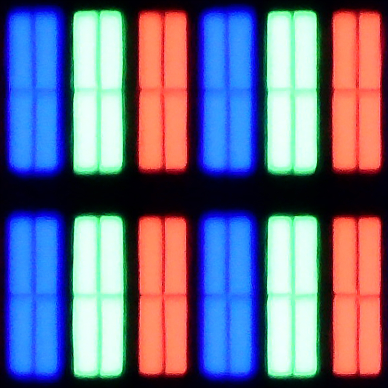
Panel uniformity and thermal imaging:

Philips PML9009 / 9019 / 9059
Haier K85F
TV features
6.1/10
5.5/10
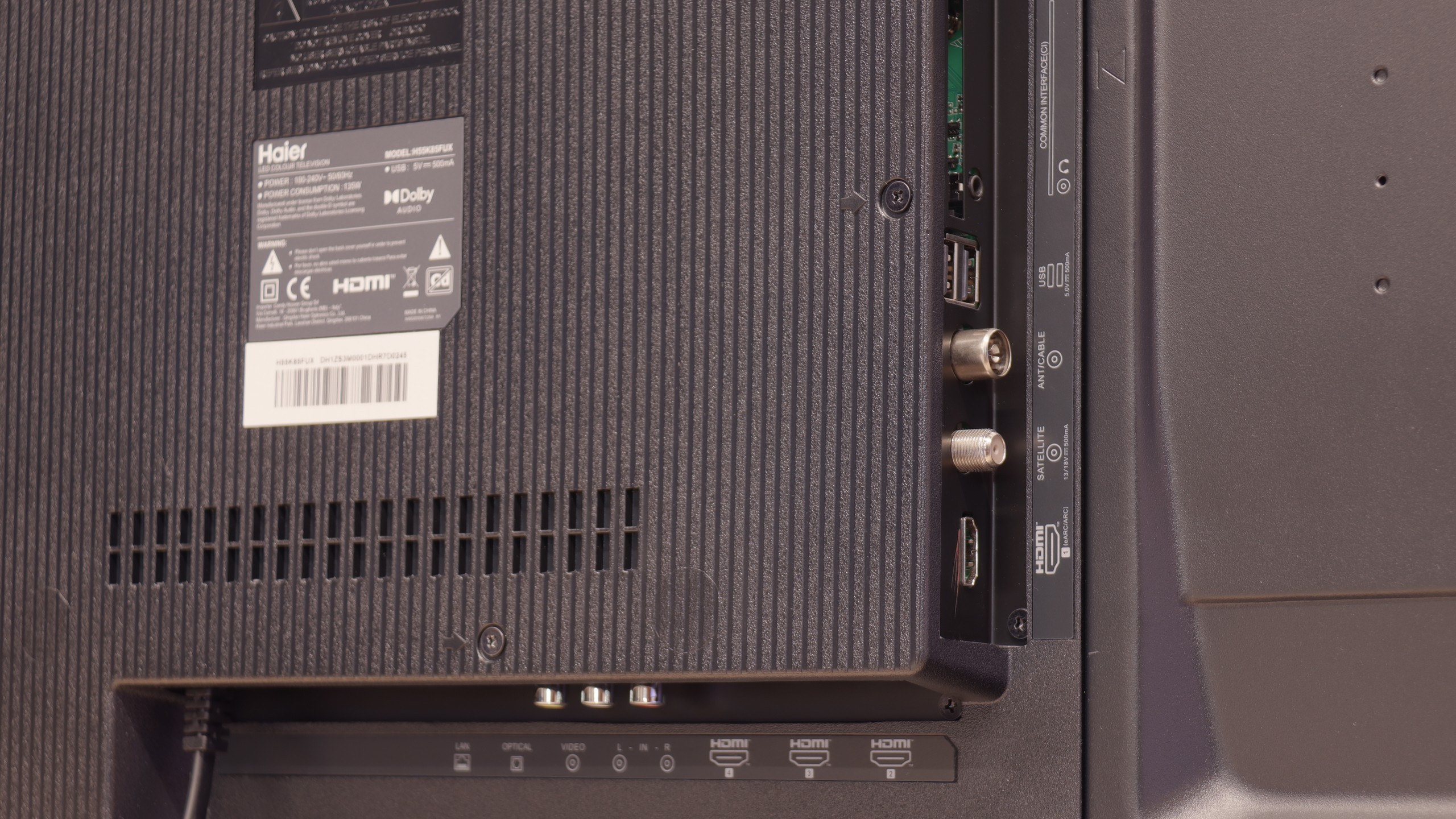
- HDMI inputs0 x HDMI 2.0, 4 x HDMI 2.1 48Gbps4 x HDMI 2.0, 0 x HDMI 2.1
- Other inputsRCA (Chinch)
- OutputsToslink (Optical audio), eARC (HDMI), ARC (HDMI), Mini-Jack (Headphones)Toslink (Optical audio), eARC (HDMI), ARC (HDMI), Mini-Jack (Headphones)
- Network InterfacesWi-Fi 2.4GHz, Wi-Fi 5GHz, Ethernet (LAN) 100MbpsWi-Fi 2.4GHz, Wi-Fi 5GHz, Ethernet (LAN) 100Mbps
- TV receptionDVB-T, DVB-T2, DVB-S, DVB-S2, DVB-CDVB-T, DVB-T2, DVB-S, DVB-S2, DVB-C
Classic features:
- Recording to USB (terrestrial TV)
- Recording programming
- Picture in Picture (PiP)
- RF remote control (no need to aim)
- Backlit remote control
- Teletext
- Audio only mode
- Bluetooth headphones support
- Simultaneous Bluetooth headphones & TV audio
Smart features:
- AirPlay
- Screen mirroring (Windows Miracast)
- Voice search
- Voice search in native language
- Ability to connect a keyboard and mouse


Before delving into the software that powers the Philips PML9009, it’s essential to highlight one of the standout features of the manufacturer’s TVs: the multicoloured Ambilight backlighting. This unique feature enhances the viewing experience by projecting colours from the back of the TV that correspond to the on-screen action, creating a more immersive atmosphere.
The operating system used in the PML9009 is Philips' proprietary TitanOs. While it offers some benefits, it is notably more closed and limited when compared to other models that use the Google TV system. One significant drawback is the absence of essential applications such as Apple TV, MAX, Canal+, and Player. Additionally, TitanOs restricts users from performing basic tasks like scheduling recordings or recording to USB. Apple device users may also be disappointed by the lack of AirPlay functionality, which allows for easy screen sharing.
On a positive note, the TV supports connecting a keyboard and mouse, which can simplify navigation through the menu. However, it's worth noting that while the remote pairs via Bluetooth for voice selection in English, all other functions rely on infrared (IR) connectivity.
In summary, TitanOs has its limitations, especially for users who frequently utilize a variety of streaming platforms. It seems better suited for those who primarily engage with a few key services—what one might refer to as the "holy trinity" of streaming: Netflix, YouTube, and CDA.
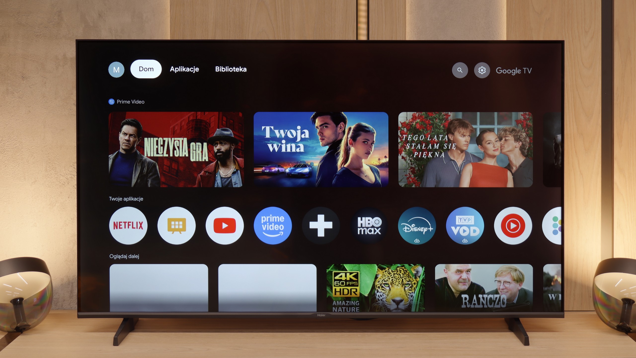
GoogleTV on Haier K85F
The heart of the television is the Google TV system, which in theory should be its huge advantage. Access to thousands of applications and a wealth of features are promises we are familiar with. Unfortunately, in Haier's execution, this is one of the worst implementations of this software we have encountered. The system operates painfully slowly, and the interface notoriously freezes. However, the real nightmare is the incorrect and often downright comical translations of some menu options, making it at times difficult to figure out what is being referred to. To make matters worse, during our tests, we were unable to launch the AirPlay function, which simply did not work.
Classic features on Haier K85F
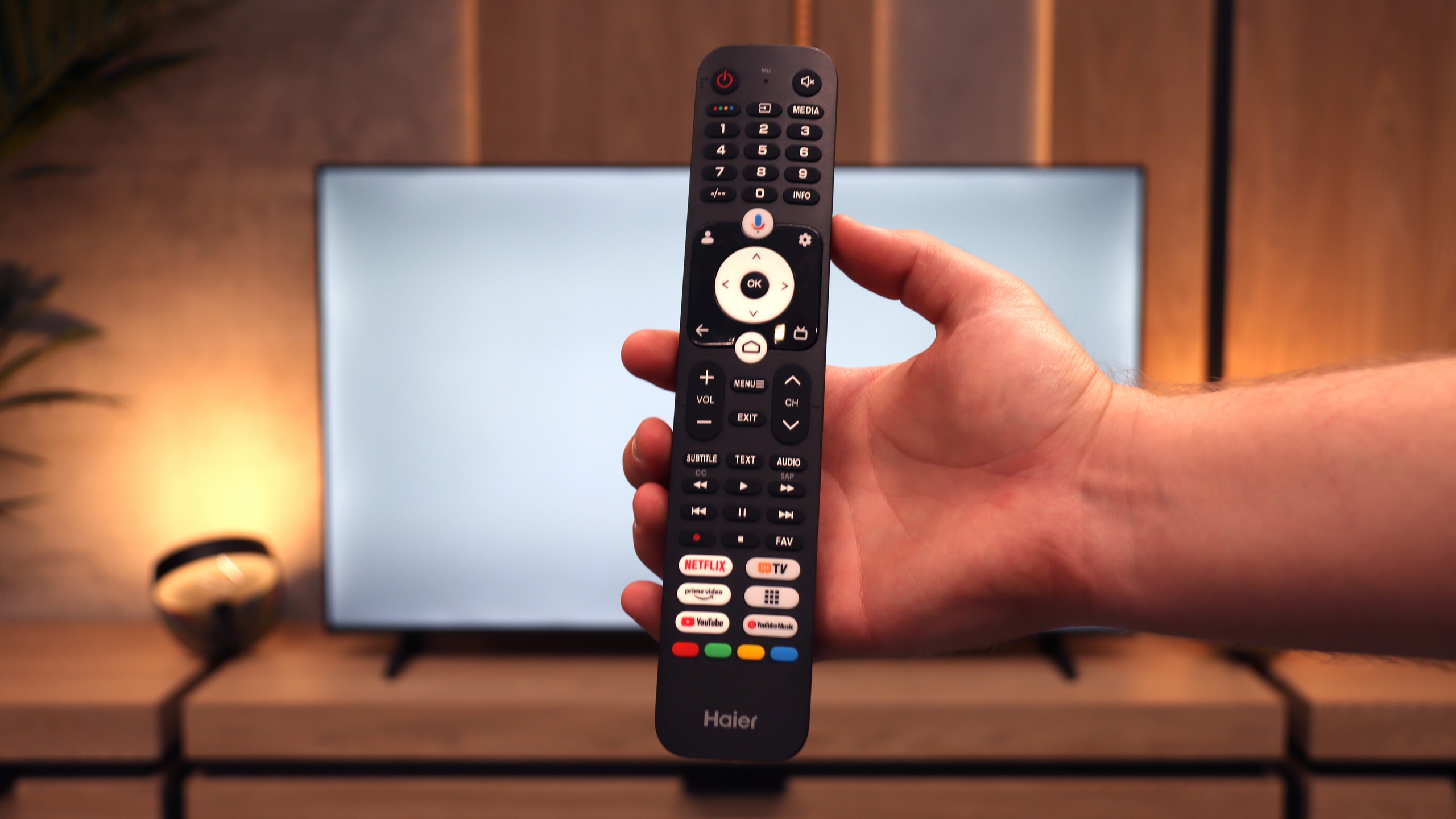
Let's move on to the classic features and ports, because this story is even more interesting. A plus is certainly the rich set of ports, including four HDMI inputs and a rarely found mini-jack headphone output. Unfortunately, the television does not offer either USB recording or PiP mode. However, the real ordeal begins with the remote. Our first attempts to pair it via Bluetooth to activate radio frequency (RF) control and voice functions ended in total failure. After several dozen attempts, we were sure it was simply a manufacturing defect. And here's the surprise: after a long struggle, we discovered that the remote can be paired, but it needs to be done from the native Google TV settings, completely bypassing Haier's non-functioning system overlay. This is a perfect example of how terrible software can ruin basic functionality. Oh, and one more thing. In the box... there weren’t even any batteries for the remote.
Apps
6.7/10
9.6/10
Playing files from USB
8.2/10
9.4/10
Supported photo formats:
Maximum photo resolution:

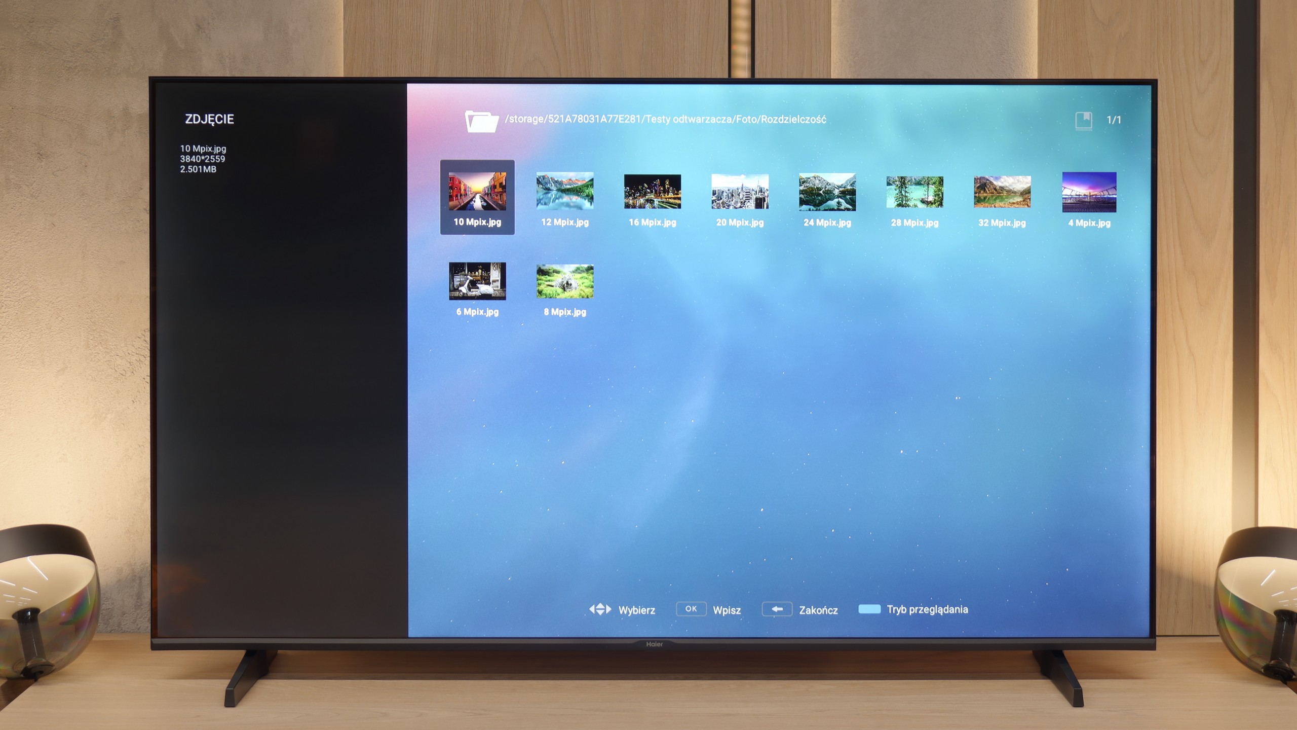
The default media player integrated into the Philips PML9009 provides a fairly comprehensive set of features but does have certain limitations. It supports nearly all common video formats except for the relatively rare .asf format. However, users may encounter issues due to the absence of the H.265 HEVC codec for high-bitrate content and a lack of support for .sub subtitle files, which are popular among many users.
With photo playback, the media player performs adequately, though it does not support some widely used resolutions and formats, such as HEIC, commonly found on Apple devices. The player excels in audio playback and leaves little room for criticism.
Unfortunately, the system's limitations prevent users from extending the player’s functionalities, meaning users are confined to the capabilities the manufacturer has included. This can be a drawback for those who rely on specific formats or additional features not provided by the built-in player.
After all our complaints about the unfinished software, the moment came when we experienced absolute shock. It turns out that within this error-prone and slow system, there is a function that works almost perfectly and puts industry veterans to shame. We are talking about the built-in media player for USB drives. It is a true multimedia powerhouse that played virtually every video format we threw at it without the slightest hesitation – from the most popular to the completely niche. Haier, a newcomer to the TV market, has achieved something that many manufacturers with decades of experience have struggled with for years. Who knows, perhaps it was intended to be a reliable player for conference rooms? Regardless of its origin, the result is outstanding!
Sound
6.7/10
4.8/10
- Maximum volume-83dB
- Dolby Digital Plus 7.1
- Dolby True HD 7.1
- Dolby Atmos in Dolby Digital Plus (JOC)
- Dolby Atmos in Dolby True HD
- DTS:X in DTS-HD MA
- DTS-HD Master Audio
At the outset, it is worth noting that sound quality is a subjective matter. The built-in audio system in the Philips PML9009 is characterised by clear high tones, but the bass is quite flat and significantly worse than in competing models in the same price range.
Unfortunately, the review regarding the sound will be very short. The biggest advantage of the built-in speakers of the K85F is actually that they are simply there and produce sound. Aside from that, the sound is completely flat, lacking any bass tones and just anemic. Yes, the TV box features a Dolby Atmos logo, but in light of the physical capabilities of these drivers, it is a function that exists only on paper. Therefore, the verdict can only be one: when planning to purchase this TV, one should immediately add a soundbar to the budget.
Sound Quality Test
No sound test video
Acoustic Measurements
No acoustic data
83dBC (Max)
75dBC