Blaupunkt UGC5500S is a textbook example of a very inexpensive television that primarily has two huge advantages: the Google TV system and an extremely low price. It is these two elements that make it an enticing option for many people. During testing, we also found other fantastic uses for it, such as working with a computer. Thanks to the exemplary readability of fonts and good viewing angles of the IPS panel, Blaupunkt surprisingly performs well as a budget monitor. However, one must be aware that this is a typical budget device, and this cost-saving is evident in the image quality. The panel is simply dark, making it difficult to perform in challenging lighting conditions, not to mention creating any real HDR effect. Additionally, despite good viewing angles, the blacks on this model leave much to be desired – in the evening, they will be more dark gray, which is a typical characteristic of the IPS technology used here. Looking through the lens of price, this is a device intended to compete in the market not on image quality but rather on the amount on the receipt. Blaupunkt UGC5500S will find its place perfectly as an additional television in the home, equipment for the cottage, or in a less important room where the image is simply needed, and we want to enjoy all the benefits and applications that Google TV offers.
- Matching (Score) |
- Our verdict |
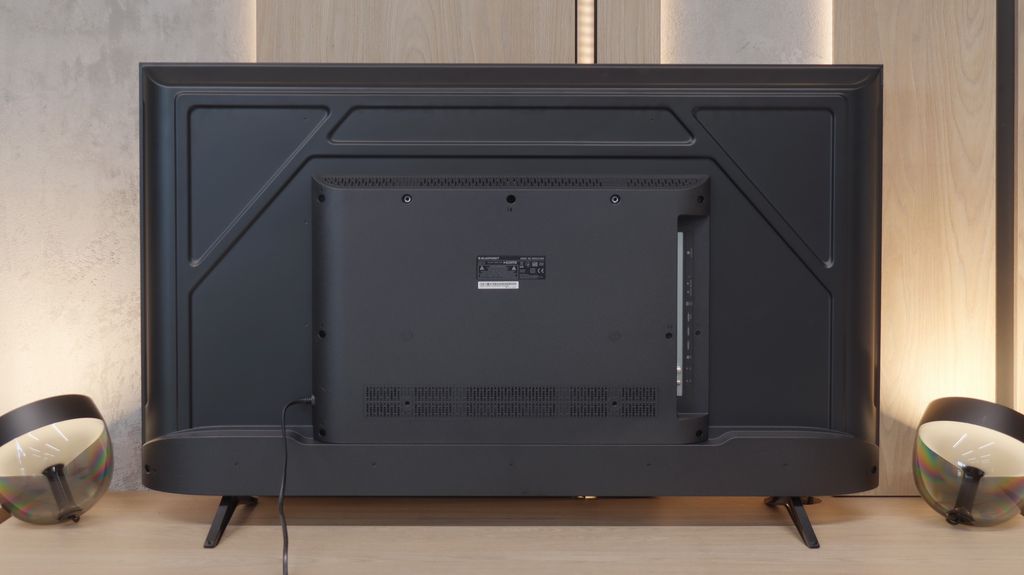
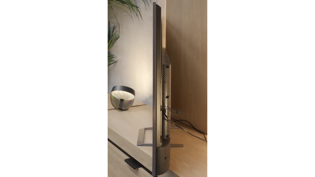
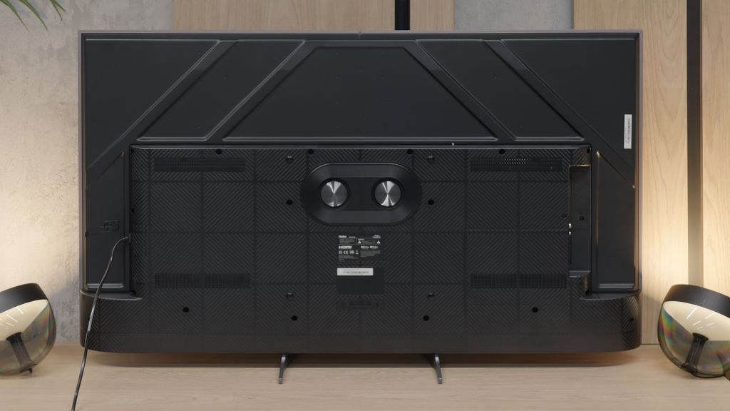
- TV appearance |
- Where to buy |
- Contrast and black detail |
- HDR effect quality |
- Factory color reproduction |
- Color reproduction after calibration |
- Smoothness of tonal transitions |
- Image scaling and smoothness of tonal transitions |
- Blur and motion smoothness |
- Console compatibility and gaming features |
- Input lag |
- Compatibility with PC |
- Viewing angles |
- Daytime performance |
- Panel details |
- TV features |
- Apps |
- Playing files from USB |
- Sound
Blaupunkt UGC5500S vs Haier M90E
![]() Direct comparison
Direct comparison
M90E
Panel type: LCD IPS
Resolution: 3840x2160
System: Google TV
Model year: 2025
Complete the survey to find out the result
Panel type: LCD VA
Resolution: 3840x2160
System: Google TV
Model year: 2025
Complete the survey to find out the result
Overall rating
5.0
7.1
 Movies and series in UHD quality
 4.2
6.7
 Classic TV, YouTube
 4.1
6.1
 Sports broadcasts (TV and apps)
 4.1
5.9
 Gaming on console
 5.4
7.8
 TV as a computer monitor
 6.0
6.7
 Watching in bright light
 4.0
7.8
 Utility functions
 5.1
5.0
 Apps
Apps 9.6
9.6
 Sound quality
 6.0
8.6
Complete the survey to find out what fits your preferences
Advantages
Google TV system: a gigantic library of apps
Relatively low input lag
Good viewing angles: thanks to the IPS panel
PC compatibility: exemplary font readability (Chroma 4:4:4)
Refresh rate: 120 Hz at Full HD resolution
Presence of a classic mini-jack output
Quite pleasant sound: clear and loud above the "budget" standard
High peak brightness in HDR (over 1000 nits)
Very high native contrast and deep black (VA panel)
Support for 144 Hz refresh rate and HDMI 2.1 ports
Very low input lag in mode (<10 ms)
Versatile USB media player
Good sound quality with noticeable bass
Support for dynamic HDR formats (Dolby Vision, HDR10+)
Disadvantages
Very weak black levels and contrast
HDR: low brightness (250 nits) and lack of real effect
System fluidity: sluggish performance and "numb" remote
Motion: complete lack of digital smoothers in the menu
Image processing: noticeable overscan and motion artifacts
Aggressive and unstable local dimming algorithm
Poor stability and errors in the operation of the Google TV system
Narrow viewing angles
Lack of font sharpness at 144 Hz refresh rate
Poor tone mapping in the standard HDR10 format
Our verdict
Haier M90E is an ambitious attempt by the manufacturer to enter the higher segment of the market. "On paper," the specifications look impressive: Mini LED backlighting, a VA panel, and a refresh rate of 144 Hz suggest a complete piece of equipment. However, reality verifies these assumptions. We get a device with two faces: a powerful hardware base that struggles under the weight of unrefined software. On one hand, we have excellent brightness, high contrast, and deep blacks, which combined with low input lag and HDMI 2.1 ports should make this television a hit. On the other hand, daily use is marred by annoying bugs: a poor dimming algorithm and an unstable Google TV system. It is clear that the manufacturer lacks experience in optimizing such a complex device. Who is this model for? Mainly for conscious users who can overlook system errors in exchange for high brightness. However, for the average consumer, the Haier M90E currently poses too great a risk. In this price range, the competition is enormous. We can easily find proven models from other brands that offer similar picture parameters but provide a significantly more stable and predictable operation. Rather than experiment, it would be safer to reach for solutions that do not suffer from "growing pains."
TV appearance


Contrast and black detail
2.2/10
6.9/10
Local dimming function: No
Local dimming function: Yes, number of zones: 240 (15 x 16)
Contrast:
Result
1,000:1
Result
1,100:1
Result
1,150:1

Result
1,100:1
Result
1,050:1
Result
139,700:1
Result
25,250:1
Result
23,150:1
Result
9,500:1
Result
5,550:1
Halo effect and black detail visibility:

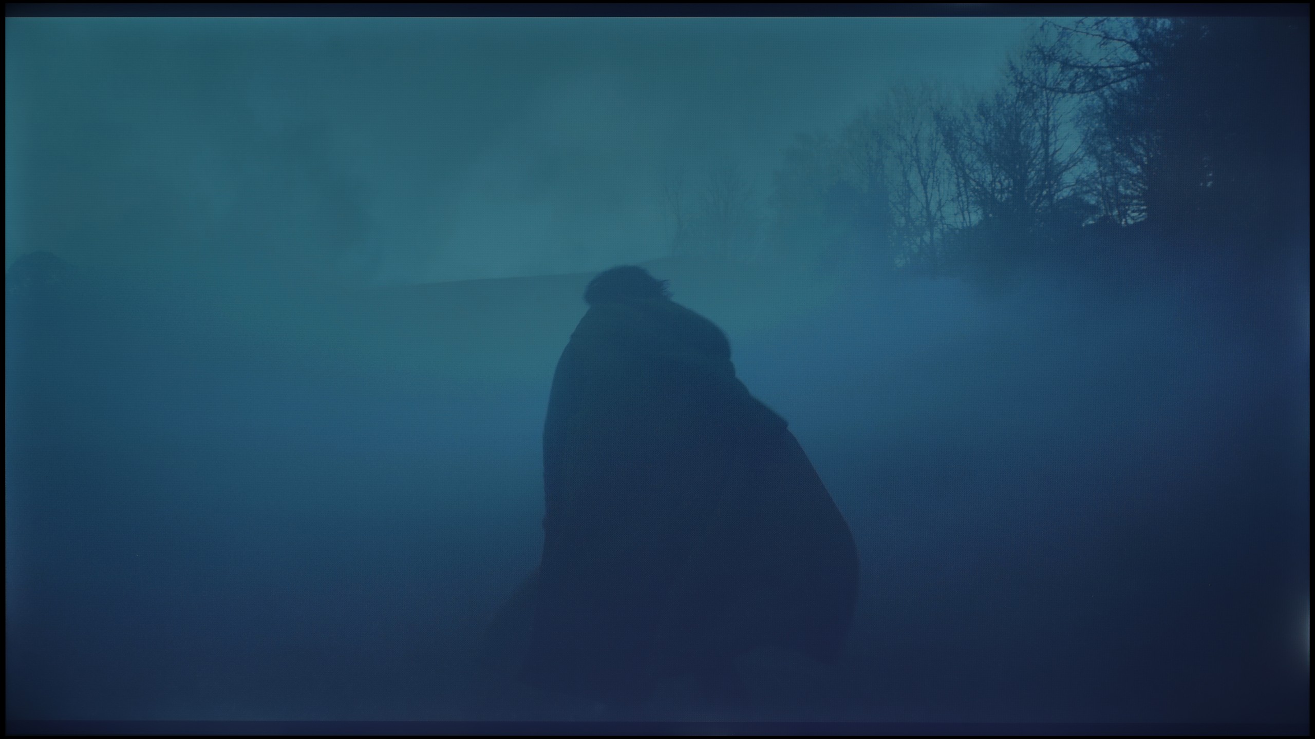
Check the visibility of bright lights on a dark background. Mini-LEDs often struggle with this. The photo does not compare black levels – that’s what the video below is for.
The video accurately shows differences in contrast and black levels between TVs, as well as potential issues: halo around bright objects or Mini-LED zone operation visible as brightness jumps.
To put it bluntly: the black levels are simply very poor. Our measurements on test screens only confirmed what we could see with the naked eye – a result around 1000:1 is, in today's standards, even in this price range, a disappointing result. In cinematic conditions, this "black" simply does not exist. To back up our claims, we fired up one of our favorite test scenes – the helicopter flyover in "Sicario 2" (you can actually see it in the video we posted below). Instead of a pitch-black, deep night, we got an image that is... navy blue. Everything that should be dark and mysterious on screen, in reality, shines dark blue. This is the price we pay for using an IPS panel. On one hand, we get quite decent viewing angles, so if you're watching TV with the whole family from different angles, the image doesn't lose much saturation. On the other hand, if you plan to have evening screenings with the lights off, this lack of contrast will hit you in the eyes from the very first minute.
Haier M90E is a fully-fledged Mini LED television utilizing a VA panel. Such a technological combination usually guarantees deep blacks and high contrast. In the tested model with a 55-inch diagonal, the backlighting system is based on 240 independent dimming zones, and their number increases proportionally in the larger variants of this model. Laboratory measurements confirm the high hardware potential – in synthetic tests with active dimming, the contrast exceeded 100,000:1.
However, the dry measurement data does not translate into an ideal picture in real-world applications, which forced us to lower the score in this section. The bottleneck turned out to be the software controlling the zones. The algorithm operates too aggressively and replicates errors we observed earlier in the more expensive M95E model. The problem becomes apparent when bright objects move against a dark background on the screen. The system struggles to smoothly adjust the brightness of individual zones, resulting in unnatural flickering of specific parts of the image. Instead of smooth motion, we see an effect reminiscent of a flickering damaged streetlight, which our test night scene from the film Sicario 2 ruthlessly exposed.
HDR effect quality
3.8/10
6.1/10
Luminance measurements in HDR:

Result
232 nit

Result
245 nit
Result
255 nit

Result
238 nit

Result
252 nit
Result
1004 nit
Result
517 nit
Result
615 nit
Result
399 nit
Result
774 nit
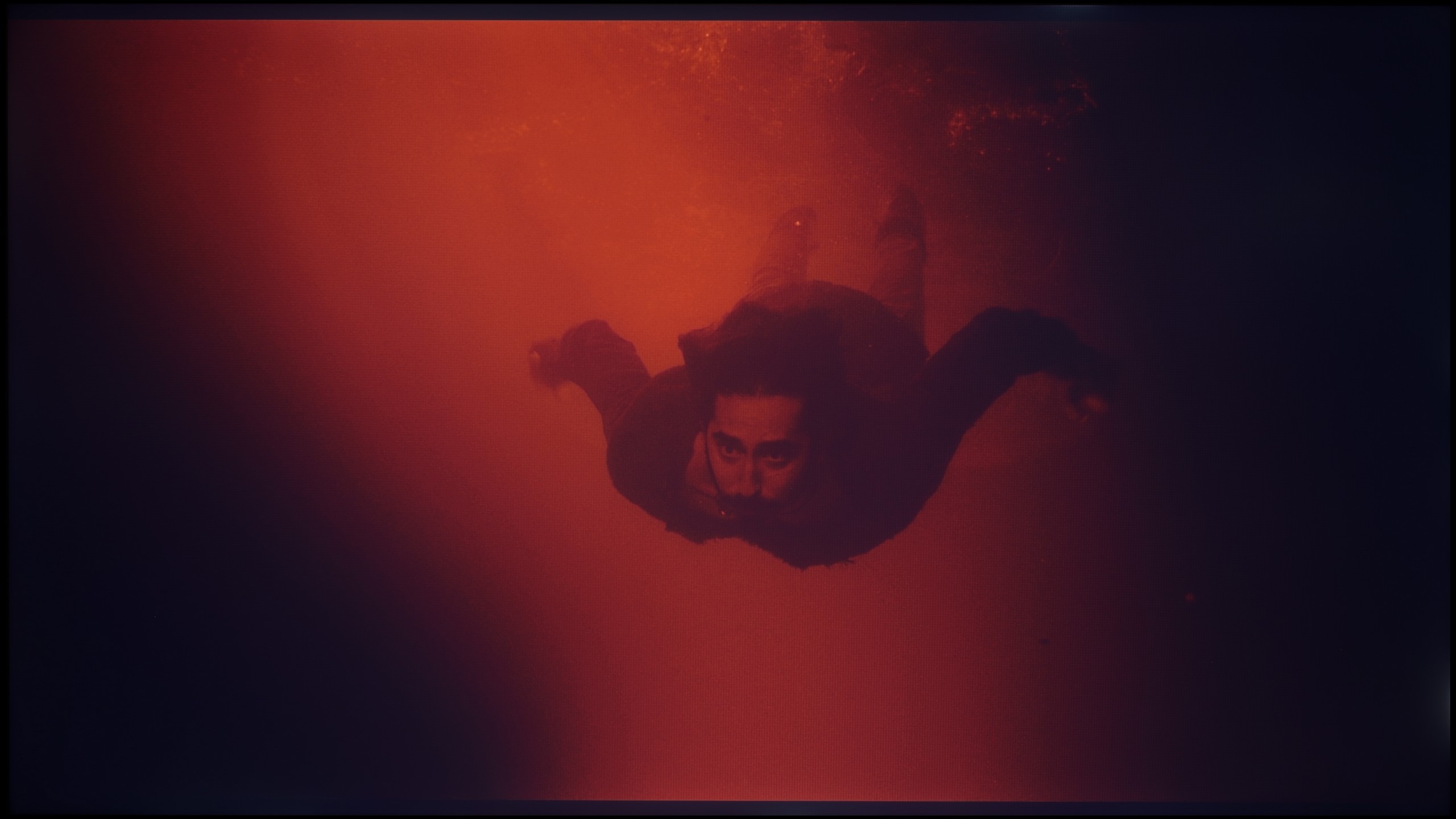
Scene from the movie “Pan” (about 2800 nits)


Scene from the movie “Billy Lynn” (about 1100 nits)


The photos show two HDR10 movies. 'Pan' is one of the brightest productions ever made, while 'Billy Lynn' (soldier) has brightness typical of streaming (Netflix, Prime, HBO MAX). Notice the intensity of effects and detail in whites.
Static HDR10

The photos present the visibility of white details in various HDR formats. They do not show brightness differences between TVs (these can be compared in the previous gallery).
HDR luminance chart:
Haier M90E
Blaupunkt UGC5500S
Here, we won't beat around the bush either – if you're looking for a TV strictly for cinematic HDR experiences, you've come to the wrong address. The Blaupunkt UGC5500S unfortunately is not a machine designed for such challenges. This is primarily due to its very low brightness, which we measured during our tests. A result of around 250 nits on film screens speaks for itself. It's simply too little to even talk about any real HDR effect. To be honest, everything displayed here in this format can best be considered a slightly "boosted" SDR mode. We expected this because practically every device in this price range fails in this regard, but we feel obligated to warn you. Manufacturers love to boast about HDR compatibility stickers on the boxes, but in reality, this format simply doesn't exist here – it lacks the "fuel" of brightness.
The situation is made all the more difficult for Blaupunkt because we have a panel with a very basic DCI-P3 color gamut coverage of just around 80%. You won't find any advanced coatings that enhance these capabilities (like quantum dots), making scenes that are supposed to burst with richly saturated colors appear simply desaturated on this screen. Therefore, we have a concrete piece of advice for you: do not push the HDR mode on this model. If you have the option in the streaming app settings – just turn it off. Sticking with the classic SDR mode will ensure that the TV won't try to "enhance" something that it can't handle hardware-wise.
Haier M90E is a television that does not lack brightness. In most movie scenes, peak luminance exceeds 1000 nits, which gives the image a clear "kick" and high dynamics. In typical, bright HDR materials, this looks really good. However, one must take into account the previously mentioned dimming algorithm. In scenes that are not evenly flooded with light – for instance, when displaying individual stars in a black sky – high brightness underscores the imperfections of zone control. Instead of a precise light point, we often see a distinct halo effect around bright objects. Despite these shortcomings, the overall image presentation can be pleasing, largely thanks to color reproduction. The manufacturer applied a PFS phosphor coating, allowing for wide coverage of the color palette. In our measurements, the coverage of the DCI-P3 space was a solid 95%.
Factory color reproduction
4.8/10
4/10


This gallery shows how colors change after professional TV calibration. If you notice the difference, we recommend ordering this service at SkalibrujTV.com.
Factory Mode
After calibration
This gallery shows how colors change after professional TV calibration. If you notice the difference, we recommend ordering this service at SkalibrujTV.com.
Factory Mode
After calibration
We also took a close look at how Blaupunkt handles colors in movie mode, and here the situation is, to put it briefly, twofold. We must clearly separate what we see in the standard SDR format from what happens when HDR is turned on, as these are two completely different worlds. Let’s start with the better side of the coin. If you plan to watch classic television, YouTube, or older movies on this TV, you can count on really well-tuned colors. In our test sample, the white balance in movie mode was exceptionally accurate, which honestly surprised us. Of course, to not make it too rosy, we noticed some flaws. Looking at the gamma charts, we observed that the processor struggles with properly dimming the image in its brightest parts. Additionally, there is quite strong, at times too aggressive, red saturation, which resulted in noticeable errors in reproducing certain shades. Nevertheless, in general terms, the image in SDR is simply solid and watchable without a grimace on your face. Unfortunately, the magic fades when we re-enter the world of HDR. Here, Blaupunkt behaves as if we suddenly switched it to store mode, and in its worst form. The excess blue in the white balance is so overwhelming that it literally clashes with the eyes, ruining any realism of the scene. Furthermore, the TV interprets brightness very loosely, which, when analyzing the EOTF curve, clearly showed that for most of the time the colors appear simply washed out and lacking depth. This is, by the way, perfectly visible in the color errors that become evident in this mode. Once again, we are left with the same conclusion: Blaupunkt in SDR mode looks significantly better and more natural than in HDR, which feels forced and not properly refined.
For the measurements, we chose the Film mode, which should ideally offer an image closest to the creators' intentions. Unfortunately, in the case of the M90E, its characteristics – besides the reduced brightness – do not differ much from the Dynamic mode. Both in SDR and HDR content, the image is clearly tinged with a cool blue hue. The white balance is heavily skewed towards blue, reminiscent of typical aggressive "store" settings. This results in an unnatural representation of skin tones and makes the image straining on the eyes during longer viewing sessions. The way brightness is managed also negatively affects color fidelity. The television struggles to maintain proper levels – small details are often too dim, while larger, bright areas of the image tend to get blown out. These deviations in the brightness curve, combined with the cool white balance, lead to very significant color reproduction errors (DeltaE) in the factory settings.
Color reproduction after calibration
6.4/10
6/10

The photos show how movies look on the TV. Pay attention to black detail visibility, colors, and shadow tint.


The photos show how movies look on the TV. Pay attention to black detail visibility, colors, and shadow tint.
It may sound like a joke – pulling out professional measurement equipment for a television costing around a thousand zlotys / 250 dollars – but we wouldn't be ourselves if we didn't check it out. The question is: does such cheap equipment give us any room for calibration? To your surprise, the answer is yes, and absolutely so. In the Blaupunkt UGC5500S menu, we found surprisingly many options that allowed us to really work on the picture. These are not just empty sliders; they are concrete tools that enabled us to make use of our measurement sensors and software. In SDR mode, the effects were noticeable to the naked eye. We successfully eliminated the issue we mentioned earlier – that excessive, almost artificial saturation of reds. We also fixed the problem of incorrect dimming of the brightest parts of the image. After calibration, the standard format picture became much more balanced and simply correct. As for HDR, the situation was again more complicated. Although we managed to "tame" that aggressive blue tint in the white balance, it was evident that we were fighting a bit in vain. Even after changing the settings, the television still tried to intervene in the image in its own way, as if the electronics knew better than we did how the scene should look. Additionally, there's a hardware barrier that no slider can overcome – colors in HDR still remain unsaturated. This simply results from the quality of the panel itself; it physically cannot produce the most vibrant colors. To summarize this point: if any of you ask whether it’s possible to calibrate a television for "a thousand," we respond with full conviction: it is possible.
Haier M90E clearly benefits from professional calibration, especially for SDR content. The TV menu offers a sufficient number of tools to effectively correct factory errors. We managed to "tame" the white balance and eliminate the dominant blue tint. We also adjusted, albeit to a lesser extent, the brightness curve (gamma), which allowed us to recover some details in the shadows that were too heavily muted from the factory. The end result for SDR is a picture that is definitely more natural and pleasant to watch. In the case of HDR mode, the success is only partial. Although it was possible to improve the white balance here as well, the color reproduction errors (Color Checker) remained at a high level. Analysis of the EOTF curve (responsible for brightness in HDR) points to the root of the problem: the TV imposes its own interpretation of the signal and does not provide tools to modify this curve. The source of the high errors is not the calibration itself, but the specifics of the device – aggressive and imprecise zone dimming interferes with measurements and is "stiffly" embedded in the characteristics of this model.
Smoothness of tonal transitions
6.4/10
9.1/10


These are selected scenes that show smooth tonal transitions from one color to another. If you see distinct banding, it’s the TV panel’s fault.

These are selected scenes that show smooth tonal transitions from one color to another. If you see distinct banding, it’s the TV panel’s fault.
These are selected scenes that show smooth tonal transitions from one color to another. If you see distinct banding, it’s the TV panel’s fault.
These are selected scenes that show smooth tonal transitions from one color to another. If you see distinct banding, it’s the TV panel’s fault.
Looking at our test photographs, it's really hard to find fault with anything. Most of the colors in the attached images blend together almost perfectly, creating smooth gradients without distinct "steps." And indeed, in most of the scenes where we took these shots, it looked surprisingly good. However, the problem arises when we stop analyzing the still frames and simply start watching the movies. In motion, the situation changes dramatically. During dynamic scenes on screen, artifacts start to pop up, which are a direct result of using a simply weak image processor here. Unfortunately, a static photo cannot capture this "jittering" of colors, but you have to take our word for it: what looks clean and smooth in the picture can be quite noticeable and simply annoying during playback. This is precisely why we rated this category quite low.
The gradient reproduction is one of the strongest points of this model. In the vast majority of film scenes, the Haier M90E handles this task flawlessly, seamlessly blending adjacent colors. We did not observe any issues with posterization or clear color separation (banding) here. Minor imperfections were only noticeable in very demanding frames based on a gray palette. However, even under such challenging conditions, the errors are minimal, and the image remains consistent.
Image scaling and smoothness of tonal transitions
2.5/10
5/10
Smooth transition function

The match photo shows how the TV smooths weak tonal transitions in low-quality video.
Image scaling SD (576i)


The model photo shows how it handles upscaling of SD material.
If you expect that the processor in this model will magically "fix" the poor quality signal from cable TV or old films from YouTube, we must disappoint you. The capabilities of this television end with absolutely basic upscaling, which is simply stretching the image to a higher resolution. It does this correctly in that the image is not blurry, but there is no talk of any intelligent sharpening or adding details. Worse still, Blaupunkt is completely devoid of any functions that reduce unwanted tonal transitions. If the material being viewed has so-called banding (ugly "steps" instead of a smooth transition of colors, e.g., in the sky), this television will display them in all their glory. Additionally, the television tends to slightly crop the edges of the image. Instead of displaying 100% of what the source sends, Blaupunkt slightly enlarges the frame, causing us to lose details located at the very edges of the screen. In summary: in the category of digital "enhancement" of the image, Blaupunkt simply performs poorly. We receive a raw, unprocessed signal with all its flaws.
The evaluation of the image processor must be divided into two separate aspects, as the Haier M90E behaves inconsistently in this regard. The first issue is the upscaling itself, that is, scaling lower-resolution content to 4K. In this task, the television performs quite decently. The algorithms effectively enhance the detail, resulting in a final image that is relatively sharp, clear, and readable. In this respect, it's hard to have major complaints about the device.
The situation looks completely different with materials that have a high degree of compression, which we encounter in older recordings or on platforms like YouTube with lower bitrate. Here, the processor falters in smoothing tonal transitions and masking source imperfections. The television cannot hide compression blocks, resulting in a very harsh, "digital" character of the image. The lack of effective artifact reduction can effectively discourage viewing lower-quality content on this screen.
Blur and motion smoothness
3.7/10
7.2/10
Blur (native resolution, maximum refresh rate):


Blur ():
Blur (4K@144Hz):


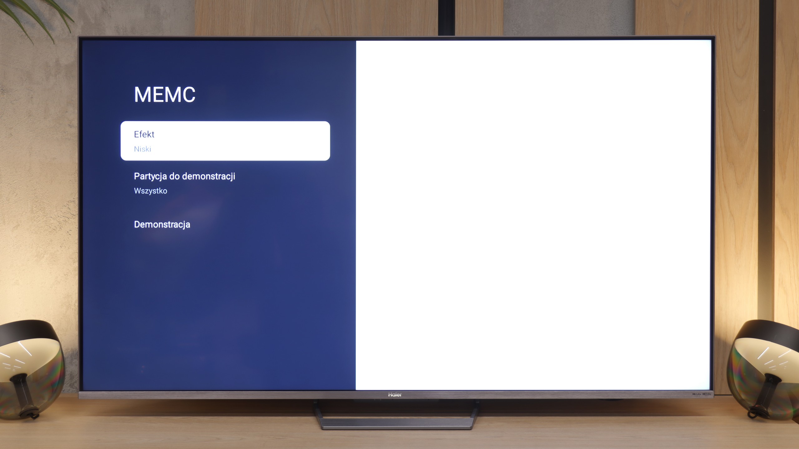
When it comes to motion fluidity, Blaupunkt has nothing to defend itself with. A 60 Hz panel at this price is standard, so none of us expected a perfectly sharp image during fast action scenes or while watching a game. However, the biggest drawback of this model is that you won't find any digital smoothers in the menu. The manufacturer did not give us any room to maneuver – there's no way to smooth anything out or adjust the image to our preferences. The image is always "raw" and we receive it exactly as the source transmits it. For fans of cinematic "motion jump," this might be fine, but everyone else just has to get used to the absence of any motion support.
The Haier M90E is equipped with a simple yet functional motion smoothing system (MEMC). In the settings menu, the user will find a three-level adjustment scale: low, medium, and high. This allows for tailoring the degree of interference with the image to personal preferences – from gentle smoothing of 24p movies to maximum fluidity (soap opera effect). The system operates stably and fulfills its purpose in typical applications.
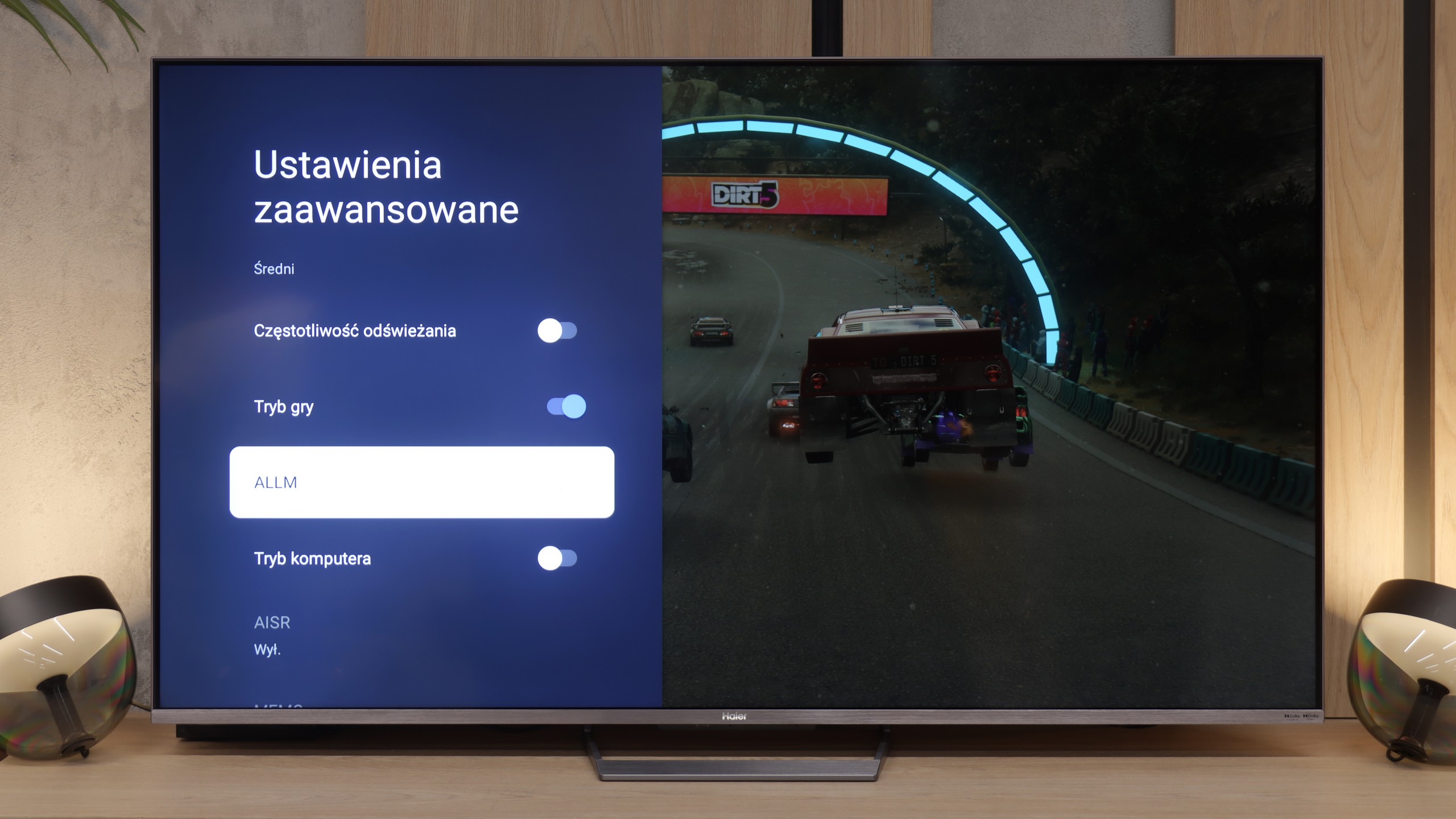
Console compatibility and gaming features
3.5/10
7.5/10
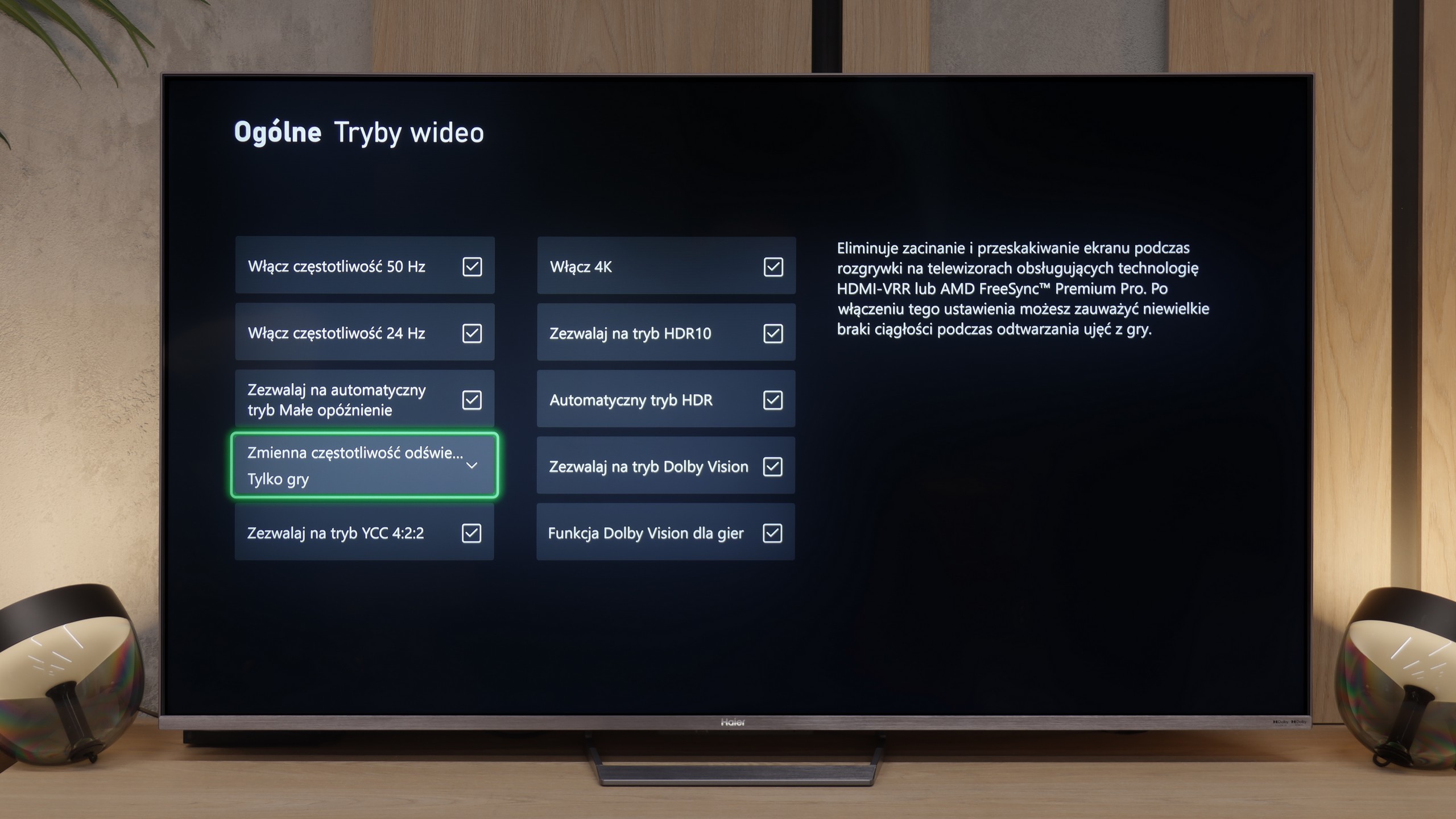
- ALLM

- VRR

- VRR range 48 - 144Hz
- Dolby Vision Game Mode
- Correct implementation of HGIG
- 1080p@120Hz
- 1440p@120Hz
- 4K@120Hz
- Game bar
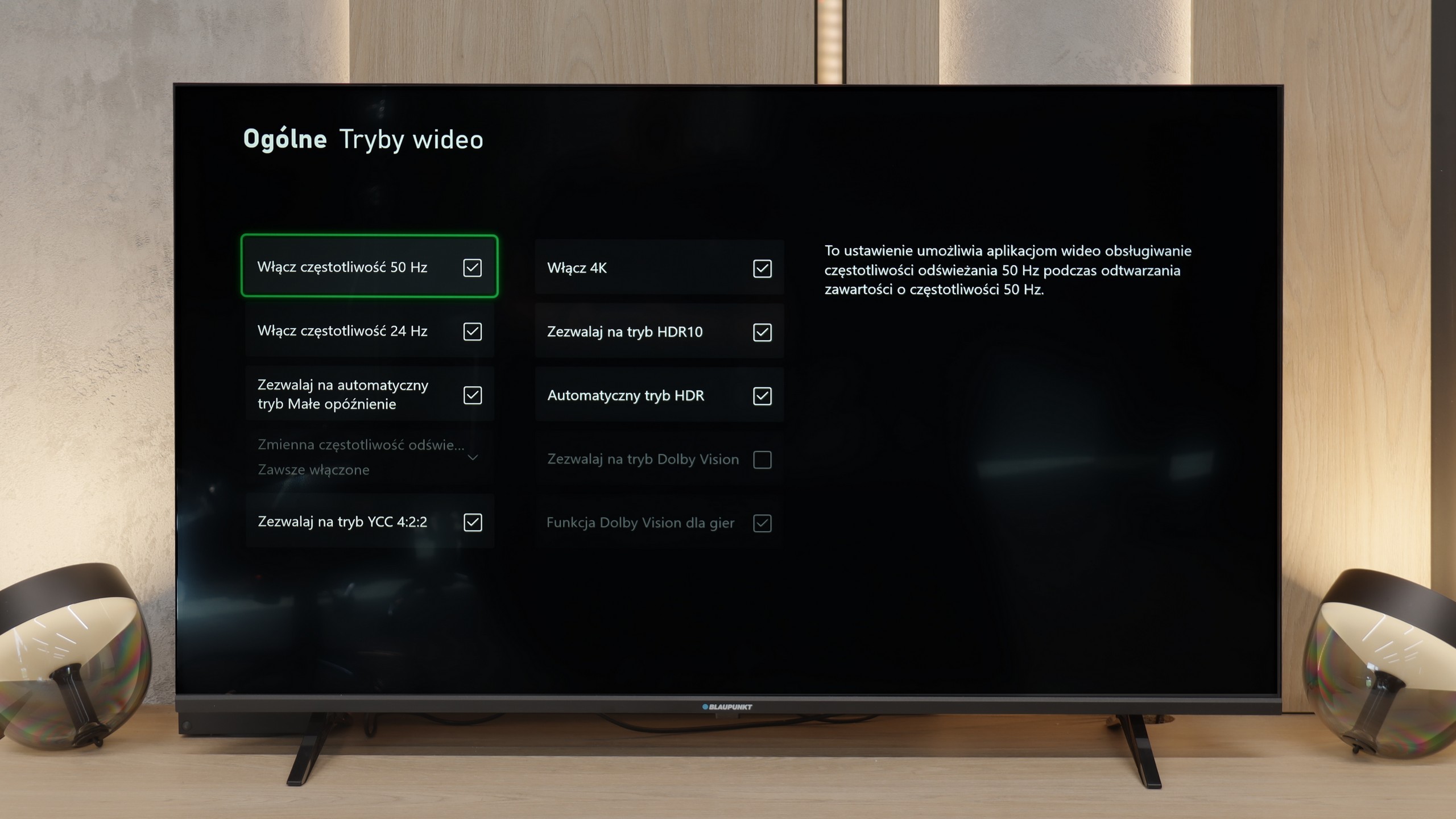
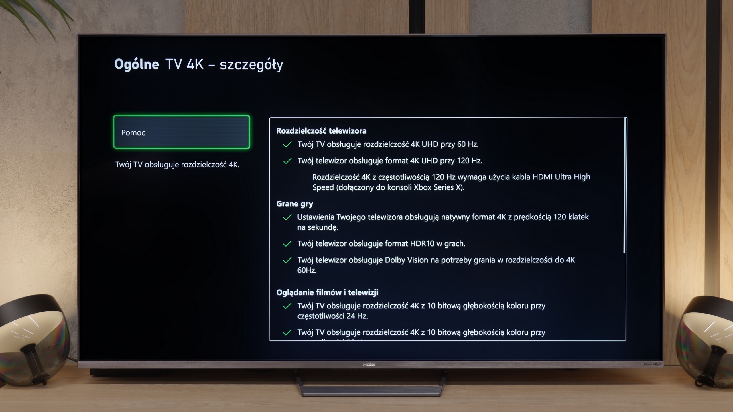
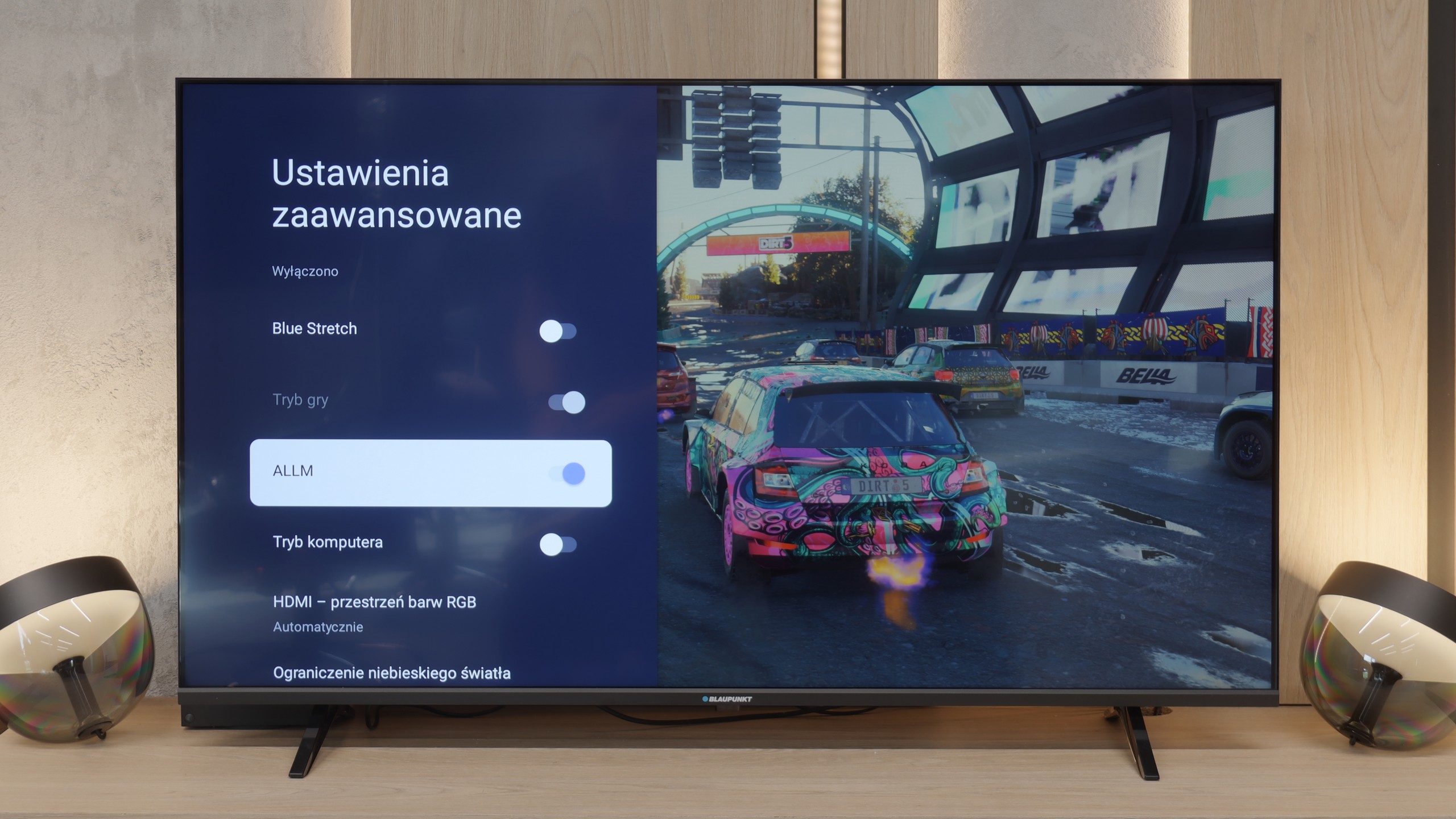
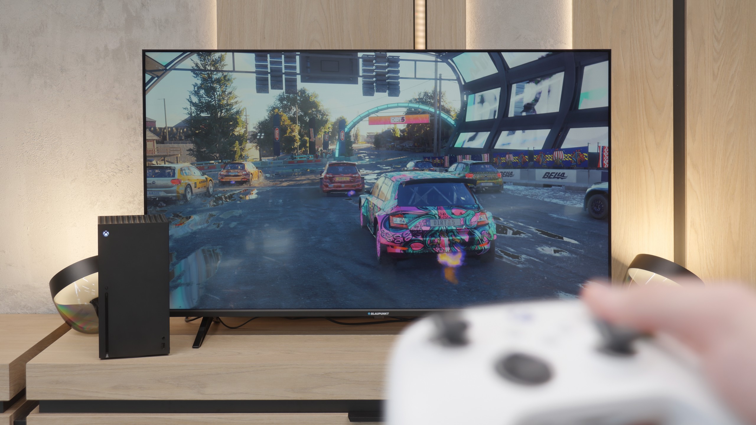

When it comes to gaming on the Blaupunkt, we didn’t expect miracles and indeed – the list of features is not very long. However, there are two interesting points worth mentioning, as they may be significant for some of you at this price. The first advantage is that the TV quite efficiently detects the connected console. Thanks to the ALLM (Auto Low Latency Mode) feature, the device automatically knows when you start gaming and switches to low latency mode. This is convenient because you don’t have to fiddle with the settings every time to prevent input lag from ruining the fun. The second point is a real curiosity that surprised us. Even though it’s a 60 Hz panel, the Blaupunkt can display images at 120 Hz at Full HD resolution. Sure, we lose 4K details then, but for those playing more dynamic, online shooters where fluidity is more important than resolution, it’s a really nice and unexpected addition in such an inexpensive piece of equipment. Besides these two points, however, you won’t find anything else here. There are no advanced systems for improving fluidity for gamers or extensive gaming menu bars. It’s a simple screen for occasional gaming.
From a hardware perspective, the Haier M90E is a solid proposition. The TV is equipped with two full-bandwidth HDMI 2.1 ports, which ensures support for key technologies: VRR (variable refresh rate) and ALLM (automatic low-latency mode). A plus is also the correct implementation of the Dolby Vision mode for gaming, which maintains a relatively low input lag. Problems arise with software configuration. The biggest drawback is the forced, continuous dynamic tone mapping by the TV's processor. This prevents proper HDR calibration from the console using system panels (HGiG) – the TV ignores source settings and processes the image its own way. We also noted shortcomings in the interface: the M90E does not have a typical "Game Bar" (overlay with parameters), which is a standard among competitors. Cooperation with Xbox consoles at unusual parameters turned out to be problematic – the device has difficulty correctly displaying 1440p resolution at 120 Hz refresh rate. Despite the aforementioned shortcomings in the software, the Haier M90E remains a very attractive screen for gamers. The final impression is saved by a solid hardware base. Native panel refresh at 144 Hz and the presence of full-fledged HDMI 2.1 ports are advantages that are crucial in daily use. If we are looking for a TV that provides high fluidity and supports 4K signals, this model will fulfill its task.
Input lag
8.6/10
9.8/10
SDR
HDR
Dolby Vision
An important point for every gamer is, of course, input lag, which refers to how quickly the television reacts to our movements on the controller. And here, Blaupunkt has something to boast about, although the results are quite specific. At 4K resolution, the lag is only 12 ms. That's an excellent result. With such lag, gaming is simply phenomenal, and the response is almost instantaneous. However, it's a bit of a pity that the situation changes when switching to 1080p mode. Here, the input lag increases to about 30 ms. To be clear: this is still not a terrible result. For most people, it will be "more than acceptable," and during casual gaming, you probably won't even notice it. Nevertheless, it’s a shame that they couldn’t maintain the same good parameters that we saw at full 4K. Still, in the overall assessment, as a budget screen for consoles, Blaupunkt performs really well in this regard.
In terms of signal delay, the Haier M90E performs very favorably. Measurements for a signal frequency of 120 Hz showed a value below 10 ms. Such a result guarantees high responsiveness in games, and the delay between pressing a button on the controller and the reaction on the screen is practically imperceptible to the user.
Compatibility with PC
6/10
6.7/10
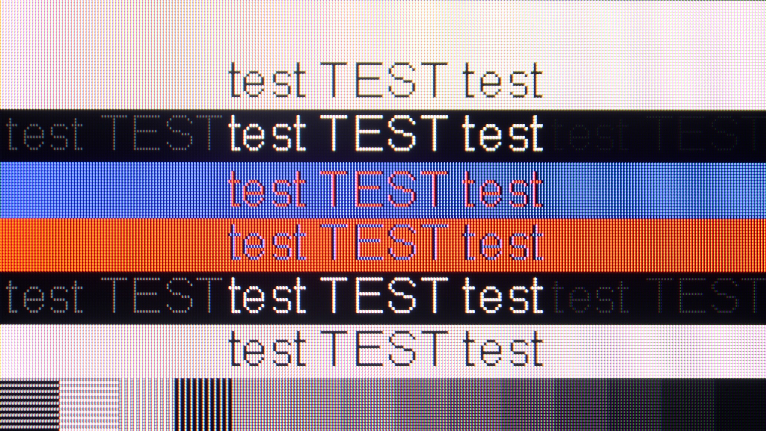
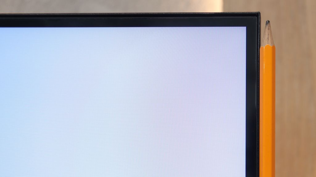
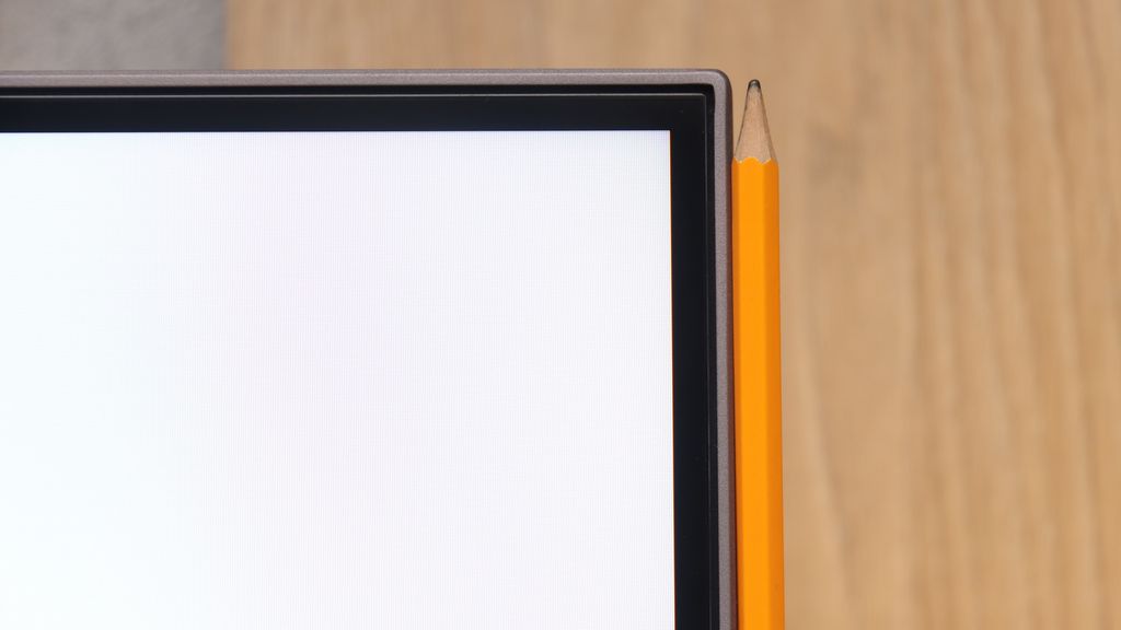
The photo shows the legibility of small fonts. Ideally, lines should be the same thickness on both light and dark text, with minimal pixel gaps.
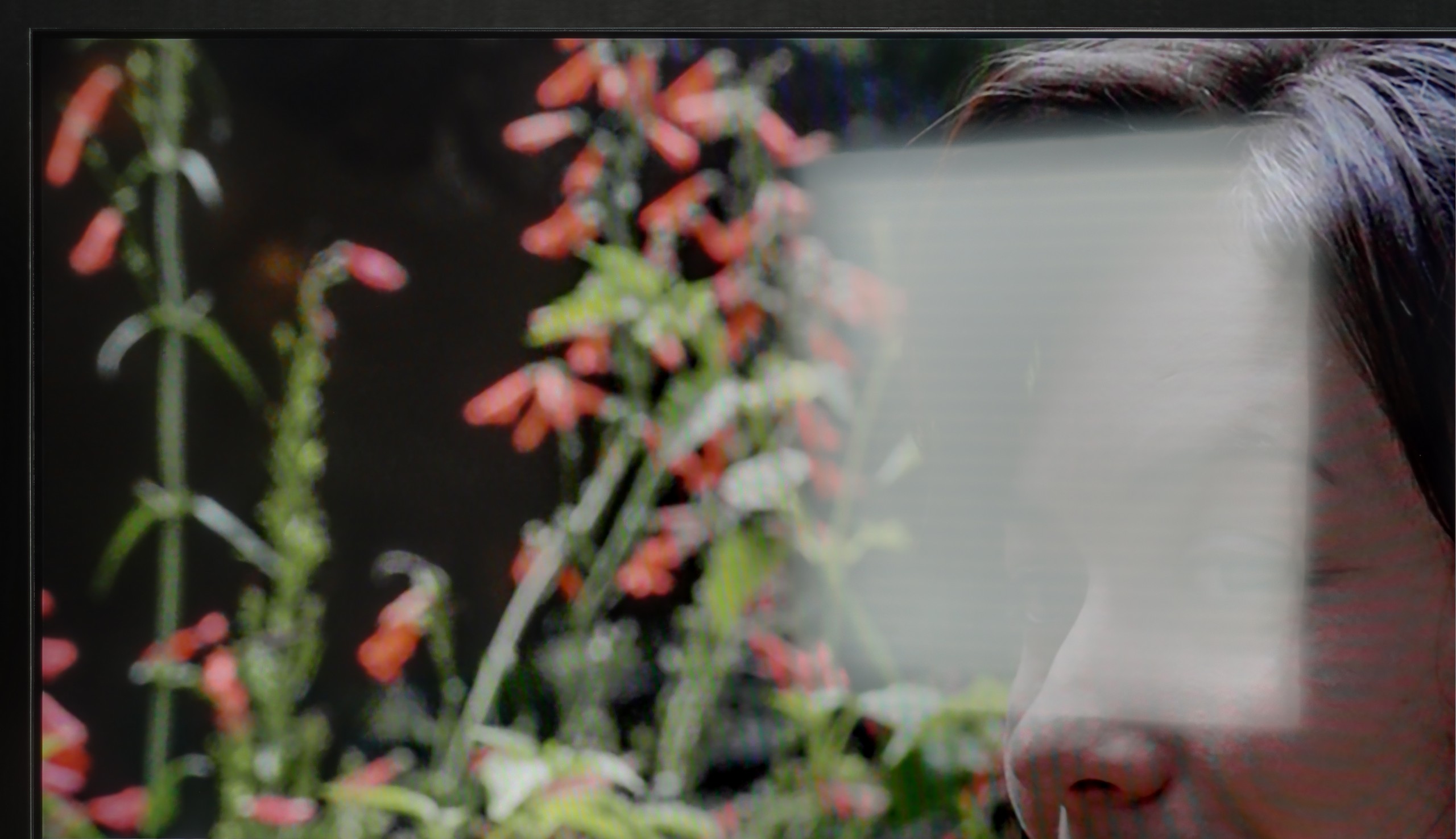
If you plan to connect a computer to this television, it is absolutely crucial that you find and enable the PC compatibility option in the menu. Once you do that, magic happens – the implementation of Chroma 4:4:4 and font clarity jumps to an exemplary level. The legibility of text is simply great here. Of course, our editorial meticulousness would not allow us to pass by this hardware without taking a look "under the hood." In very specific tests with thin, dark text, we noticed that the horizontal and vertical matrix masks differ slightly in brightness levels. However, we want to reassure you: this phenomenon is so subtle that during normal use, writing emails, or browsing the web, you won't be able to notice it with the naked eye. We maintain our opinion that as a monitor strictly for dynamic gaming on PC, this is not an ideal choice (as we mentioned regarding the 60 Hz refresh rate), but if any of you are wondering whether you can comfortably work on such a Blaupunkt – we answer: yes, it is absolutely possible.
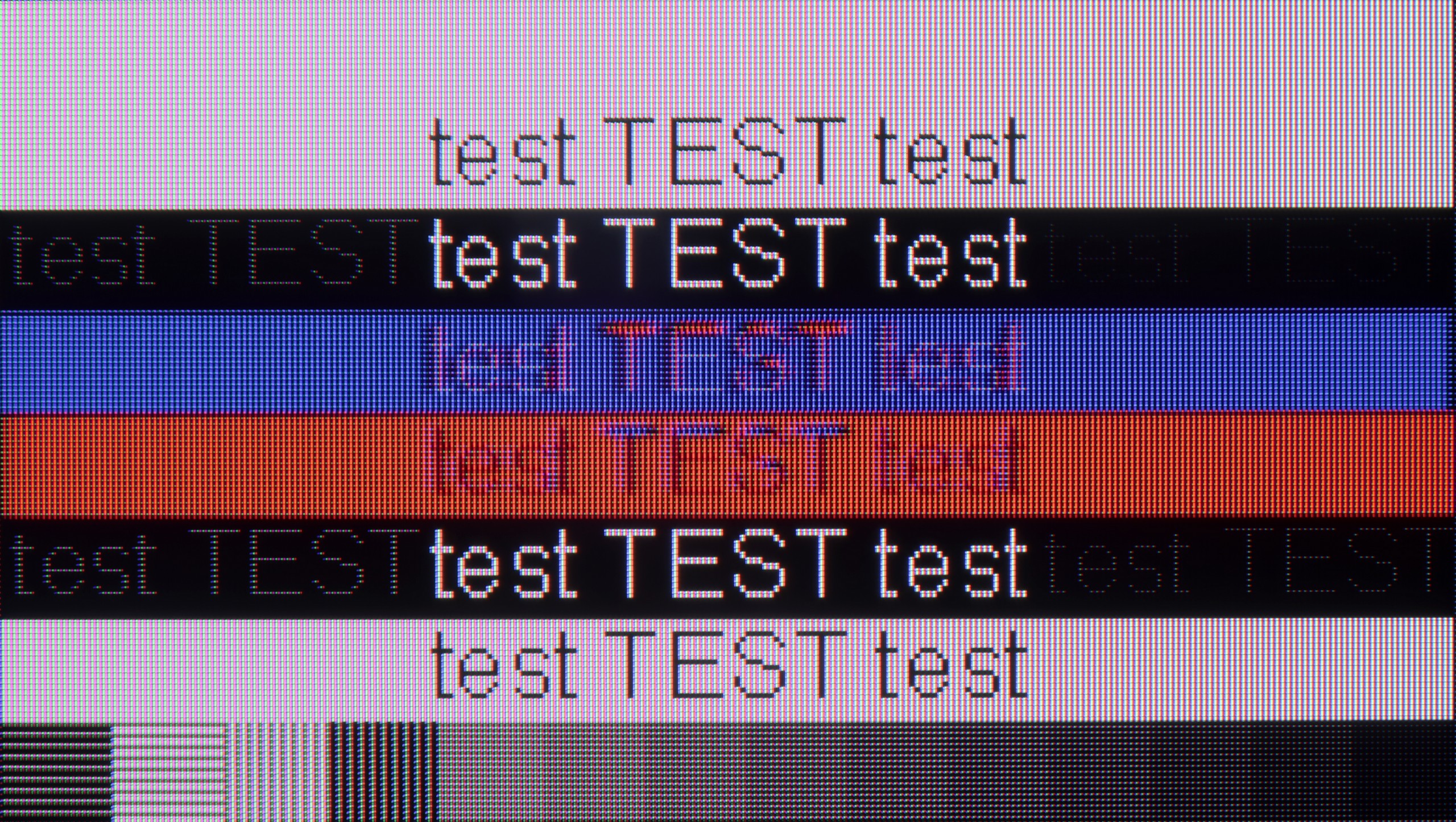
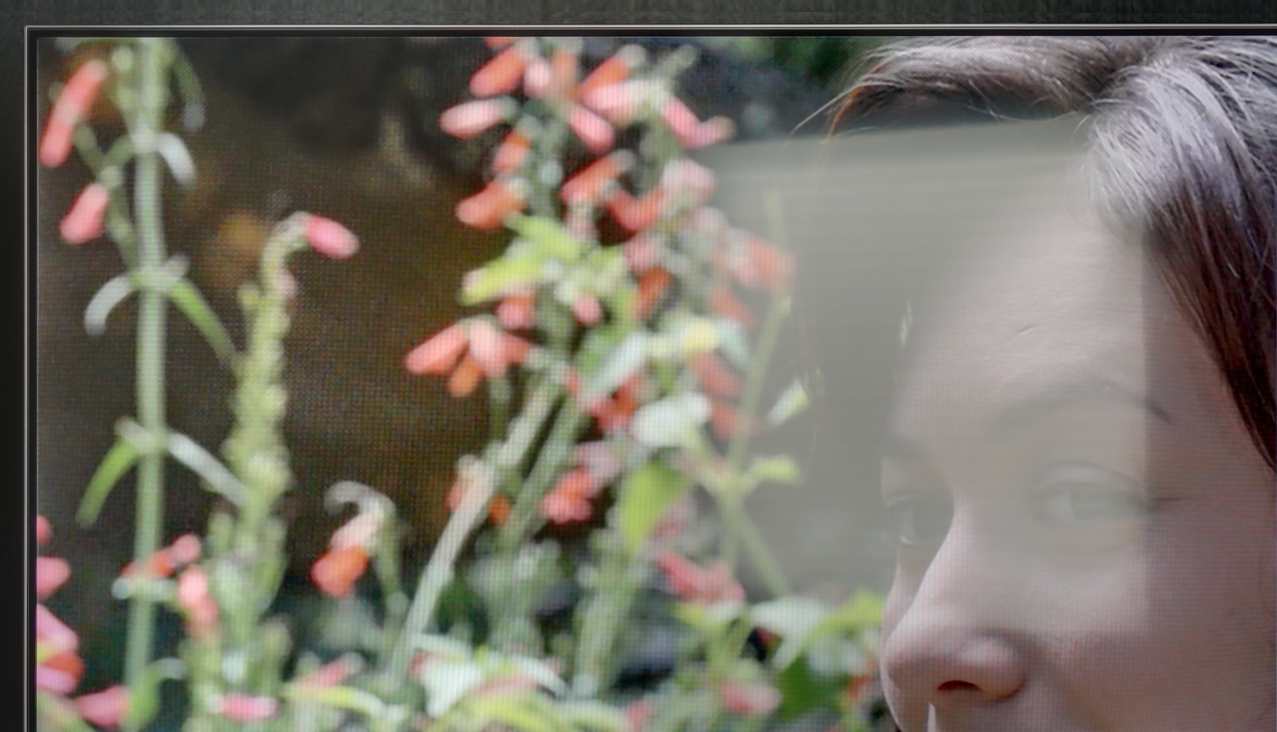
Connecting a computer to the M90E yields mixed results. Hardware-wise, it's good: the TV supports G-Sync, FreeSync, and refresh rates up to 144 Hz. In games, everything works properly. The issue arises when displaying the desktop and text. In 144 Hz mode, the TV struggles with chroma subsampling 4:4:4. Fonts appear jagged and unclear, making reading tiring for the eyes. To achieve readable, sharp text (as seen in our comparative photos), one must lower the refresh rate to 60 Hz. This forces the user to constantly "tweak" the settings in Windows – 144 Hz for gaming, 60 Hz for browsing the internet or working.
Viewing angles
5/10
2.9/10
It is really very good here. Regardless of whether we sat directly in front or on the edge of the couch, the colors retained their saturation. This is a big plus if you plan to watch matches or movies with a larger group – no one will complain that their picture looks worse. While IPS panels are known for good viewing angles, in this particular model, when viewed from a large angle, the picture clearly loses brightness. Interestingly, the color saturation still remains in place, but the screen simply becomes darker. This is not something that disqualifies this television, but it is worth knowing.
The use of a VA panel comes with specific consequences. The viewing angles on the M90E are simply very poor. This is a typical characteristic of this technology, but it's important to be aware of it before making a purchase. Even with a slight deviation from the central axis, the image begins to degrade. Blacks turn gray, contrast drops drastically, and colors lose saturation and become washed out. In direct comparison with IPS (or ADS) panels, Haier falls short. Where IPS maintains a consistent image even for viewers sitting to the side, the M90E requires viewing straight on. If you plan to set the television in a wide living room where family members watch movies from different places, this model will not be a good choice.
Daytime performance
4/10
7.8/10
Panel brightness
Haier M90E: 843 cd/m2
Blaupunkt UGC5500S: 245 cd/m2
In terms of daytime performance, Blaupunkt is simply average. It all comes down to the low brightness of the panel, which – as we mentioned before – hovers around 250 nits. This is definitely too little for the screen to "break through" strong light coming into the living room. As a result, under high sunlight, the image loses clarity and appears somewhat washed out. However, there is one bright spot in this category: the satin coating of the panel. Thanks to it, we don't have to deal with the mirror effect, which often makes us watch the reflection of our own sofa instead of the movie. The satin nicely diffuses reflections, which saves the situation somewhat. Nonetheless, we can't defy physics: while the coating bravely fights against reflections, the low brightness ultimately capitulates in the battle with sunlight. If you are planning a screening in the middle of the day in a very bright room, be prepared to close the curtains.
The screen is covered with a satin finish. This solution does quite well at reducing glare, although it does not eliminate it completely. The greatest advantage of the M90E in this aspect is its high brightness. In everyday use (SDR content), luminance can exceed the 1000-nit threshold. Such a power reserve allows the TV to easily "break through" existing light. The image remains clear and readable even in very brightly lit rooms.
Panel details
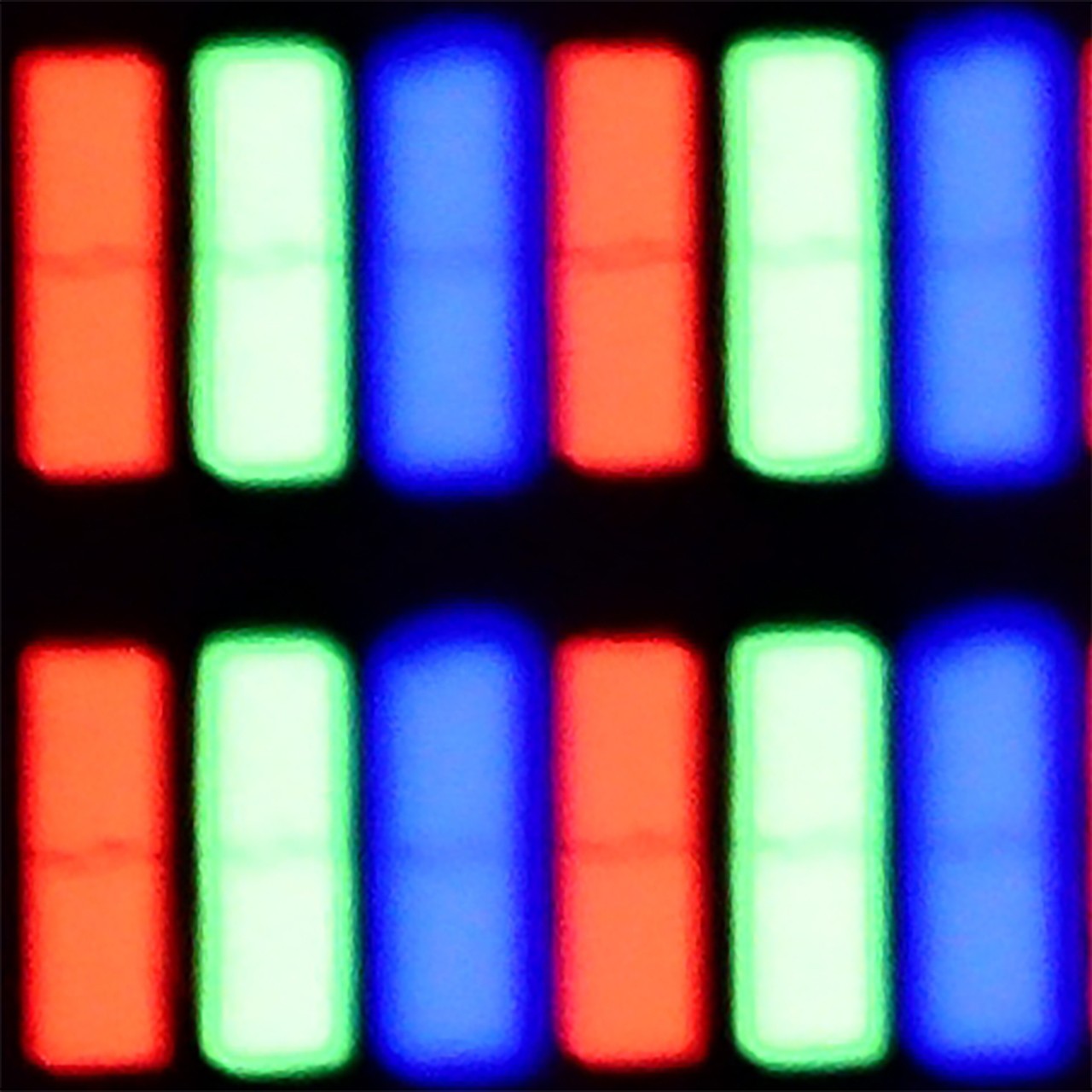
Subpixel Structure:
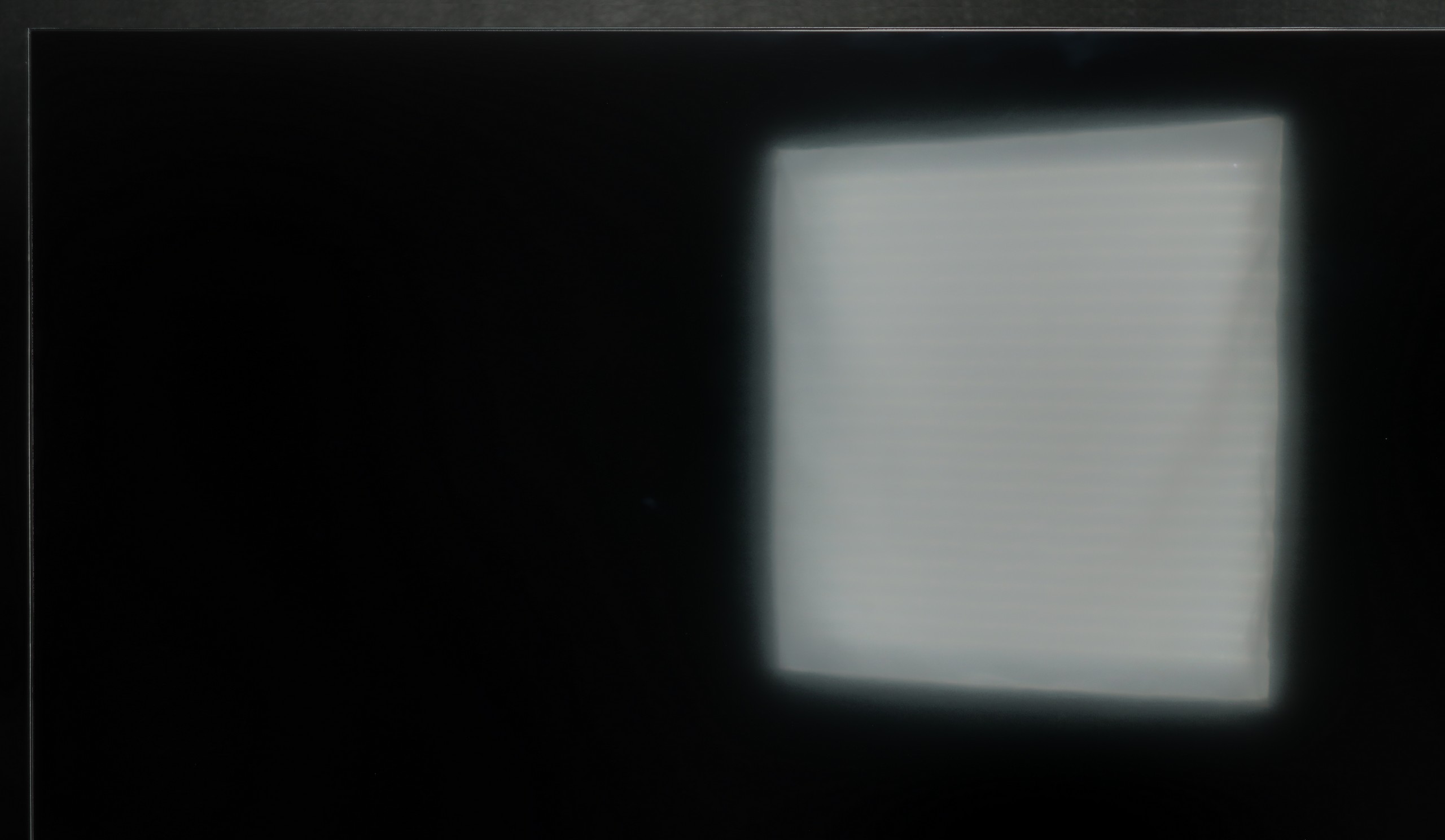
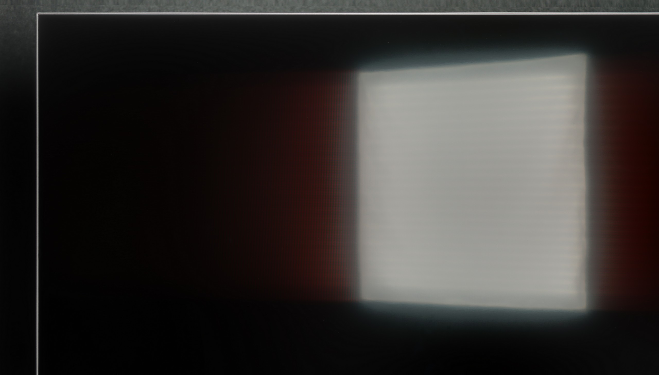
Panel uniformity and thermal imaging:


Blaupunkt UGC5500S
Haier M90E
TV features
5.1/10
5/10
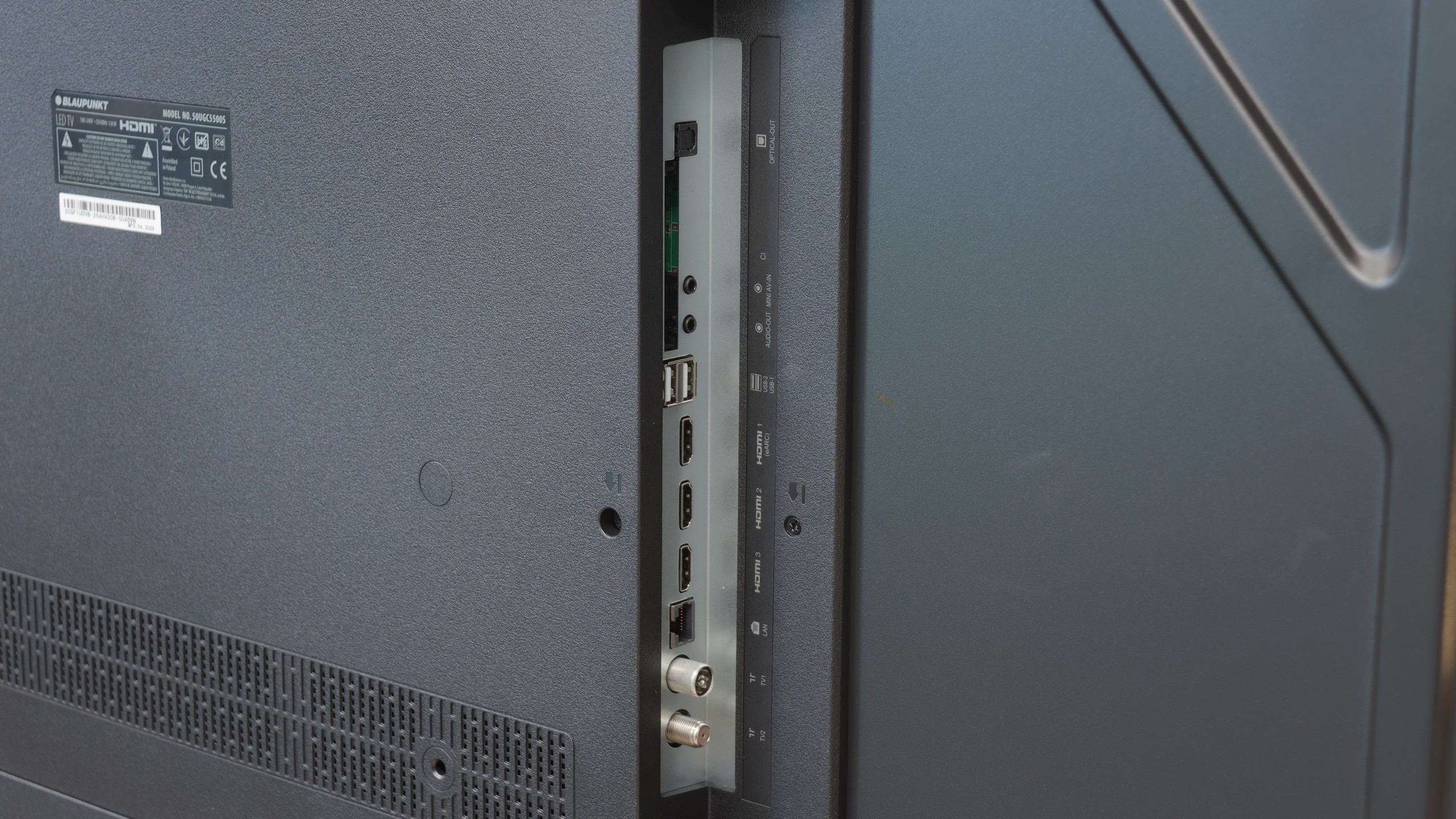
- HDMI inputs3 x HDMI 2.0, 0 x HDMI 2.12 x HDMI 2.0, 2 x HDMI 2.1 40Gbps
- Other inputsRCA (Chinch)RCA (Chinch)
- OutputsToslink (Optical audio), eARC (HDMI), ARC (HDMI), Mini-Jack (Headphones)Toslink (Optical audio), eARC (HDMI), ARC (HDMI), Mini-Jack (Headphones)
- Network InterfacesWi-Fi 2.4GHz, Wi-Fi 5GHz, Ethernet (LAN) 100MbpsWi-Fi 2.4GHz, Wi-Fi 5GHz, Ethernet (LAN) 100Mbps
- TV receptionDVB-T, DVB-T2, DVB-S, DVB-S2, DVB-CDVB-T, DVB-T2, DVB-S, DVB-S2, DVB-C
Classic features:
- Recording to USB (terrestrial TV)
- Recording programming
- Picture in Picture (PiP)
- RF remote control (no need to aim)
- Backlit remote control
- Teletext
- Audio only mode
- Bluetooth headphones support
- Simultaneous Bluetooth headphones & TV audio
Smart features:
- AirPlay
- Screen mirroring (Windows Miracast)
- Voice search
- Voice search in native language
- Ability to connect a keyboard and mouse
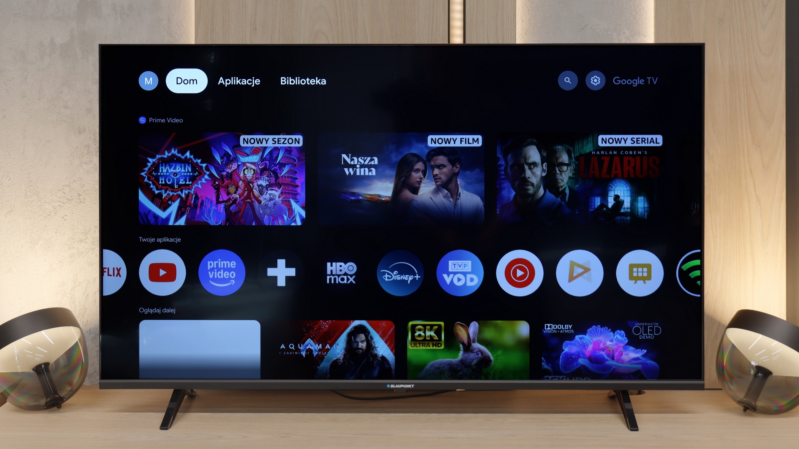

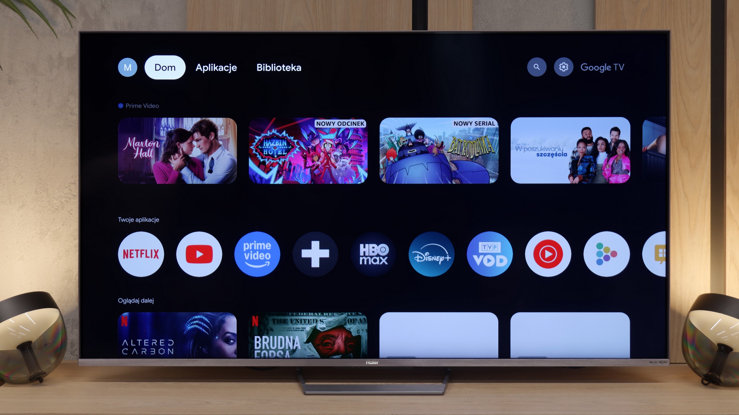

In terms of Smart TV functionality, Blaupunkt UGC5500S is a classic example of a device where the system is both its greatest asset and its biggest flaw. On one hand, we have full Google TV, which at this price point is a huge plus. We get access to a gigantic library of applications and virtually all the features we know from brands that use this software. Nothing is cut out forcefully, which is truly appreciated in such an affordable television. Unfortunately, we must honestly admit that in Blaupunkt's version, this system simply runs sluggishly. This is a typical issue with low-budget TVs featuring Google TV – the processor barely keeps up with the software. Navigation through the menu is not as smooth as we would like, and the remote can respond with a noticeable delay, giving the impression of being "dull." Of course, once you launch a specific app and start a movie, everything runs stably, but simply sifting through the interface requires a bit of patience.
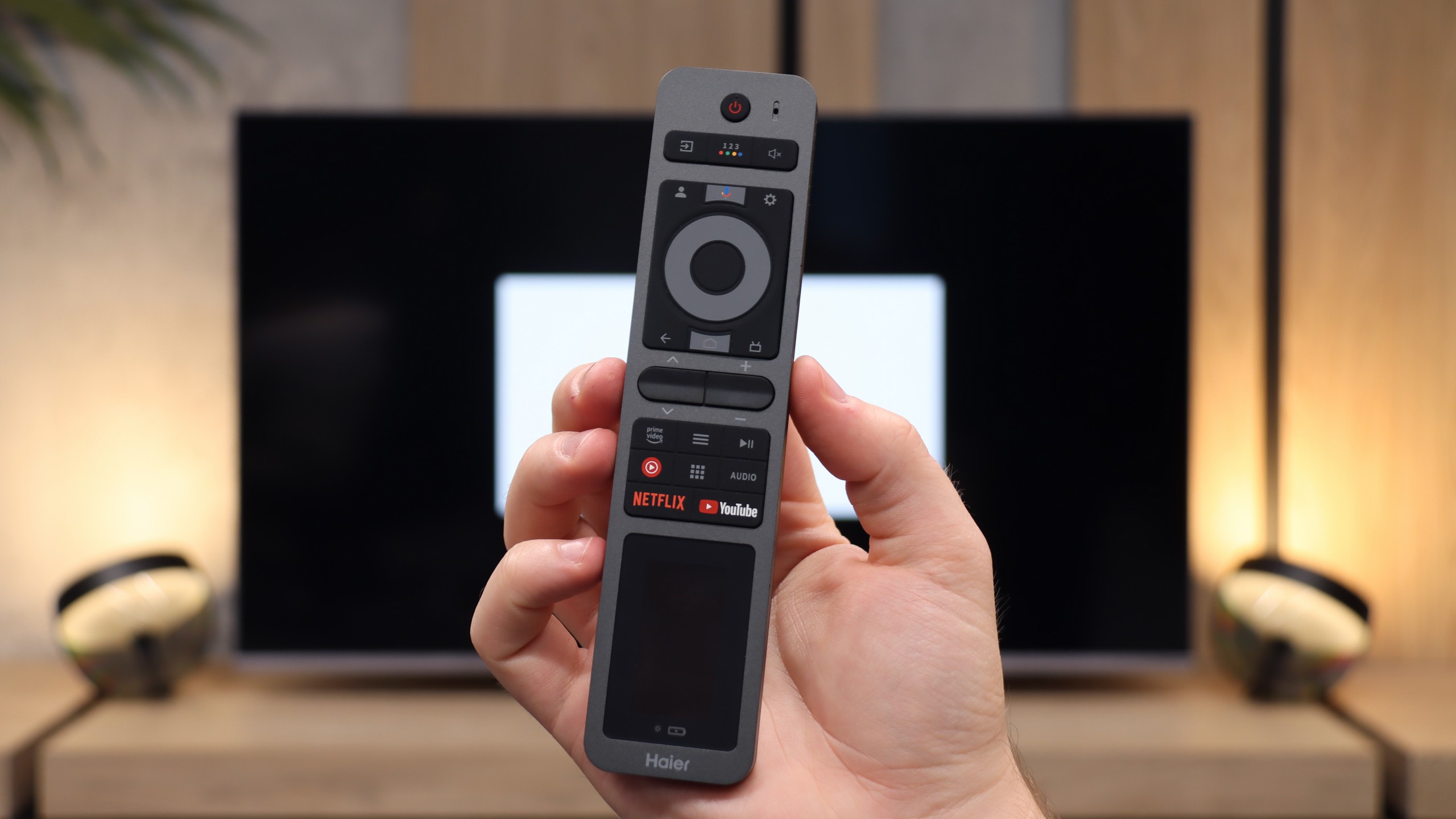
As for classic television functions, Blaupunkt does not offer anything extraordinary. It’s a basic device for fundamental tasks. The remote deserves praise for having a classic numeric keypad, which is simply convenient when flipping through cable channels. We also have Bluetooth, so you can easily connect wireless headphones or a speaker. The television also has a physical mini-jack headphone output. At a time when manufacturers are mass removing this connection, the presence of a "jack" is a nod to those with older audio equipment or simply those who prefer classic wired headphones. It's a small thing, but it brings joy.
Smart TV System – Google TV
Haier M90E operates on the Google TV platform. This means access to a vast library of applications, efficient voice search, and a built-in Chromecast for streaming content from your phone. Theoretically, the functionality is complete. In practice, the software adaptation by the manufacturer leaves much to be desired. The system in Haier's execution is unstable and "buggy." During testing, we repeatedly encountered errors, apps would freeze or refuse to cooperate. It is clear that the company is still gaining experience in optimizing such a demanding environment as the Google system. We hope that over time and with subsequent updates, these "growing pains" will be eliminated, but at this moment, the experience can be frustrating.
Classic and Multimedia Features
In terms of traditional equipment, only one element truly deserves praise: the physical headphone output. This connection is increasingly being removed by competitors, and here it is still available, which will be appreciated by owners of older audio equipment. Aside from this exception, the list of features is very average. The TV does not offer the ability to record TV channels to a USB memory (PVR). There is also a lack of picture-in-picture (PiP) functionality. Here, we only get the essential minimum, without any added value.
Apps
9.6/10
9.6/10
Playing files from USB
9.3/10
9.5/10
Supported photo formats:
Maximum photo resolution:
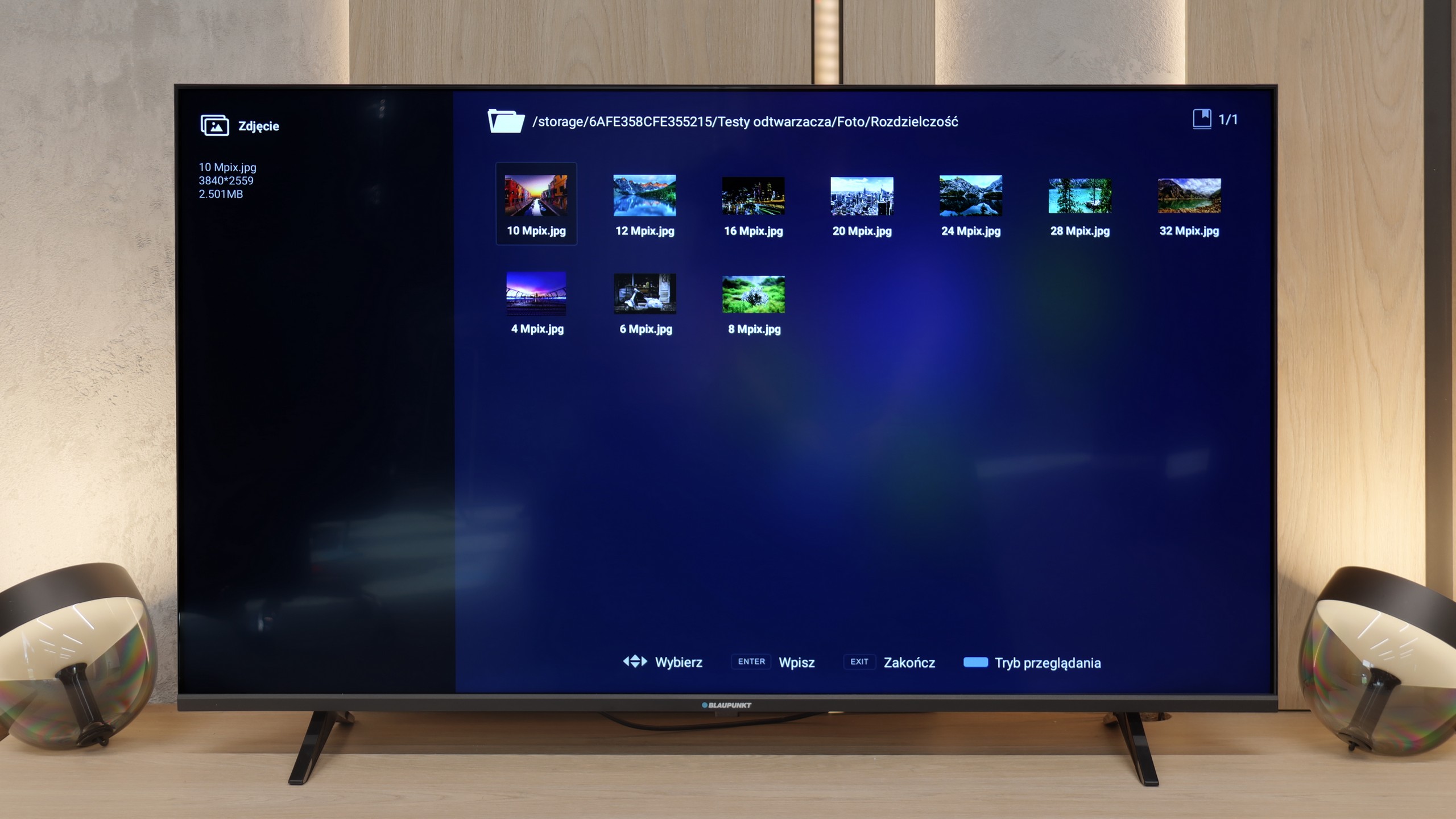
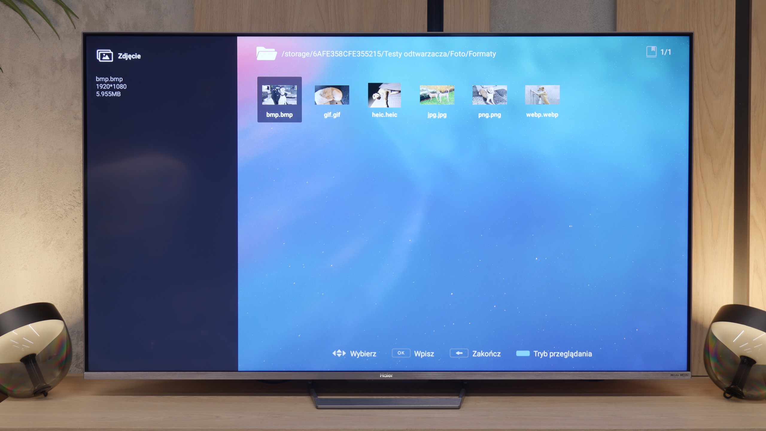
In terms of playing files from USB, Blaupunkt performs quite solidly. We checked several of the most popular formats and basically everything that matters worked smoothly on the factory player. Therefore, you are not forced to immediately download additional software right after taking the television out of the box because the device is simply self-sufficient "out of the box." Nevertheless, taking advantage of the charms of Google TV, we still recommend that you install something external, like VLC or Kodi. The factory player is adequate, but it is in these external applications that you will find the most configuration options, better subtitle support, or simply a more convenient interface. Since the system gives you such freedom, it's worth taking advantage of it to get as much as possible from your media.
The built-in media player is one of the strongest features of this model. We can confidently state that it is one of the best and most "universal" players we have had the opportunity to test. The device handles practically every audio and video format. During tests with our test library, the television flawlessly opened the vast majority of files, regardless of the codec or container used. Users with extensive movie collections on external drives will not have compatibility issues here.
Sound
6/10
8.6/10
- Maximum volume85dB83dB
- Dolby Digital Plus 7.1
- Dolby True HD 7.1
- Dolby Atmos in Dolby Digital Plus (JOC)
- Dolby Atmos in Dolby True HD
- DTS:X in DTS-HD MA
- DTS-HD Master Audio
In terms of audio, Blaupunkt performs really well, especially considering that this is a typical budget television. You can see, or rather hear, that the brand hasn't forgotten its roots, and for such an inexpensive setup, the sound is actually excellent. Of course, there's a clear lack of bass, but overall it is loud and surprisingly clear. Most importantly for us – even at louder listening levels, the sound is not heavily distorted, which is a rarity and a nice surprise at this price point.
The Haier M90E offers sound quality that pleasantly surprises, considering the lack of a sophisticated external audio system (e.g., soundbar). The design relies on hidden main speakers and two visible subwoofers located on the back wall of the casing. This configuration results in a specific sound characteristic. The TV generates clear, audible bass and well-exposed high tones. The only weaker point is the reproduction of mid tones. Our measurements of the frequency response indicated a slight dip in this range (a dip on the graph). Despite this technical inconsistency, the overall sound experience in daily use remains enjoyable.
Sound Quality Test
Acoustic Measurements
85dBC (Max)
75dBC
83dBC (Max)
75dBC