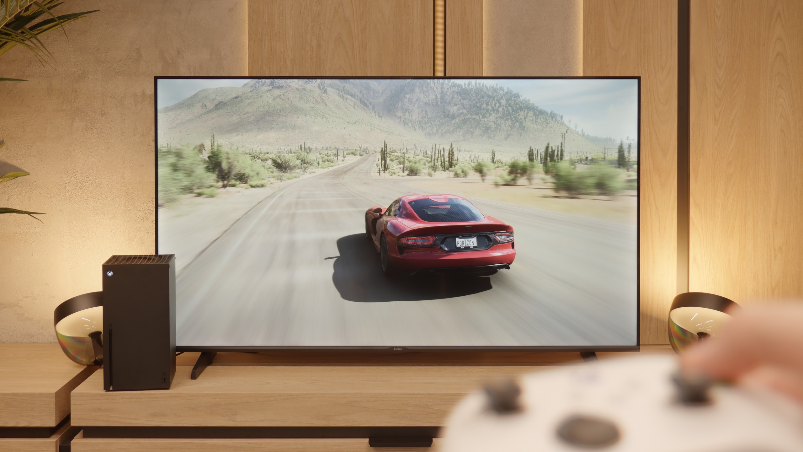
The mid-range television segment is expanding rapidly, and TCL C75B demonstrates that it’s possible to get really solid equipment in this price category. This model is clearly designed with gamers in mind – the HDMI 2.1 port offers a lot of potential, providing VRR, ALLM, and impressive 144 Hz refresh rate in 4K (or 240 Hz in Full HD), which will certainly please both gaming and sports fans. The TV’s operation is pleasant and intuitive, mainly thanks to the Google TV system. While there may be minor stutters, the wealth of available apps and features more than compensates for this – practically everything we need is at our fingertips or even at the sound of our voice if we wish to talk to the remote in Polish. As for picture quality, TCL C75B also performs well. Thanks to the VA panel, it boasts quite good contrast, and the presence of Dolby Vision allows for enjoyable HDR effects, even if the brightness isn’t mind-blowing. Of course, it isn't without its flaws – despite the fast panel, there is some motion blur, and the lack of traditional features (like USB recording) may disappoint some users. Nevertheless, in its price category, the C75B is a very attractive option, especially for those looking for a screen designed for high-level gaming.
- Matching (Score)
- Our verdict
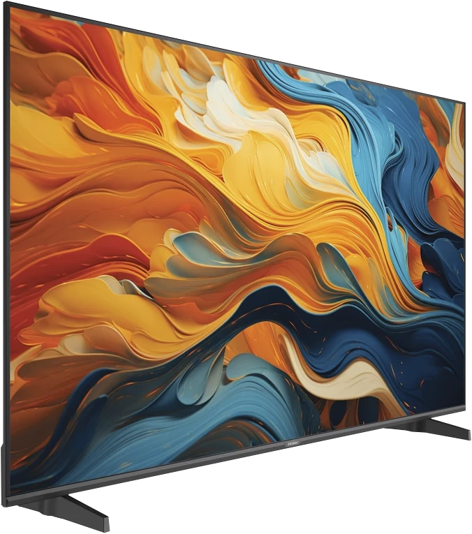
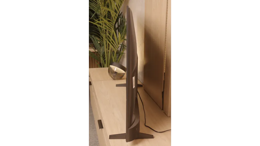
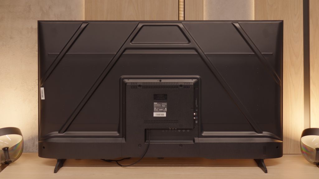
- TV appearance
- Where to buy
- Contrast and black detail
- HDR effect quality
- Factory color reproduction
- Color reproduction after calibration
- Smoothness of tonal transitions
- Image scaling and smoothness of tonal transitions
- Blur and motion smoothness
- Console compatibility and gaming features
- Input lag
- Compatibility with PC
- Viewing angles
- Daytime performance
- Panel details
- TV features
- Apps
- Playing files from USB
- Sound
TCL C75B vs Haier K85F
![]() Direct comparison
Direct comparison
K85F / K85FUX

Panel type: LCD VA
Resolution: 3840x2160
System: Google TV
Model year: 2024
Complete the survey to find out the result
Panel type: LCD VA
Resolution: 3840x2160
System: Google TV
Model year: 2025
Complete the survey to find out the result
Overall rating
6.6
5.4
 Movies and series in UHD quality
 6.4
5.2
 Classic TV, YouTube
 6.0
5.2
 Sports broadcasts (TV and apps)
 6.2
4.6
 Gaming on console
 8.4
6.4
 TV as a computer monitor
 7.6
6.0
 Watching in bright light
 4.9
4.1
 Utility functions
 6.6
5.5
 Apps
Apps 9.6
9.6
 Sound quality
 6.6
4.8
Complete the survey to find out what fits your preferences
Advantages
Great TV for gamers - HDMI 2.1: VRR, ALLM, Game Bar
Very high refresh rate - 240Hz in FullHD and 144Hz in 4K
Very low input lag - 9ms
Advanced operating system - GoogleTV
Support for Dolby Vision, HDR10+
Decent black levels thanks to VA panel
Low input lag, great for gaming
Surprisingly good file player from USB
High contrast and decent blacks (VA panel)
Good text readability in PC monitor mode
Presence of features for gamers: ALLM and VRR
Access to many apps thanks to GoogleTV
Disadvantages
Limited brightness (350 cd/m²), making it difficult to watch in bright rooms
Issues with the smoothness of the Google TV system
Missing traditional features like USB recording or PIP
Average response time of the panel causing motion blur
Catastrophic image quality in HDR mode
Low quality of workmanship and fit of materials
Slow, glitchy, and poorly translated Google TV system
Very poor sound quality from built-in speakers
Problematic remote (and no batteries included)
Poor viewing angles
Low brightness and weak anti-reflective coating
Low colour gamut coverage
Our verdict
The debut of the Haier brand in the European television market with the K85F model feels quite rushed, and after thorough testing – almost unfinished. Analyzing this product leads to a fundamental conclusion: its biggest problem is not the quality of the panel used. Considering the price segment, it is simply average, with typical VA technology advantages such as high contrast and equally typical disadvantages like poor viewing angles. What truly disqualifies this model as a home entertainment centre is the glaring lack of engineering and, above all, software refinement. The list of shortcomings is long and starts with the first contact with the device. Shoddy assembly, which could have been avoided at the quality control stage, a terribly optimised and poorly translated Google TV system, or annoying issues with basic functions like pairing the remote – all contribute to an impression of a product that seems to have been launched without due diligence. Catastrophic picture quality in HDR mode, resulting not only from low brightness but also from a complete lack of smart adaptation to the signal, only adds to this disappointing picture. However, it turns out that this model has a surprising second face. Just looking at it not through the lens of a home television, but rather as a large and inexpensive display for special tasks, shifts its shortcomings to the background, bringing unexpected strengths to the forefront: a fantastically functioning media player with USB, excellent font readability from a PC, and access to a vast array of applications. In such a role – as a screen in a conference room, hotel lobby or a simple advertising player – the Haier K85F performs surprisingly well. For a typical user searching for a reliable and simply well-functioning television for the living room in 2025, however, the Haier K85F is a proposition that is extremely hard to recommend with a clear conscience. It is a product full of contradictions, which fails in too many areas in its primary, intended function as designed by the manufacturer.
TV appearance


Where to buy

Contrast and black detail
5.9/10
5.6/10
Local dimming function: No
Local dimming function: No
Contrast:
Result
5,400:1
Result
5,700:1
Result
6,600:1

Result
6,250:1
Result
4,100:1
Result
3,550:1
Result
5,200:1
Result
5,350:1
Result
5,400:1
Result
3,500:1
Halo effect and black detail visibility:

The TV we tested, TCL C75B in size X," is equipped with a VA panel, which naturally provides quite decent contrast results – and that’s what we observed during our tests. On each test pattern, the TV achieved a contrast level of around 5500:1. This is a result that can be considered very good in this price category. The black in this model performs really well, though of course, it’s far from perfect.
Due to the C75B belonging to the mid-range segment, we won’t find local dimming technology here. This is particularly noticeable in more demanding scenes, such as those from the film Sicario 2, where we noticed that the black takes on a navy hue instead of a pitch-black. This limitation of panels without local dimming can be particularly evident in evening viewings with the lights off, when dark elements of the image are more pronounced. It's worth keeping this in mind when choosing a TV in this category, especially if we care about the best quality of black while watching movies at night.
Alright, but let's get to the meat of it, that is, how the Haier K85F handles black and contrast. The key information is that the television uses a VA panel, which is crucial for image quality in dark scenes. Thanks to this, the contrast is really solid – our measurements indicated values around 5000:1, which is much better than popular IPS panels.
However, it is important to remember that we're discussing budget equipment. So, we shouldn't expect any advanced technologies like local dimming. The backlighting operates across the entire screen surface at all times. How did it look during viewing? We took the film "Oblivion" with its cosmic landscapes for a test, and we also checked classic black bars in other productions. The effect was quite decent. The black had good depth, but it wasn't perfectly inky – a slight blue glow could be noticed, indicating that the panel's backlighting was still active.
HDR effect quality
5.3/10
3.4/10
Luminance measurements in HDR:

Result
368 nit

Result
382 nit
Result
429 nit

Result
404 nit

Result
425 nit
Result
217 nit
Result
212 nit
Result
278 nit
Result
250 nit
Result
273 nit
Scene from the movie “Pan” (about 2800 nits)


Scene from the movie “Billy Lynn” (about 1100 nits)


Static HDR10


HDR luminance chart:
Haier K85F
HDR luminance
TCL C75B
HDR luminance
During our brightness test, the TCL C75B "spat out" around 380 nits of brightness. We recorded similar results while watching most of the films we tested. These can be considered average – the TV performs decently in this segment, but around 400 nits is definitely too low to fully experience the magic of HDR effects. Of course, such results are better than those of budget models, which can achieve nearly half the brightness values. However, for HDR enthusiasts seeking stronger lighting effects and greater realism, the C75B may prove insufficient. On the plus side, it's worth mentioning the coverage of the DCI-P3 colour gamut at 95%. This is a very good result that easily suffices to enjoy a wide range of colours in content available on popular streaming platforms. Vivid and rich colours are definitely a strong point of this model.
Let’s now move on to one of the hottest topics in the world of televisions, which is the quality of HDR performance. In the case of the Haier K85F model, we unfortunately have to make it clear: if you’re looking for equipment to watch content in a wide dynamic range, you should steer clear of this model. The main issue is its very low peak brightness, which during our tests barely reached 250 nits. To give you a better idea of what that means – this level is fine for watching standard SDR content, but it’s absolutely insufficient to show any real benefits of HDR. The image simply doesn’t have the "power" to generate bright, striking highlights. All of our measurements and tests on specialised test patterns confirmed this. As if that wasn’t enough, the television also struggles with colour reproduction. In this budget build, there are no technologies that broaden the colour gamut, such as quantum dot layers (marketed as "QLED"). As a result, the coverage of the DCI-P3 colour space, which is crucial for HDR content, is only around 80%. In practice, this means that the image will not only be dark but also devoid of the vibrant, saturated colours that the director wanted to show us.
Factory color reproduction
7.3/10
3.8/10


Factory Mode
After calibration


Factory Mode
After calibration
TCL C75B offers various picture modes, but in our opinion, the best choice is the “Film” mode. Although its settings are quite decent, the TV struggles with certain colour reproduction issues. In tests, we noticed that the image had a noticeably pinkish hue compared to what could be considered correct. This effect was particularly evident in skin tones, which appeared unnaturally flushed. The main culprit of this phenomenon turned out to be the white balance, characterised by an excess of blue and red in both HD and 4K HDR materials.
An additional problem was the way brightness was reproduced. The gamma, which is responsible for the visibility of details in darker materials, was definitely boosted, causing details in the darkest parts of the screen to be invisible, disappearing into complete black (e.g., the bottom part of the screen in the comparison image - the area around the actress's ear). The situation was similar on the EOTF curve, which was below the correct value, suggesting that a similar issue may be encountered in 4K HDR content.
Thanks to our experience and the appropriate tools, we decided to take matters into our own hands and check how much could be extracted from this model after professional calibration. The details are described in the next section.
Alright, how does the television handle colours straight out of the box, without any intervention from our side? The Haier K85F offers a whole range of picture modes, such as Dynamic or Eco, but for anyone wanting to watch films according to the creators' intentions, there's essentially only one that matters: Film mode. This is where we focused our tests, and unfortunately, its name has little to do with reality. The picture on factory settings is very far from what we could call cinematic fidelity and requires many adjustments. Let's start with the white balance, which has a clear deficiency of red colour. In practice, this means the entire image has a cool, bluish tint. Even worse is the issue of brightness management, that is, the gamma curves (for SDR) and EOTF (for HDR). Their graph resembles a true rollercoaster, which terribly impacts the viewing experience. This results in unnatural dimming of SDR content, causing details in the shadows to be lost, and in the case of HDR – an excessive brightening that further exacerbates the problem of clipping. Such a combination, which consists of too cool white combined with chaotic brightness and too much blue colour saturation, leads to enormous errors in colour reproduction. Our measurements on a specialist ColourChecker chart showed errors (Delta E) regularly reaching and exceeding values of 8-9. To put it simply: errors above the threshold of 3 are easily noticeable to the naked eye, so such a result means that the colours on the screen are simply heavily distorted.
Color reproduction after calibration
8.2/10
6.2/10


After calibration, TCL C75B has clearly improved when it comes to colour reproduction. Although the TV doesn't offer too many options for adjusting the white balance, we managed to improve its settings quite a bit. As a result, the image is no longer overly pink, and the colours now look much more natural and harmonious.
The gamma jump that was previously an issue hasn't completely disappeared, but we were able to significantly reduce it. This has made details in dark scenes more visible – both in HD and 4K HDR content.
Unfortunately, the lack of local dimming is still noticeable. The 'blooming black' effect remains, but that's a limitation of the display itself. Still, the colours post-calibration look significantly better, and the image is much more pleasant to watch.
No good, but can anything be done about this picture? Is professional calibration able to save the situation? The answer is both yes and no. It needs to be said clearly that there are certain things we cannot overcome. The limitations of the construction itself, namely a poor panel and its narrow colour coverage, mean that you can forget about a sensible HDR effect – we won't be pulling the wool over your eyes on that. The biggest beneficiary of our adjustments is undoubtedly the SDR mode, and it is for watching such content, after calibration, that this television starts to make sense. We managed to tame the white balance in our own way. Although the television only offers basic, 2-point adjustment (rather than precise, 20-point), it's not perfect, but we successfully eliminated that unpleasant, cold "chill" in the picture. Above all, though, we noted a huge improvement in brightness management. The gamma curve, which previously resembled a rollercoaster, looks like an almost perfectly straight line after calibration. This is a sign that the television can finally display an image without artificially dimming or brightening it. The conclusion is simple: even with such a cheap television, professional setting correction can achieve a great deal and extract the maximum potential from it.
Smoothness of tonal transitions
8.2/10
7.6/10


When it comes to tonal transition fluidity, TCL C75B performs really well. It particularly excels in gradation of the darkest colours – here the television does not disappoint and presents a high-quality image.
Some imperfections can be noticed in the brightest areas of the screen, such as in a scene from the film Kingsman (sun in a blue sky). Nevertheless, the final effect should satisfy the vast majority of users.
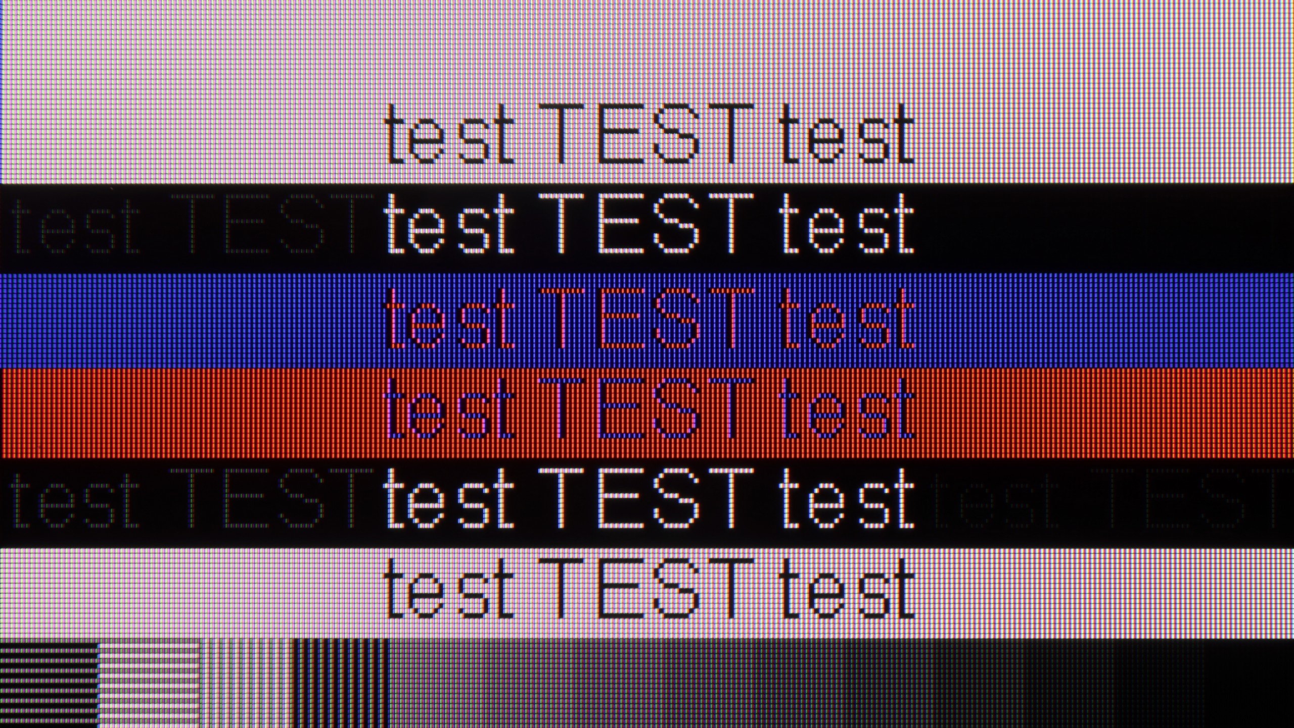
It's time to address an issue that is often overlooked by many but can be quite irritating to the discerning (and not just discerning) eye. We're talking about the smoothness of tonal transitions, or how seamlessly the screen displays transitions between very similar shades of one colour – for instance, on a clear blue sky. We have to admit that in this category, the Haier K85F, considering its price, performs quite decently. In bright scenes, such as the aforementioned sky or expansive landscapes in the film "The Martian," there are no stark, contrasting bands. Yes, if we scrutinise closely, we can spot minimal imperfections, but generally, the effect is more than satisfactory. However, the situation changes when darker scenes make an appearance on the screen, such as gloomy corridors in games or nighttime landscapes. Here, banding, or the effect of posterization, becomes much more evident. Transitions in shadows and greys are no longer as smooth and can become quite bothersome to a more sensitive eye. It's not a level that would completely disqualify the television, but it is clear that this is an area where costs were saved.
Image scaling and smoothness of tonal transitions
5/10
4/10
Smooth transition function


Image without overscan on the SD signal


TCL C75B has a feature for smoothing tonal transitions, but unfortunately, we cannot praise it. Regardless of the selected level – low or high – tonal transitions in older materials remained visible, as if the feature wasn’t working at all. It’s hard to say anything positive about it, as in practice it seems completely useless.
Image scaling is better. The TV handles it quite decently, although on thinner elements, like branches in the background, you can see slight jaggedness. However, this is not something that significantly hinders everyday viewing.
Unfortunately, a bigger problem turned out to be overscan, or cropping of the image edges. In our tests, it happened that news ticker or other elements close to the edge of the screen were cut off. This is definitely something to pay attention to, especially if we use the TV for watching news programs or content with text on the screen.
Let’s move on to digital processing and image scaling, specifically how the Haier K85F handles lower resolution signals, such as from regular television. Right off the bat, we encounter an incredibly annoying and completely incomprehensible issue – the overscan is enabled by default. This means the television artificially enlarges the image, cutting off its edges on every source, even 1080p. To see the full frame, you have to dig into the screen settings each time and manually switch the format to "stretch to 16:9." It's a minor detail, but devilishly frustrating. The scaling of content to 4K resolution can be described in one word: acceptable. And that's about it. The image processor doesn't strip detail from the image, nor does it generate jagged edges or other artifacts. It simply does its job, without any bells and whistles. It’s alright, but nothing more. The most significant and noticeable shortcoming in the digital processing section is, however, the absence of a tone transition smoothing feature. This is an algorithm that could significantly reduce the annoying banding effect we mentioned earlier. Unfortunately, the manufacturer did not foresee such a solution, condemning us to watch the imperfections of the panel and low-quality material in all their glory.
Blur and motion smoothness
7.3/10
4.5/10

Blur (native resolution, maximum refresh rate):


TCL C75B definitely has something to offer gamers. The television is equipped with a panel that can display images with a refresh rate of 144 Hz in 4K, and even 240 Hz in Full HD. These are really impressive results, especially for a model from the budget range.
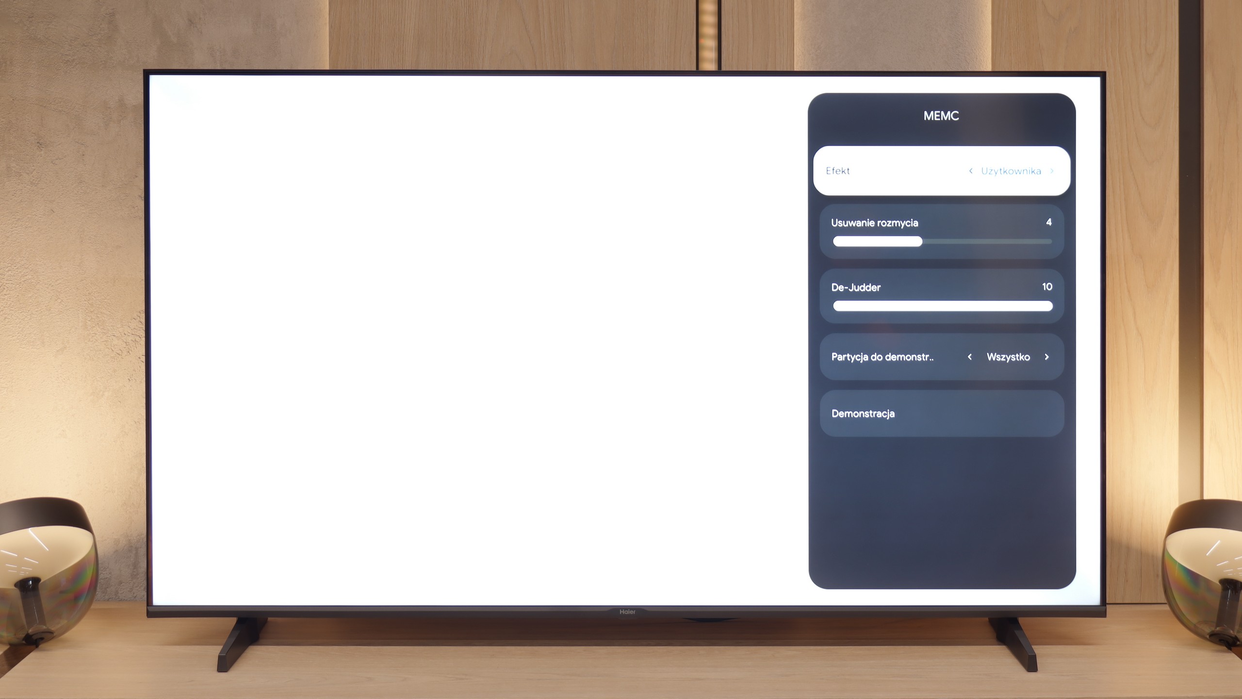
On top of that, there are features for improving smoothness and reducing motion blur in films. The "Motion" option allows for precise adjustment of the effect on a 10-point scale, providing significant personalisation possibilities – everyone can set the smoothness to their liking.
The panel in the K85F model operates at a native refresh rate of 60 Hz, which sets certain expectations for image smoothness right from the start. However, we must admit that we were very positively surprised when we found two separate motion control sliders in the settings menu: one labelled "Motion Blur Reduction" and the other "De-Judder." Such generosity in this price segment is an absolute rarity, as manufacturers usually offer at most one shared option. Unfortunately, our enthusiasm faded as quickly as it appeared. It soon became clear why Haier was so "generous" – the slider responsible for reducing motion blur is simply a decoy. Sliding it makes absolutely no visible difference on the screen, so only one of the two options works.
Console compatibility and gaming features
9.8/10
4/10
- ALLM

- VRR
- VRR range48 - 240Hz48 - 60Hz
- Dolby Vision Game Mode

- Correct implementation of HGIG
- 1080p@120Hz
- 1440p@120Hz
- 4K@120Hz
- Game bar


TCL C75B is undoubtedly a television designed with gamers in mind. It has almost everything needed for even the most demanding console users. With the implementation of full bandwidth HDMI 2.1, the TV supports features like ALLM (automatic low latency mode) and VRR (variable refresh rate) – operating within the full capabilities of the TV, up to 240 Hz in Full HD resolution.
Additionally, the television supports advanced HDR technologies, including Dolby Vision and HGiG, which allows for even better detailing in HDR-optimised games. C75B is also equipped with a very convenient interface for gamers in the form of Game Bar, where you can check all key parameters such as refresh rate, input lag, or picture settings – all just a click away.
In one sentence: C75B is a great choice for gamers, offering a wide range of features that fully enable enjoyment of the capabilities of modern consoles and games.
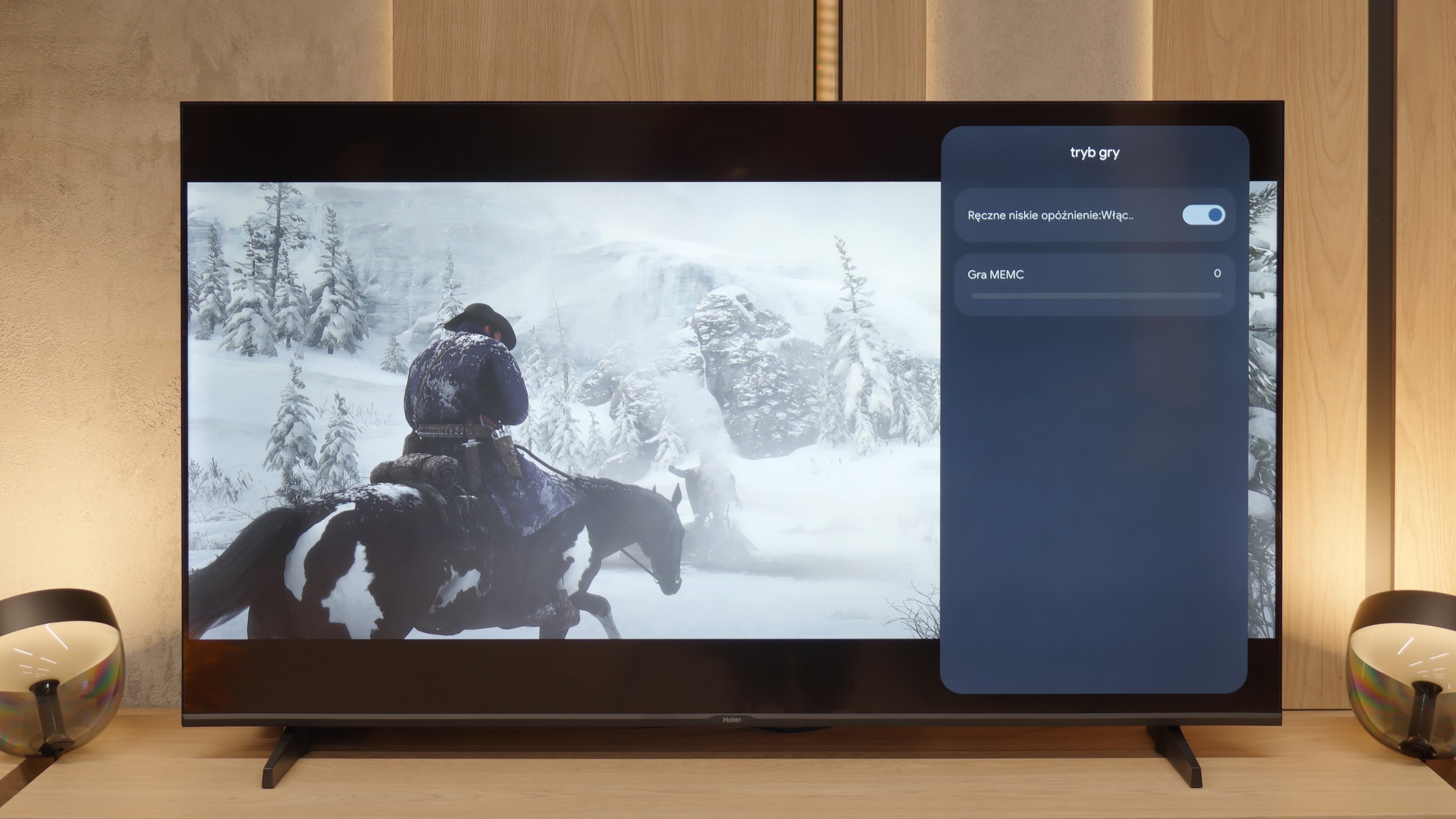
Let’s move on to the features for gamers, although we must point out straight away that this is more of a proposal for the "occasional" ones. The manufacturer does boast in the specifications about having HDMI 2.1 ports, which looks impressive on paper, but in reality, it’s largely a marketing ploy. What good is a modern port when the heart of the television is a panel with a refresh rate of 60 Hz? It physically cannot display a signal at 120 frames per second, even at lower resolutions, which takes away HDMI 2.1’s key advantage. What a shame. (That’s why in our tests we note this as HDMI 2.0 ports). Another odd issue is the TV's response to an attempt to calibrate HDR from the console. Changes to brightness settings result in very unnatural image behaviour, which could suggest incorrect implementation of the HGiG standard. To be honest, one shouldn’t worry too much about this, as we have repeatedly mentioned, we simply do not recommend using any HDR content on this screen. However, to counterbalance the negatives, the Haier K85F does have two big and unexpected advantages. The first is the presence of ALLM, or automatic game mode, which switches the TV to low latency mode as soon as it detects a connected console. The second, even bigger surprise, is support for VRR, or variable refresh rate. While it operates within a very modest range of 48-60 Hz, its mere presence is commendable. Thanks to this, the image in games can “tear” less, which realistically improves the gaming experience.
Input lag
9.8/10
10/10
SDR
HDR
Dolby Vision
The input lag on the TCL C75B is something that truly impresses. With a refresh rate of 144 Hz, the lag is just 9 ms, making the TV's response to our actions on the controller or keyboard practically instantaneous. For 60 Hz, the result is 19 ms – it's not a record low value, but it still falls within a range where the lag is practically unnoticeable during gaming. One could say that the difference is hardly felt, which makes this TV a good choice even for more demanding gamers.
We must give credit where it's due – there is one parameter where this television absolutely shines and puts to shame many more expensive models. We're talking about input lag, or signal delay. Our measurements showed a remarkably low result of just 13 ms. This is a huge plus that makes gaming control lightning-fast and incredibly responsive. In this regard, the K85F performs excellently.
Compatibility with PC
7.6/10
6/10

TCL C75B is quite a good choice for connecting to a computer. With high refresh rates, low input lag, and G-Sync support, the television performs exceptionally well in games – both fast-paced and more demanding ones. The image is smooth, and the response to our actions is quick, which gamers will undoubtedly appreciate.
For office work, the television also holds up well. Text is readable, although on a dark background some imperfections can be noticed – some fonts appear as if they are missing pieces of vertical lines. This may be distracting if we work a lot with documents or text editing. However, if the computer is mainly used for gaming or watching movies, TCL C75B will easily serve its purpose as a monitor. It’s a versatile device that can handle most applications.
And what if we tried using this Haier as a computer monitor? Here, what was a big surprise for us was that the television performs exceptionally well. For office work, it’s perfect. All thanks to the fact that it correctly handles the so-called 4:4:4 chroma sampling. To put it simply: every little letter on the screen is sharp, without annoying coloured edges or blurriness. Sure, let’s be frank – this is not equipment for PC gamers. 60 Hz is too low for them. But if you just need a big screen for text work, browsing the internet, coding or displaying presentations, the K85F excels in this role. This is one of its strongest and, let’s face it, most unexpected applications.
Viewing angles
2.7/10
2.8/10
The viewing angles on the TCL C75B are, unfortunately, very poor. This is a typical compromise with VA panels – better blacks at the expense of off-angle visibility. The picture quickly loses quality when viewed from the side, which is the complete opposite of what IPS panel televisions offer. If we plan to watch the TV mainly head-on, this won't be a big problem. However, with a larger number of viewers sitting at different angles, the picture quality may disappoint.
At nearly the very end of the evaluation of the panel itself, we left out the viewing angles, which unfortunately are one of its biggest weaknesses. It must be honestly admitted that this is not surprising – it is simply a natural and commonly known feature of VA-type panels. In the unit we tested, interestingly, the brightness of the image did not drop drastically when we moved away from the centre of the screen. However, the real problem lies with the colours, which instantly begin to fade. A slight change in position on the couch is enough for the hues to lose their saturation and become washed out. In this regard, the Haier K85F presents a very average, typical level for this technology.
Daytime performance
4.9/10
4.1/10


Panel brightness
Average luminance SDR
Haier K85F: 276 cd/m2
TCL C75B: 366 cd/m2
TCL C75B performs okay during the day. The satin display somewhat limits reflections, but it's not an ideal solution. Brightness is also an issue – 350 cd/m² is simply not enough for comfortable viewing in a brightly sunlit room.
In less extreme conditions, for example, in a moderately lit room, the TV does alright. However, if the sun starts streaming directly onto the screen in summer, watching can become tiring. It's worth keeping this in mind when choosing this model.
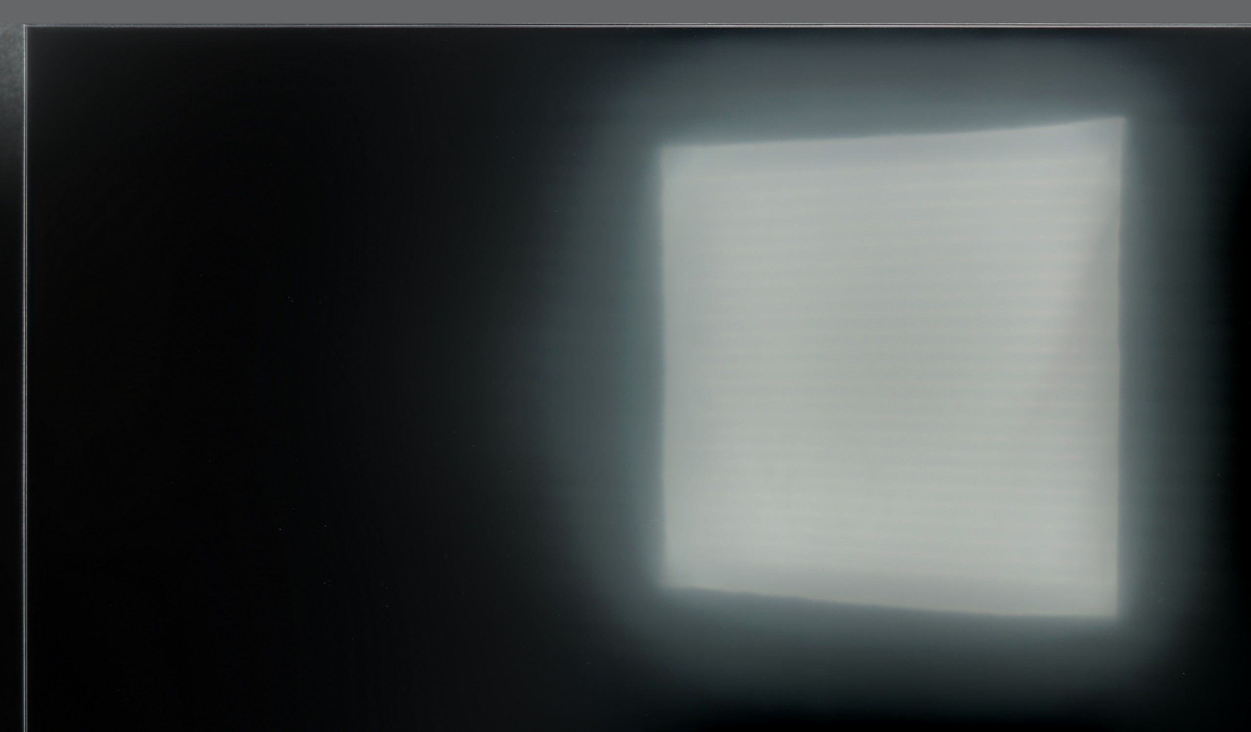
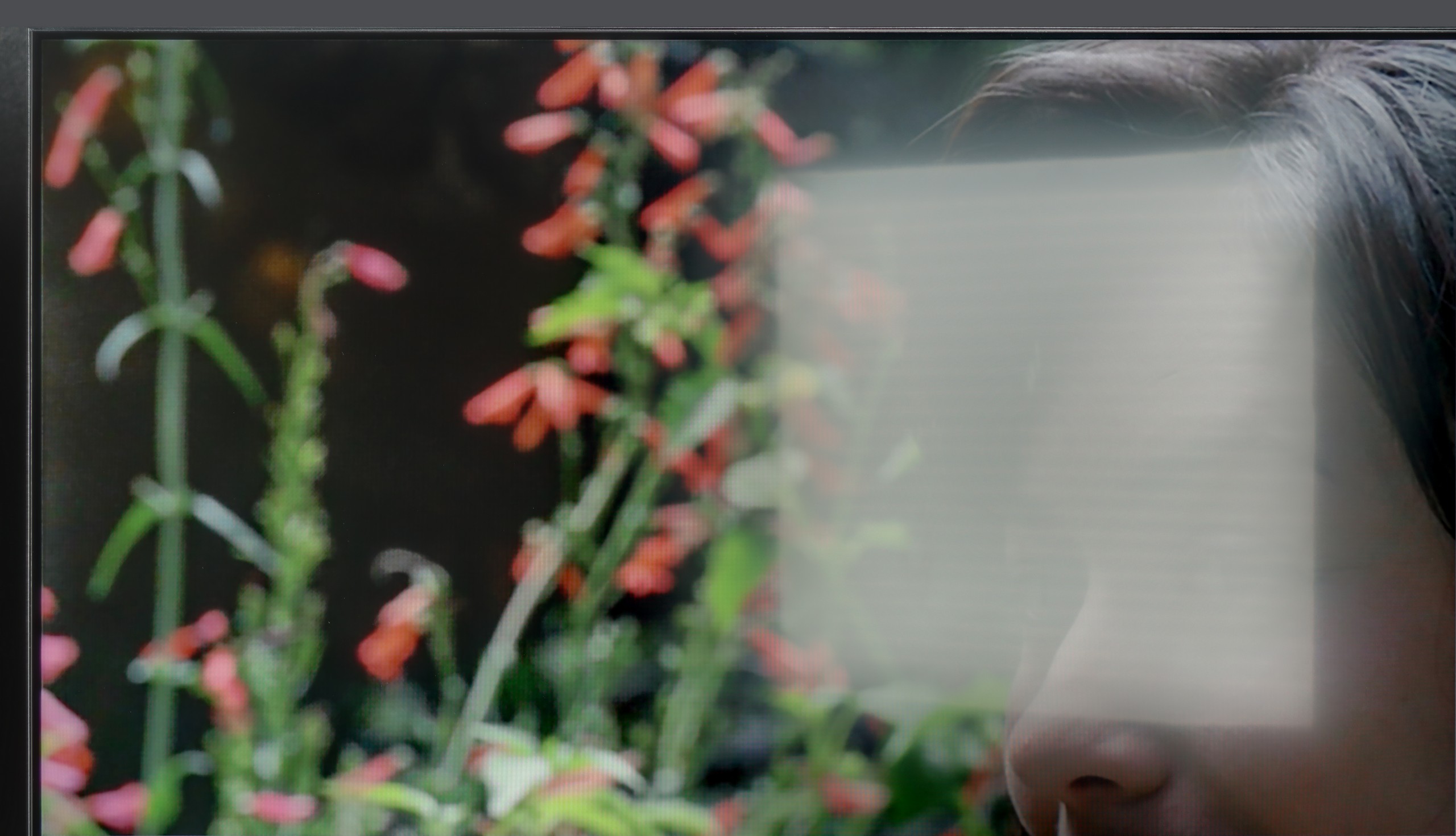
And how does the television perform in confrontation with daylight, for example in a brightly lit living room? Unfortunately, we don't have good news here. As we have established, it is a television with relatively low brightness, which becomes a serious drawback when faced with sunlight. The situation is further worsened by the screen coating used. Instead of effectively suppressing reflections, its satin structure tends to unfavourably scatter them. In practice, this means that the reflection of a window or lamp turns into a large, blurred, milky haze that degrades contrast and effectively hinders viewing. The conclusion is therefore clear: if the television is to be placed in a bright room, the K85F model will not be a good choice.
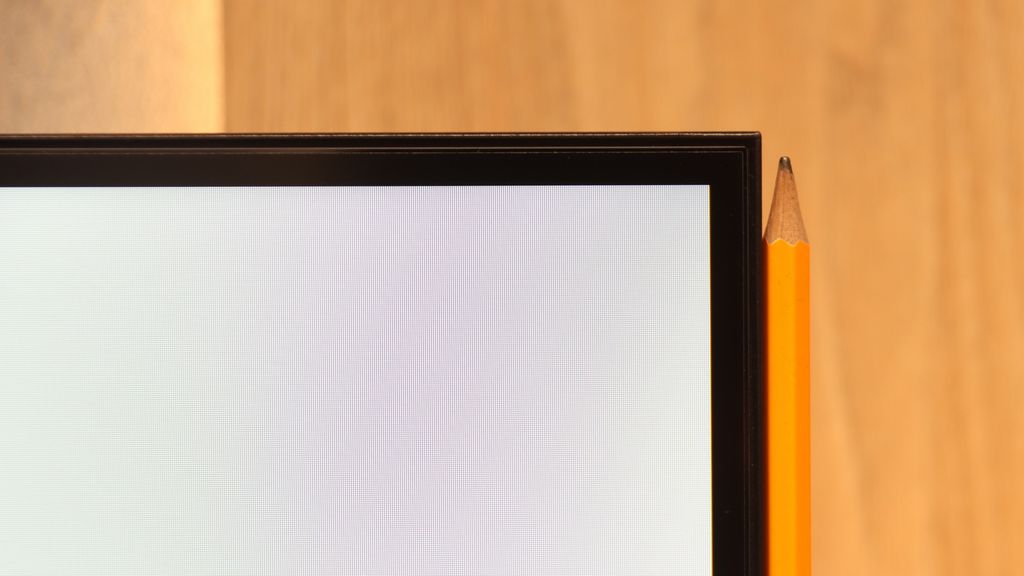
Panel details
Subpixel Structure:
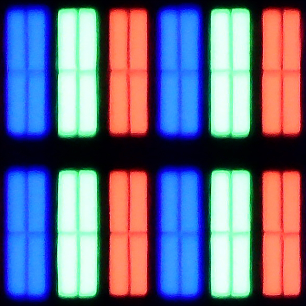
Panel uniformity and thermal imaging:

TV features
6.6/10
5.5/10
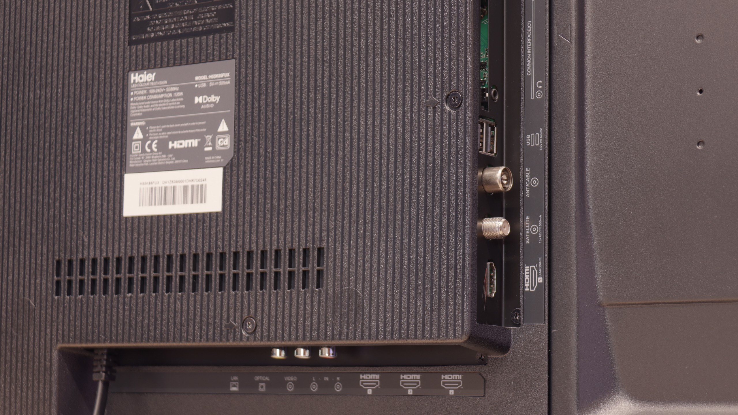
- HDMI inputs2 x HDMI 2.0, 2 x HDMI 2.1 48Gbps4 x HDMI 2.0, 0 x HDMI 2.1
- Other inputsRCA (Chinch)RCA (Chinch)
- OutputsToslink (Optical audio), eARC (HDMI), ARC (HDMI)Toslink (Optical audio), eARC (HDMI), ARC (HDMI), Mini-Jack (Headphones)
- Network InterfacesWi-Fi 2.4GHz, Wi-Fi 5GHz, Ethernet (LAN) 100MbpsWi-Fi 2.4GHz, Wi-Fi 5GHz, Ethernet (LAN) 100Mbps
- TV receptionDVB-T, DVB-T2, DVB-S, DVB-S2, DVB-CDVB-T, DVB-T2, DVB-S, DVB-S2, DVB-C
Classic features:
- Recording to USB (terrestrial TV)
- Recording programming
- Picture in Picture (PiP)
- RF remote control (no need to aim at the screen)
- Backlit remote control
- Teletext
- Audio only mode
- Bluetooth headphones support
- Simultaneous Bluetooth headphones & TV audio
Smart features:
- AirPlay
- Screen mirroring (Windows Miracast)
- Voice search
- Voice search in native language
- Ability to connect a keyboard and mouse


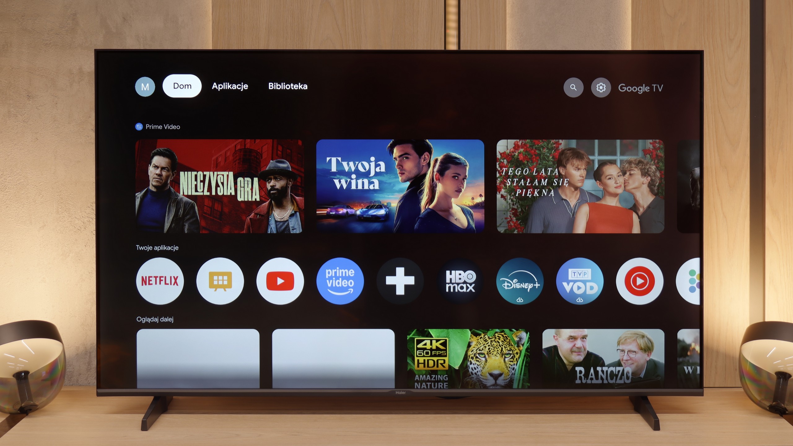
TCL C75B is a television that primarily relies on the Google TV system. The platform offers access to most popular apps, such as Netflix, YouTube, and Prime Video, making it great for watching content from the internet. However, it's worth mentioning that the system can sometimes stutter slightly, which may be noticeable during everyday use.
In terms of smart features, the C75B performs well. Voice control with the help of the built-in assistant works smoothly, and thanks to AirPlay and Miracast, we can easily transfer content from our phone or laptop. Bluetooth allows for effortless connection of headphones, controllers, or other devices.
However, anyone expecting classic television features may be disappointed. There is no option to record programmes on a USB drive or a picture-in-picture (PiP) feature. TCL has been skipping such features for some time, which may not appeal to users who mainly rely on traditional television.
GoogleTV on Haier K85F
The heart of the television is the Google TV system, which in theory should be a huge advantage. Access to thousands of apps and a wealth of features are promises we are familiar with. Unfortunately, in Haier's execution, this is one of the worst implementations of this software we have encountered. The system operates painfully slowly, and the interface notoriously freezes. However, the real nightmare is the incorrect and often downright comical translations of some menu options, making it difficult to figure out what is being referred to at times. To make matters worse, during our testing, we couldn't get the AirPlay feature to work at all.
Classic Features on Haier K85F
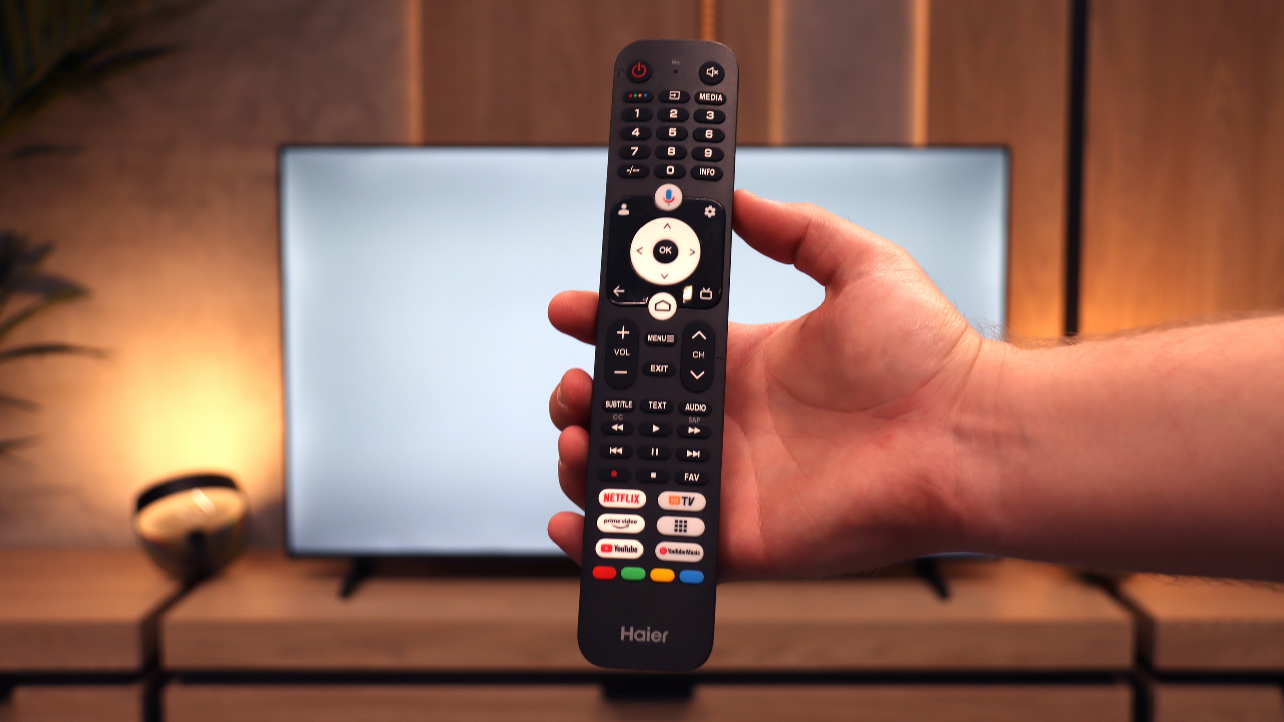
Let's move on to the classic functions and ports, because the story here is even more interesting. A plus is definitely the rich array of ports, including four HDMI connections and the increasingly rare mini-jack headphone output. Unfortunately, the television does not offer either USB recording or Picture-in-Picture mode. However, the real ordeal begins with the remote. Our initial attempts to pair it via Bluetooth to activate radio (RF) control and voice functions ended in total failure. After dozens of attempts, we were convinced it was simply a manufacturing defect. And then the surprise: after a long struggle, we discovered that the remote can be paired, but it must be done from the native Google TV settings, completely bypassing Haier's dysfunctional system overlay. This is a perfect example of how terrible software can ruin basic functionality. Oh, and one more thing. In the box... there weren't even batteries for the remote.
Playing files from USB
9.2/10
9.4/10
Supported photo formats:
Maximum photo resolution:

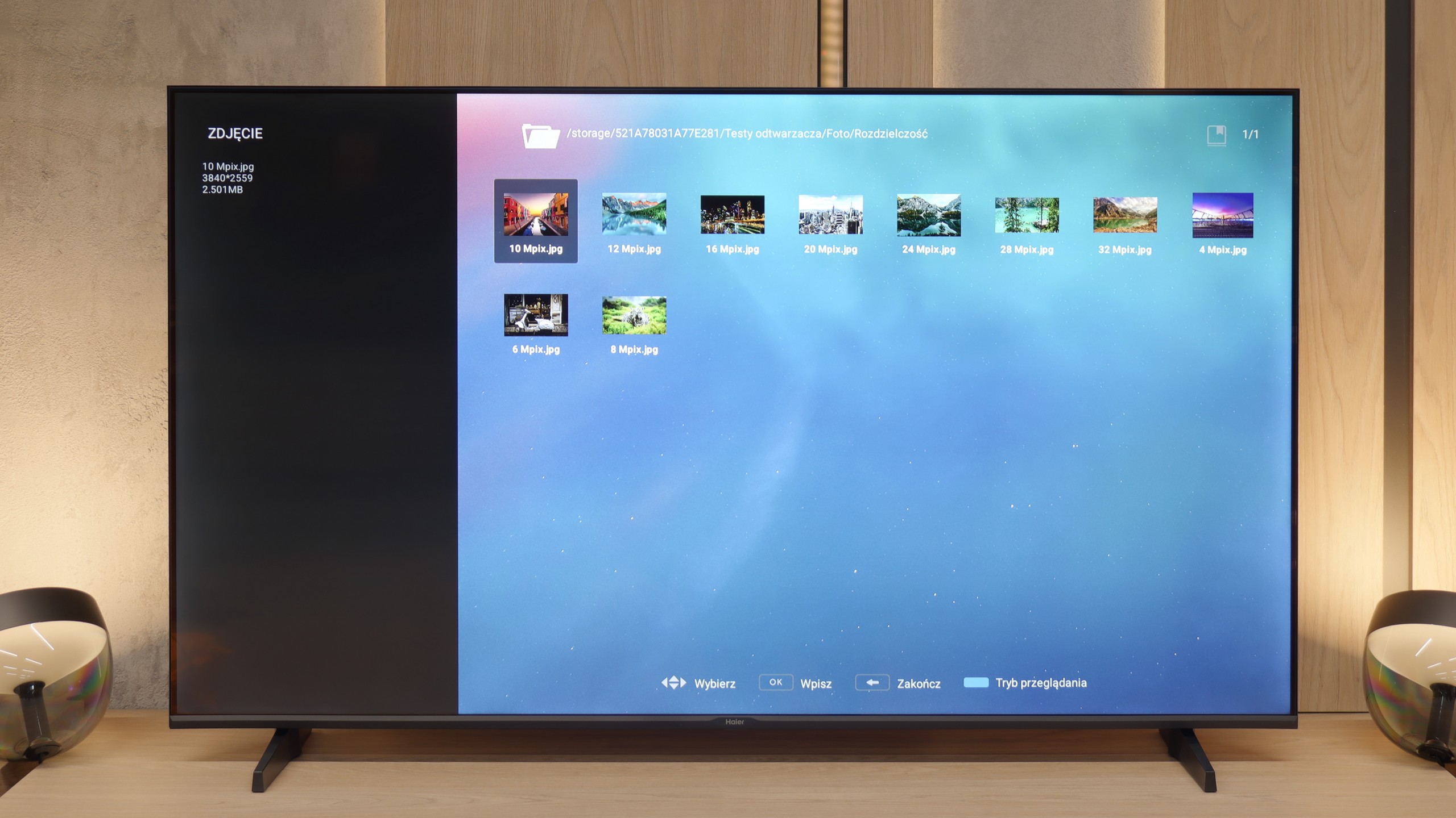
The built-in media player in TCL C75B works really well. It handles most popular image and audio formats with ease. Although there are some shortcomings in the support of certain formats, thanks to Google TV, you can easily install an alternative player that will solve this issue.
After all our complaints about the unfinished software, the moment came when we were absolutely shocked. It turns out that within this buggy and slow-running system, there is a function that works almost perfectly and puts industry veterans to shame. We are talking about the built-in media player for USB drives. It is a true multimedia powerhouse that played practically every video format we threw at it without the slightest hiccup – from the most popular to the completely niche. Haier, a newcomer to the TV market, has achieved something that many manufacturers with decades of experience have struggled with for years. Who knows, perhaps it was originally intended as a reliable player for conference rooms? Regardless of its origins, the result is outstanding!
Apps
9.6/10
9.6/10
Sound
6.6/10
4.8/10
- Maximum volume-83dB
- Dolby Digital Plus 7.1
- Dolby True HD 7.1
- Dolby Atmos in Dolby Digital Plus (JOC)
- Dolby Atmos in Dolby True HD
- DTS:X in DTS-HD MA
- DTS-HD Master Audio
The sound on the TCL C75B is really pleasant, especially at lower volume levels. The bass is noticeable and complements the sound well, but only up to about 40% volume. At higher settings, problems start to arise – the bass causes unpleasant vibrations, and the speakers begin to crackle. If we plan to use higher volume levels more frequently, it’s worth considering purchasing a soundbar, as the built-in speakers may not meet more demanding situations.
When it comes to sound, the review will unfortunately be very short. The biggest advantage of the built-in speakers of the K85F is that they simply exist and produce sound. Other than that, the sound is completely flat, lacking any bass and just anemic. Yes, on the TV's box we will find the Dolby Atmos logo, but against the physical capabilities of these drivers, it is a feature that exists only on paper. Therefore, the verdict can only be one: when planning to purchase this TV, a soundbar should immediately be added to the budget.
Sound Quality Test
No sound test video
Acoustic Measurements
No acoustic data
83dBC (Max)
75dBC